 Health-information sites are popping up across the Web like mushrooms, but the sad fact is that most of them aren’t really very good. Search sites like Healia mostly seem to want to displace Google as a “first stop” for health-minded users — a relatively unlikely prospect. Places like Healthline that aim to offer a more comprehensive look at diseases, symptoms and treatments still generally present their information in a disjointed fashion, dividing it up among separate tabs and forcing users to click through different interfaces to find what they’re looking for.
One of the more ambitious efforts to straddle the tradeoff between breadth and depth is a new site from Kosmix called RightHealth. (It’s been in beta for a while, and Kosmix is now formally launching it.) At first, the concept sounds unpromising — Kosmix describes the site as a “home page” for health topics, in line with similar sites it’s also launching for auto and travel information. Once you get into it, however, it’s clear almost immediately that RightHealth does something unusual by integrating a large number of information sources into pages that are generally clear, concise, and easy to navigate. Best of all, the site is both comprehensive and deep, since it’s fairly straightforward to dive into complex subjects and to follow links to related subjects in an organic way without getting lost.
The RightHealth home page, a spare and unprepossessing layout dominated by a large ad, doesn’t really hint at the site’s power. Use the upper right-hand box to search for diseases, symptoms, the name of a drug, a surgical procedure or a general subject such as “weight loss,” however, and you’re off. Each search takes you to a tiled information page that generally offers a brief, well-written summary of the subject and links to related images and video, news, “trusted sources,” and advanced reading in the medical literature. One of the more significant features is an “explore” panel in the middle of the page that offers further links to related subjects that are intelligently assembled and organized.
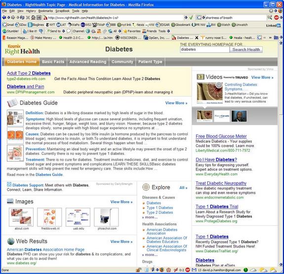
Don’t take my word for it. Here’s a screenshot of the site’s diabetes page —

— which Kosmix co-founder Venky Harinarayan says is largely assembled on the fly. (This happens to be the page the company used in a demo of the site, but I’ve since poked around enough to feel confident that it’s representative and not a Potemkin setup.) The tabs along the top of the page offer further refinements of the subject, such as the “patient type” tab that lets you zero in on information related to diabetes in men, women or children.
The site, of course, isn’t perfect. The “advanced reading” tab, for instance, serves up a few articles and then general links to medical journals, pharma-sponsored sites and clinical guidelines, none of which are likely to be particularly helpful to your average user, and the community forums are a bit on the clunky side. (RightHealth also currently links to DailyStrength, so users have alternatives.) And the site’s sponsored Google links — currently its main source of revenue, although Harinarayan says Kosmix plans to supplement and perhaps eventually replace those with targeted advertising — aren’t always distinguished as such, which could easily cause users to blunder into ad sites.
RightHealth won’t find you a doctor, manage your medical bills or save you from the heartbreak of psoriasis, but it does a pretty decent job presenting often-complex medical information in a useful fashion. I may even start using it as a professional resource, which is more than I can say for any other health site I’ve ever looked at.
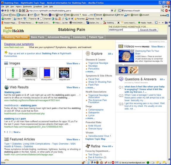
A brief aside: RightHealth can deliver some amusing results on occasion. For instance, when I searched on “stabbing pain” to see how the site would handle a slightly oddball request, the generated page came up with this:

Which is actually not bad, at least until you look under “Potential Risks” and see that the site decided to display “Knife Wound.” Causality is overrated anyway.

