![]()
(Update: One of the founders, subtly nicknamed “Plurk Overlord,” has contacted me, to correct the misinformation I had posted about Alvin Woon being a sole founder of the service. Plurk is funded, based in Ontario, Canada, and has a team of seven)
While perusing the internet recently, I stumbled upon a cool new site called Plurk. The site, launched January 23 by user interface specialist Alvin Woon, looks a tiny bit familiar. That’s because it combines features from micro-blogging service Twitter, with a touch of Friendfeed, the social conversation aggregator, and privacy features that closely mirror Facebook to put “your life on the line.”
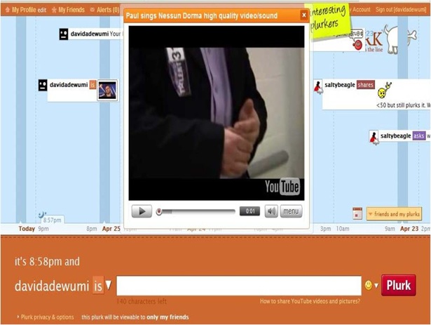
The service, still in private beta, is pretty straightforward. After selecting a username and password upon registration, users are then directed to a page mostly filled with a timeline news feed (see screenshot below), or “plurks,” that other users have posted. Featured below the timeline are the top, recently joined, and random plurkers.
I’ve complained for quite a bit about the less than stellar user interface on Twitter, which could be a barrier to entry to mainstream adoption, or at least the HSTG (high school teenage girls) audience which Plurk’s Woon is targeting.
Plurk, for the most part with its threaded conversations, timelines, and easy-to-find buttons and features tackles the UI problem pretty effectively.
Skipping on over to your personal Plurk page, you’ll be able to check your stats — users get karma depending on the quantity and frequency of their posting — friends and fans, as well as see all threaded conversations in the timeline, and of course, a big fat message box for posting 140 character messages.
One twist to Plurk that may help us grammar nuts: users have options on which verb to use for the message. Choose between loves, hates, likes, shares, gives, wants, wishes, has, wills, asks, was, thinks, says, and of course — is and freestyle (blank).
A button in the bottom right hand corner allows you to toggle between just your plurks and your friends’ as well.
A timeline could potentially be annoying, with the burden of scrolling back and forth between days, and then returning to the current time, but as you hover over either far side of the screen, you can return to start.
Click on the plurk on the screen, and you can see the threaded conversations, viewing and responding to all the plurks, and in a hat tip to Friendfeed and Facebook, you can watch content (screenshot below) directly in the plurk.

Privacy settings will be familiar to Facebook users — you can allow the whole word to see your plurks, friends of friends, just friends, and lastly your lonesome self.
Finally, the service is integrated with AOL Instant Messaging, so you can send and receive plurks directly from your chat client. It also has an embeddable widget, which Woon has posted on his blog.
All in all the service is pretty nifty for a one-man creation, and the Twitter team should look at hiring one Mr. Woon to help solve their user interface issues, even if he can’t help them scale.
David Adewumi, a contributing writer with VentureBeat, is the founder & CEO of http://heekya.com a social storytelling platform billed “The Wikipedia of Stories.”

