 Using the web site discovery service StumbleUpon right now is kind of like driving a hot convertible with the top up. It’s a cool car, and having the top on gives you better performance, but it’s just not quite as sexy. That top is akin to StumbleUpon’s toolbar web browser plug-in, which you currently must use to use the service. But tonight, StumbleUpon is dropping the top and letting the sun in.
The new version of StumbleUpon is all about accessibility — by anyone, anywhere. While it’s not getting rid of the plug-in toolbar entirely, you no longer need it thanks to some clever JavaScript code. This will allow anyone, both registered users and non-registered users alike, to visit the newly revamped StumbleUpon main site and start finding new and interesting content on the web — in any web browser.
If it works anything like the toolbar-driven version of the service — and from the demonstration I got at the StumbleUpon offices today by founder Garrett Camp, it certainly looks like it does — this is going to be a big development for the finding of good content online.
The plug-in was a limiting factor
Since it launched out of Canada in 2002, StumbleUpon’s focus has always been about directing users towards good content. It’s good at doing just that through a tailored process that includes a classification engine, a clustering engine and friend recommendations. I previously outlined how it works here. But all of that required the plug-in toolbar — and that was a barrier to entry for many people. Not only was it limited to users of Firefox and certain versions of Internet Explorer, many users — even those with those browsers — were simply not going to take the time to install a plug-in.
And Camp realized that. “The primary goal is to increase accessibility,” Camp told me with regards to this big evolution in StumbleUpon’s strategy. Right now StumbleUpon has over 6 million users, but the removal of the toolbar barrier could allow for 50 or even 100 million users to gain access to the service, Camp says.
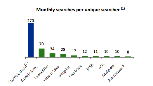
Maybe an unreasonably lofty goal, but StumbleUpon has something very important on its side: Ease of use. The chart above shows the monthly number of searches per unique user across many popular sites on the Internet including Google, Yahoo and the like. You can see that StumbleUpon easily bests all of them by a large margin. That may seem shocking, but it really makes sense. With Google or any other search engine, you have to type in a query and hit “search” to find something. With StumbleUpon, you simply hit the “Stumble” button.
It’d be almost like if everyone just used Google to hit the “I’m Feeling Lucky” button — but could do so without having to type anything into the query field. Of course, Google doesn’t work that way, but StumbleUpon does because it keeps track of what you like and don’t like. Thanks to web cookies it can still do this without the toolbar now.
But as I said, StumbleUpon has no intention of getting rid of the toolbar plug-in anytime soon. In fact, Camp has a long term strategy with this new phase of the service which he hopes will lead to more people using the plug-in. The thought is that if you get them familiar with the service, users will want more customization that the plug-in can provide. The plug-in also allows for one-click submission of new content, while the web version requires a longer, manual process more along the lines of how you submit something to Digg or most other social news sites.
In an ideal world, StumbleUpon would have a Stumble toolbar built-in to browsers just as many now include search bars featuring Google search, Camp told me.
While the new web-based version will begin to roll-out tonight to select users, it will be a phased roll-out that will take place over the next few weeks, according to Camp.
Camp felt it was important to get this new version out the door and into the wild and notes that it should work in any web browser that is compliant with general web standards. That, of course, calls into question Microsoft’s Internet Explorer browser (which is generally bad with compliance to web standards). But while Camp says their have been some bugs, he’s certain they will be ironed out prior to launch.
More importantly, the feature will work in Safari, a popular web browser among Mac users (as Apple makes it), as well as Opera.
The new main page
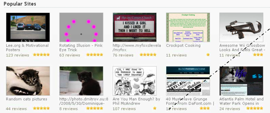
Perhaps the real key to the new web-based StumbleUpon is the new stumbleupon.com homepage. Here you’ll find the best quality content from the service highlighted and broken down into several sub-categories.
Clicking on any of the content will open it in the window with the new browser-based toolbar overlay. This looks a lot like the alert drop downs you see on Firefox. It’s a dark overlay (shown below) that has a Stumble button, a button to give a site a “I like this” or “thumbs up” vote and a rating area.
There is also an area to save the site you are currently on, which will work with a web cookie and eventually with user logins. With time, StumbleUpon will add more features and functions to this web-based toolbar, Camp said.
StumbleThru Partnership Program
There’s another new service StumbleUpon is launching tonight as well: Its partner program called StumbleThru. StumbleUpon currently has four sites, The Huffington Post, Rolling Stone, National Geographic and HowStuffWorks which are signed up as partners. The first two, Huffington Post and HowStuffWorks will go live tonight with the StumbleThru functionality. What this means is that when you visit the partner site, you will find a Stumble badge (shown below left) on the page. Depending on where you click, this badge will either take you to its rating page on StumbleUpon or will actually start stumbling various pages on that site.
 That’s the key: It’s kind of like a mini version of StumbleUpon that is sequestered into one domain. Sure, there are other services or add-ons that create a similar functionality for sites such as blogs (that is, take you to other content on that site), but StumbleUpon’s partner version uses its vast database of people’s likes and dislikes of various pages of content from that site.
Camp made sure to note that the company was being selective with who it chose for its partner program. Right now it’s a few sites, and it will roll out to more, but Camp hopes to keep the feature limited to only quality sites, so those trying to flush the system with bad content won’t be allowed.
Gaming the System
Gaming the system is always a hot topic with social content sites. This new web-based version of StumbleUpon adds a new dimension to it because of what Camp calls the “escape frame” issue. It’s a bit technical, but basically the reason it took StumbleUpon so long to come up with a web-based version is that certain pages which have areas known as “frames,” mix up the web-based toolbar. A malicious person could insert such a frame to trap a user on their site during a Stumbling session.
Camp is very clear that StumbleUpon won’t tolerate such behavior. The company has a team (which impressively, is mostly one person) using three high powered systems that is constantly checking most of the pages that are in StumbleUpon’s system. If any site is found to be inserting escape frames on purpose, it will be removed from the system.
Gaming is also an issue in that you no longer need an account to Stumble something. This could lead to users trying to inflate or drive down certain sites. But again, Camp is not worried because of the recommendation engine it has in place. Basically, anonymous users will have much less weight in terms of their votes counting towards overall page ratings than those users who say, use the toolbar and have a lot of trusted friends.
The future
Camp has a lot of grand ideas about where StumbleUpon can go in the future. One is a Stumble widget that you can place on a blog or any social network profile page. Basically this would show your readers or your friends the content you’ve found and liked through StumbleUpon.
You could basically build this now yourself thanks to StumbleUpon’s new RSS feeds. They will show what you liked, and they even include thumbnails of the sites so you could build something pretty decent looking. Hopefully social content aggregator FriendFeed will start using these thumbnails to better highlight Stumble data — and now with the web-based version, aggregation of StumbleUpon data will be much more useful because a click on a link can take you to a page where you can actually vote on it yourself.
While StumbleUpon doesn’t have any specific plans for mobile, there is no reason this web-based version of the service shouldn’t work on some of the more advanced mobile web browsers like Safari on the iPhone or Skyfire on Windows Mobile and Symbian devices.
The eBay question
Despite what appears to be a major step in the right direction for StumbleUpon, questions remain about the future of the company. This is due to the rumor that eBay, which bought the service in 2007 for $75 million, is now trying to sell it to another buyer.
Camp would not comment on that issue and would only say that the features StumbleUpon is releasing tonight should overshadow that news.
[top photo: flickr/emdot]


