 Has Facebook just destroyed its usefulness? Is the design, introduced a week ago, killing the site’s ability to help you share information with your real-life friends? That’s what a vocal and perhaps large group of people think. That’s at least judging from a poll of around a million people who self-selectively voiced their displeasure, various reports of “100 percent” of people’s Facebook friends hating it, and the well-articulated dissatisfaction of many readers here on VentureBeat.
Meanwhile, we ourselves have noticed sharp increases in the number of status updates by our friends, and the number of comments on items in our feeds. And analytics firm Compete reports that Facebook usage has only seen an insubstantial drop since the redesign was introduced.
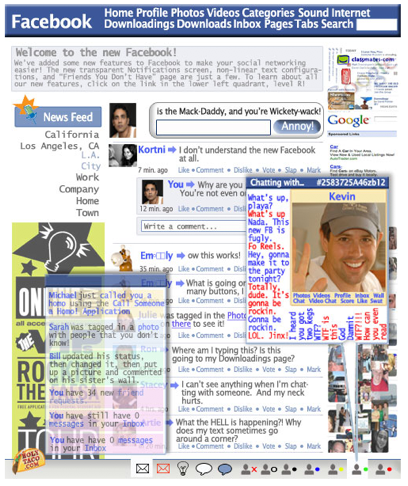
So how should Facebook proceed? Should it revert to its older design? Or, if not, which parts of its old design should be returned and what new features should stay? Lots of questions — and everyone seems to have their own opinions. (See the hilarious Holy Taco parody of the redesign for more on that, above.)
Here, we’ll try to summarize the issues people are complaining about, then explain why Facebook is making changes, what we think it is doing right, and what it can do differently to make its product better.
Some things people hate about the new Facebook design
Facebook has nearly 200 million users around the world, including most ages and cultures, and some portion of these people will be upset whenever a feature is changed. What people say they hate about the redesign depends entirely on how they use it. Some have a few friends who they interact with all of the time through status updates. Some have many hundreds if not thousands of friends and don’t interact with many of them that much except through things like notes and shared items. Some people use applications all the time. Some people don’t use applications all the time, but their friends do. The list goes on.
But Facebook has thrust a wide range of features on its diverse user base, impacting these unique individuals differently form each other. To think about how that looks if you were trying to design Facebook, think of a giant matrix, with a row listing the different changes that you’re making and a column listing every single user. The point of conflict is where change meets each user’s pre-existing behavior within this matrix.
To try to figure out where the biggest problems are, let’s look at what people seem to be complaining about the most. Because, unlike past design changes that caused massive protests, these changes are different, according to many people. While the other changes created new ways of finding information and interacting with people when they were introduced, like the news feeds in 2006 or the redesigned news feeds last fall, the redesign restricts how users can use the site.
News feed: From slow-moving river to babbling stream
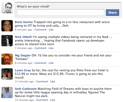 In the previous design, news feeds prominently featured a wide variety of information about what your friends were up to on Facebook’s own applications (like photos and groups), their activity on third-party applications and on other sites, friends tagged in photos, comments about those photos, events that your friends are attending, who your friends have become friends with, friends changing their profile picture, videos, posted items, and more. This information is now harder to see in the feed. Facebook has removed its secret algorithm for deciding which of the millions of feeds to show you, so whatever you and your friends are doing a lot of will appear most often. Now, the main way to see much of what used to be in the feed information is in a tab to the right called “Highlights” (which has its own issues that we’ll get into further down).
If the old design was a wide and slow-moving river about all sorts of stuff, the new feed is intended to be a fast-moving “stream” (as Facebook now calls it) of what seems to be mostly status updates.
To make matters worse, the real-time updates that Facebook said the news feeds would include don’t seem to be automatically updating — at least for many people, including ourselves.
Applications: Where’d they go?
Meanwhile, the company has changed a number of what were horizontal tabs in the old interface into vertical tabs in a new left-hand sidebar. These tabs still let you filter your feeds based on existing friend lists (something we’re not sure everyone knows about yet) or by application type. If you click on any item in the left-hand column, you sort the feed to see only those items. But there’s a catch. Facebook currently auto-sorts these applications so you only see the applications you and your friends and their friends are using most. You can re-order these lists, but you can’t add new ones — at least not yet.
 Where else did the applications go? Confusingly, Facebook has also removed a box on the right-hand side of the news feed that previously allowed you to click and go directly to up to six types of applications. Many people used these application bookmarks to go to Facebook-created applications that are key to the site, like Facebook’s events and group applications. When the applications were in on the right-hand side, you could manually select which bookmarks you wanted to appear there — either Facebook’s (the defaults) or other those of third parties.
Now, if you want to go directly to an application, look down. You can see your favorite applications’ icons listed on the left-hand side of the bottom toolbar (Facebook chat and notifications icons are on the right-hand side). Facebook has had this toolbar for awhile, but most web sites don’t have anything similar — it’s not the sort of user interface that many people are used to. As a result, frustrated users have found it impossible to locate their apps.
Highlights: Of things I care about?
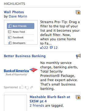 Dominating the right-hand side is “Highlights” — another current pain point for users. It includes, as mentioned, news feed items like photos, events, videos, posted items and other information that your friends are creating. These items appear as a stream of information snippets, together with thumbnailed pictures from each item. Facebook automatically selects which items appear here, based on how many of your friends are looking at them, and how often. It’s a sort of secondary news feed for items you might find especially interesting. Unfortunately, you can’t remove some items — like photos of your former spouse.
Unlike these same items in the old news feed, Highlights don’t show comments — instead, you just see how many comments an item has, and you have to click through to read them. Highlights also include an ad that appears near the top of the page that links to items like a company’s fan page. At least some people have been confused enough to assume that the entire Highlight section is comprised of ads (a side effect of trying to make ads more content-like, it seems).
Lots of other problems
 Certainly, there are other issues with the new design. For example, when you go to add something to your Wall stream and it doesn’t appear right away — confusing. There should be an indication that it may take a little while for it to appear. And the list goes on…. Some people don’t like the rounded boxes on people’s profiles that appear avatar-like next to their items. Some people don’t like the new, uniform font used in news feed items.
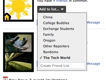
Allow us to rant about a peeve, which most people probably wouldn’t care about. We don’t like a redesign change for how you create lists of friends. Before, you could click on the button that lets you add a friend to a list, select a list, and see the name of that list appear next to their profile. Now, when you select a list, the window stays open — this allows you to select another list to add the person to. If you want to close the list and add the friends, you need to click on the “add list” button again. Then, you can’t see which list you’ve already added the person to. The result is that you end up having to click confirm without knowing if your changes actually went through.
What is Facebook thinking?
Facebook wants to be the central way that people share information. Everything it has built so far has been in that direction — its profiles, its status updates, its in-house apps like Photos and Events, its developer platform, its Connect service for sharing information between Facebook and other sites, its news feeds. What’s vexing is that the interface that has evolved around these services has become increasingly complicated. Much more so than the interfaces of FriendFeed and especially Twitter.
Facebook is most certainly trying to compete with Twitter, a site that lets users send short messages to anyone who follows them. In the new site, for example, the “publisher” — the box for sharing status updates, photos and other items for your friends to see in the news feed — now explicitly includes a call-to-action phrase “What’s on your mind?”
But there are some fundamental differences. Although Twitter has a private setting, most of its usage comes from people publicly sharing information. A not-often-discussed viral mechanism is that the more people following you, the more you feel compelled to tweet. Facebook doesn’t currently offer this.
However, Facebook wants to be something more than what Twitter is, because Twitter itself is not oriented around private relationships with just your real friends. Just try to make sense of the stream of tweets from your friends — there’s no way to sort. Some third parties are trying, but the results aren’t there yet. Facebook wants to beat Twitter to where it is going.
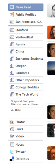 Which is where FriendFeed comes in. Facebook has been emulating FriendFeed by letting users import feeds from other sites (something that’s hidden in “settings” on users profile pages), letting users comment on those imports, and by letting you “like” other people’s feed stories. FriendFeed also lets you create filters to sort out types of feeds; like what Facebook offered with its horizontal news feed sorting tabs in the old design, but on the left — now Facebook’s sorting tabs are on the left.
Facebook is basically trying to cut Twitter and FriendFeed out of the game before they become evolved enough — or just plain popular enough — to become better ways of sharing friend updates and sorting feeds of friends.
But none of these three services has yet to perfect a way to create a central messaging service. They’re all still circling around the key idea of offering a single fountain of information that matters to you, from around the web. Or that’s how FriendFeed co-founder Paul Buchheit framed it to me a few weeks ago.
Facebook has the users to be able to experiment with a better central communication service on a much larger scale than its rivals. But right now it needs to “train” users, as it were, on how to use the new site. And it needs to do that before mass implementation of Facebook Connect begins, or else that will add even more confusion. You see, Facebook Connect is really the key to what Facebook’s goals are. It’s the way Facebook is going to become the main hub on the web for everything that you need — from comments on blogs to your friends activity on an iPhone application. While all that sharing may sound scary, it will also be incredibly convenient and will turn the web into a more social place — if Facebook can pull it off, of course. And that’s exactly what these changes are about: Putting the foundation in place to make it easier for you to process all the information you might care about in the world.
Fixes, in motion
The site right now is too complicated. After its last major redesign last fall, Facebook decided to go with two toolbars — one horizontal toolbar of sorts above the feed, and the other, bottom toolbar. Now, given everything else it’s trying to do with feed filters on the left-hand side, it needs to unify these toolbars. Perhaps along the top toolbar it might add a spot for “Applications” and “Core” (which contains the core Facebook applications like Pictures, Video, etc). Perhaps it could move chat into the left-hand sidebar below the feed filters, with the chat windows still popping up at the bottom of the screen — similar to how Google does it within Gmail.
Facebook needs to do a better job of filtering. Right now, when you click the “X” on a feed item, it blocks that user from appearing in your feed. Really, there should be an option that pops up asking if you want to block that user or just the type of item that user has in your feed. For example, say you don’t want to see Joe’s Google Reader Shared Items. You click the “X” and you’re given an option to block Joe from your feed or just all of his Google Reader Shared Items. Yes, this is exactly what FriendFeed does, and it’s the right way to do it.
From here, Facebook needs to figure out what might be worth bringing back from the old feed, like items about your friends making new friends, events, profile picture changes, etc.
Perhaps most importantly though, Facebook needs to do a better job easing users into this redesign. If it wants people to do their own filtering using lists, it needs to make sure they know how. That’s why above the feed filters, there should be two options: One to show you the news feed after the redesign, and one “legacy feed” below to show you just the core Facebook elements that were previously in the news feed prior to the redesign. In effect, this would be the “training” mechanism described above, and again, is critical before the real flood of information starts coming in through Facebook Connect.
While some of the redesign’s implementation has been handled poorly, the overall idea behind it is the right one. As a lead Facebook engineer and other developers said recently, feeds and status updates are the most efficient ways for users to communicate. Users never like change because it disrupts the way they are comfortable with doing things. Facebook, for its part, tells us that it is listening to the many complaints that users have been making. As with previous designs, Facebook did, in fact, ask for user feedback ahead of time, although not as much as it did during last fall’s redesign.
Facebook should listen to its users in some regards — but if every company only listened to its users, there would be no innovation. If the changes made are ultimately for the better, as Facebook clearly believes, then it needs to suck it up and get through this growing pain. And so do its users.
