Want smarter insights in your inbox? Sign up for our weekly newsletters to get only what matters to enterprise AI, data, and security leaders. Subscribe Now
 When Facebookers began thinking about the design for Timeline, the name for the new look and feel of Profiles, they reached for books more often than browser tabs.
As a result, while the new Facebook Profiles might look a bit like a WordPress or Tumblr theme, they actually have a lot more in common with a physical scrapbook or a box of old photos once you start using them (and most users will be able to activate the new options within a few weeks).
“We looked at a lot of print, and we did entire studies on scrapbooks,” Facebook product chief Sam Lessin told VentureBeat in an interview in San Francisco.
“We’d get out a big box of old pictures, flip through the photos and talk about them. We were watching test users reminisce over these things, and we tried to design with that in mind and create that experience.”
Reminiscence, memory and nostalgia are concepts that came up over and over in our talk with Lessin. He brought up the fictional Mad Men character Don Draper’s pitch for the Carousel slide projector, a presentation that emphasized memory and emotion.
“We must have watched that Carousel video internally fifty times, thinking about nostalgia,” said Lessin.
And that focus shows. When I activated Timeline on my own profile, I was immediately struck by what Facebook had done.
Years-old memories flashed before me — old friends, old places, things I hadn’t thought about in ages. I got sucked back into the past the same way I would have in front of my mother’s old cedar chest, a trunk packed full of childhood tchotckes and pictures that holds our family’s history.
This innocuous social web tool had just made a powerful and convincing bid for more than my information or my time. Facebook was grasping at my emotions by way of my memories, and it was doing a damn good job.
With Timeline, Facebook is succeeding where so many other web companies have failed: It has created a technology with real emotional power.
Under so strong a grip, I think it unlikely that any Facebook user would seriously consider leaving the site. The company would have to do something egregious to make its users abandon such an elegantly organized personal history of memories and relationships.
Is that scary? It’s as scary as you want to make it. You can still easily export all your posts and photos if you ever want to leave Facebook or simply back up your data. But Facebook is also giving you a well-designed, interactive, shareable, cloud-based scrapbook that’s more useful and possibly more interesting than the traditional format scrapbook sitting at the bottom of your mother’s cedar chest.
How Timeline came to be

The first thing I wanted to know from Lessin is where this Timeline idea came from. Facebook is famous for developing features and products with small teams of two or three employees working independently and intrapreneurially. Had Timeline been the work of a couple designer/hackers coding their butts off for a few months?
Lessin told me that Timeline was different from most other Facebook features in that respect.
“The number of people that touched this to make it happen was enormous. A large part of the design team worked on parts of Timeline. It was uniquely, really collaborative, and it took a village to get it done.”
The new user interface has been a long time coming; in fact, a lot of people have been wondering why a bold Profile redesign didn’t roll out sooner. “The most recent iteration took at least a year,” he said, “but even getting to that point took years.”
Lessin continued, “We had a thousand iterations for this. If you look at books, a lot of timelines are horizontal, so we had a bunch of iterations based on that. There were a lot of designs that we built and unbuilt with different designers.”
Also, Lessin confirmed that the Timeline idea “wasn’t something we at Facebook hadn’t thought about before.” In other words, Facebook has been thinking about chronological design and restructuring Profiles for quite some time – years, in fact. So while the thesis was easy and the end was a lot of work, Lessin said, “The really tough part was the middle. It’s hard to know when to go into build mode.”
Ultimately, one point stood out for the team: Facebook users kept going back in time.
That is, people were constantly looking through deeper, older information on their Walls and friends’ Walls. And that desire to quickly, easily navigate through time, skimming over the detritus but not overlooking the gems, was a large part of what motivated the team to structure the new Profiles as a timeline wherein memories are distilled and important events are highlighted. In the end, Facebook made Profiles an algorithmically derived scrapbook that can contain and beautifully display the most important things about you.
“Time is not a new concept,” said Lessin. “People have been making timelines since the Romans and before. So we had a lot of source material to draw from.”
Lessin also said that, as modern citizens, the designers looked to a wide variety of industries, time periods and places for inspiration. They even got into infographics and information design, which led them to two new hires with deep roots in information design.
“The way the project ended up running, we had certain people who spent 24/7 working on this, living and breathing it,” said Lessin. “Nick Felton was one of them, from the time he joined Facebook to the product launch.”
Felton was an information designer with whom Facebook had worked in the past, primarily on collateral for the company’s 2010 f8 developer conference. Felton is known for being a master of weaving time and information into stunning and clear graphical interfaces. His annual reports are visually fantastic, data-rich representations of personal interactions throughout the year. In short, his work represented exactly the kind of thinking Facebook needed behind Timeline.
Ryan Case was another person Facebook brought on specifically to design the new Profiles. Case was Felton’s co-founder at Daytum, a name the duo established to work on personal data visualization projects. So with a pair of infographic gurus at the helm, Facebook was ready to start building what became Timeline.
How and why Timeline works
 As a result, said Lessin, “The design is obviously interesting. There’s a lot that may be familiar, but there’s a lot that’s new.”
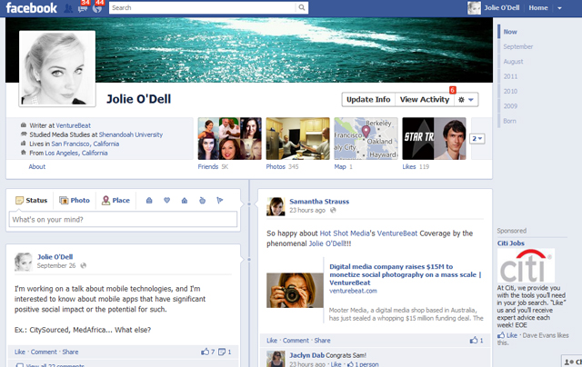
With a Timeline-enabled Profile, the above-the-fold area of the screen (the information you see first without any serious scrolling) acts like a table of contents for your life and personality. You can read straight through or skip to the good parts, like what music someone likes or highlight posts from the year you met him or her.
The first thing each Timeline page displays is a large header image that Lessin called a “cover photo.” Because of the dimensions of the image space, this isn’t really an appropriate place to plaster up yet another headshot; rather, it’s a space to show people what you’re about. Facebook is channeling its users from narcissism toward genuine self-expression.
“There are a lot of reasons for your profile picture to be a picture of you,” said Lessin, “but people have been hacking that for self-expression. Watching people choose their cover photos, people are really using them to express themselves. It’s a rich storytelling opportunity.”
As you scroll down past the header and initial string of app-related information, the Timeline acts much like a prettier version of the Facebook Wall you already have, but the scrolling never stops. Better yet, it never gets boring.
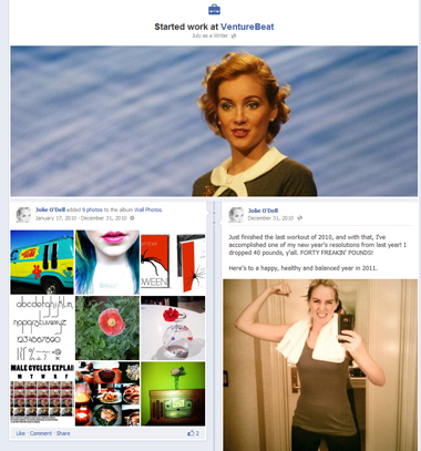
As you continue backwards in time down the page, you see less detail and more of the bigger picture. You’ll get the highlights of months and years past. You’ll get highly visual content that triggers memories; you’ll be reminded of when you first made important friendships. If you see an event, image, or update that strikes you as particularly important, you can star it; the item will become a full-page-width pictorial display.
“The first few minutes of using the product is zipping through and looking at their memories, things that have always been there but weren’t easy to surface,” said Lessin.
For those who want to dig deeper, the Timeline theme (chronologically organized information that has more detail for recent events and big highlights for later events) carries throughout the applications listed on your Profile. Want to see all your Spotify information? It’s right there in a consistent, easy-to-browse timeline. Even the geographically organized map view, which sorts all your posts and photos by location, has a timeline on the side.
Ultimately, Facebook has managed to make something that is completely and visually personal without resorting to the kind of customization options that made a designer’s nightmare out of MySpace.
“We really wanted to make this feel like it’s yours,” Lessin told us. “It’s designed very differently from News Feed. I don’t know how the rest of the site is going to evolve over time, but the central concept is that if something is yours, it should feel different from other people’s pages and other Timelines on Facebook.”
While the design focus was intense and highly specialized and the engineering behind Timeline involved “a lot of heavy lifting,” Lessin said the most important part of building Timeline was an understanding of how people engage with one another and with information online.
“We had to figure out the interactions that people wanted to have, the social construction … We like to think we have a competency in that,” he said.
Finally, I was left wondering how Facebook users would react to the changes. Historically, Facebook makes incremental tweaks to the interface, and users revolt in agony and frustration. They don’t leave the site, but much to-do is made over the smallest adjustments. Molehills become mountains. So how are users going to handle an actual mountain?
“I think Facebook users prepare each other,” said Lessin. “One of the things we did with our last Profile redesign was we had an opt-in period. Facebook users who got in early taught one another and helped one another. This time, we also have an opt-in period.”
This opt-in period will give users ample time to explore and answer important questions about the new interface. “One aspect is, can you use your own Timeline? How shocking is this to you? Who is seeing what? So this window lets people hide posts and adjust their new Profile before turning it on,” said Lessin.
“It’s a big product, and there are a lot of different features. But learning it really comes when your mom asks you or when you teach a friend. Getting the product early to people who can help with that is how we navigate these things.”


