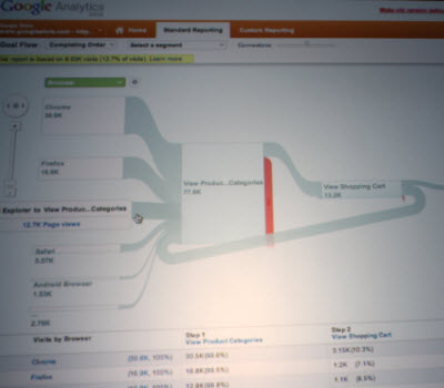
 Google has created “flow visualization” tools for its analytics service so that web site owners can better understand the flow of traffic into their sites, the company announced today.
 Susan Wojcicki, senior vice president of ads at Google, announced the addition to Google Analytics at the Web 2.0 Summit in San Francisco.
“You can understand your data and dive in,” she said. “You can see how users are moving across your site with it.”
As you can see in the picture at the right, Google Analytics is no longer just a set of numbers for you to look at when you’re analyzing your traffic. Rather, you get a visual representation of how the traffic that goes into a site branches off to different parts of the site. You can see how many people leave the site after one or two clicks.
For the change, Wojcicki said Google got inspiration from the 19th century graphic (pictured below) that showed what happened to Napoleon’s army after he invaded Russia. The large bar at the bottom shows how he invaded with 500,000 soldiers and returned with 10,000 after disastrous losses due to battle and starvation.
Google is also launching real-time traffic for Google Analytics. That makes Google Analytics more competitive with services such as Chartbeat.
“If you announce a promotion, you don’t want to know in two hours if it worked. We want to know that now,” Wojcicki said. “We are doing this for all of our analytics users.”
Google also enabled nine more languages for Google Analytics, bringing the total to 40.

VentureBeat's mission is to be a digital town square for technical decision-makers to gain knowledge about transformative enterprise technology and transact. Learn More
