Want smarter insights in your inbox? Sign up for our weekly newsletters to get only what matters to enterprise AI, data, and security leaders. Subscribe Now
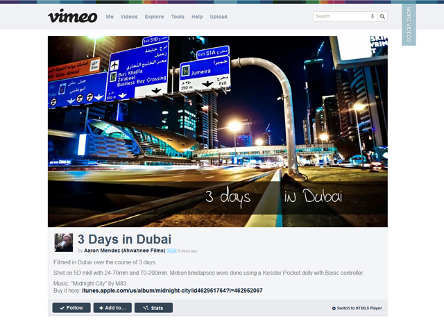
Prominent video sharing site Vimeo has begun rolling out a striking redesign that emphasizes clean aesthetics and larger videos that promote immersion, the company revealed today.
With the goal of providing a better video viewing experience no matter where you are, the redesign goes hand in hand with the recent launch of Android and Windows Phone apps and soon-to-launch iOS apps. No matter where you go, the service aims to “put video first,” a phrase the company’s employees like to trot out often.
Vimeo has essentially had the same design since 2007, and while users of popular sites often protest design changes, this one could go over smoothly. The redesigned site echoes the old design in several ways, but it comes off as much more sophisticated and smooth. Vimeo CEO Dae Mellencamp told us that during the testing process it has been quite hard for her to go back to the old design.
“The old design feels clunky by comparison,” Mellencamp told VentureBeat. “There were tons of features and functions we wanted to add, so we’re using a new code base. We’ve put video front and center.”
The most notable change to the site can be found on video pages. As you can see in the photo above, the video player now takes up twice as much space on the page. It’s so big you don’t have to make the video full-screen to immerse yourself in it. Unlike Vimeo’s old design or YouTube’s popular player, there are now no related videos featured on the right-hand side. To see more videos, all you have to do to click the tab at the top right that says “More Videos” and a bar of other videos to choose from will pop down from the top.
Other important changes in the redesign include a cleaner “Inbox” where you can watch new videos posted by people you follow, new profile pages with larger photos, more privacy settings, easy access to Creative Commons videos, threaded comments that allow for replies, and advanced search options. Vimeo has even created a “10 Reasons Why You Will Love The New Vimeo” to make sure users get up to speed on what’s coming.
Registered users that want in on the redesign can sign up today to take part in a closed beta test. The Vimeo team plans to give many more users the chance to sign up to use the new design in the next few weeks. More details on the roll-out process can be found over on Vimeo’s blog.
Vimeo has been owned by IAC, which also owns OKCupid, Match.com, Urbanspoon and The Daily Beast, since August 2006. Vimeo doesn’t reveal paid subscriber numbers, but it does have more than 8 million registered users. It notably attracted 65 million unique vistors in Dec. 2011, and that doesn’t include embedded views across the web.
You can see a comparison of Vimeo’s old design and new design in the first four screenshots below. I’ve also included screen grabs from the profile page and how comments now appear under videos.


