The new Windows 8 operating system shows a design sensibility and a clarity of purpose not often seen in a Microsoft product.
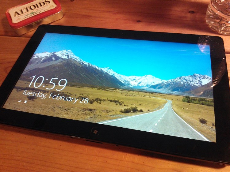
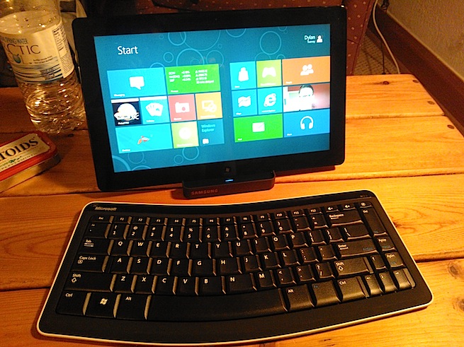
I’ve spent about a week with the “consumer preview” of Windows 8, which is available to the public today (you can download the Windows 8 consumer preview for free here). I’ve been testing it on a Samsung tablet, with a separate wireless keyboard and mouse, lent to me by Microsoft. What follows is based on my week-long review.
Here’s what you need to know about the next Windows before you download the consumer preview.
Windows 8 is trying to do everything for everyone
The operating system’s coherence and attractiveness are especially surprising given the enormous number of constituents it has to serve: Windows users in all their maddening variety, computer manufacturers, chip makers, software developers. Even people who live “in the cloud” and couldn’t care less which operating system their device is running still need an OS; they just don’t want it to get in the way.
Of course, all these competing demands are exactly what produced monstrosities like the vast numbers of toolbars in earlier versions of Microsoft Word, or the self-defeating complexity of Windows Vista’s security notifications. Microsoft has a lot of customers, and it’s provably good at capturing and holding on to those customers, but in the process, its products have a tendency to get fugly.
Given those challenges, it’s amazing to see how gracefully Windows 8 pulls off the complicated acrobatic feats expected of it. It doesn’t quite stick the landing, Mary Lou Retton-style, but it delivers a solid performance that suggests even better things to come.
In short, Windows 8 is a promising multi-touch tablet OS, an improved mouse-driven desktop and notebook OS, a cloud client, and a new application development and delivery architecture, all in one.
It’s far from ready for production use, but it is an ambitious step towards a Windows that might not even be called Windows any more.
It’s got a radical new interface
The past few versions of Windows have made interface changes that seem relatively subtle: More animations, more transparency, and so forth. Windows 8 is a striking departure.
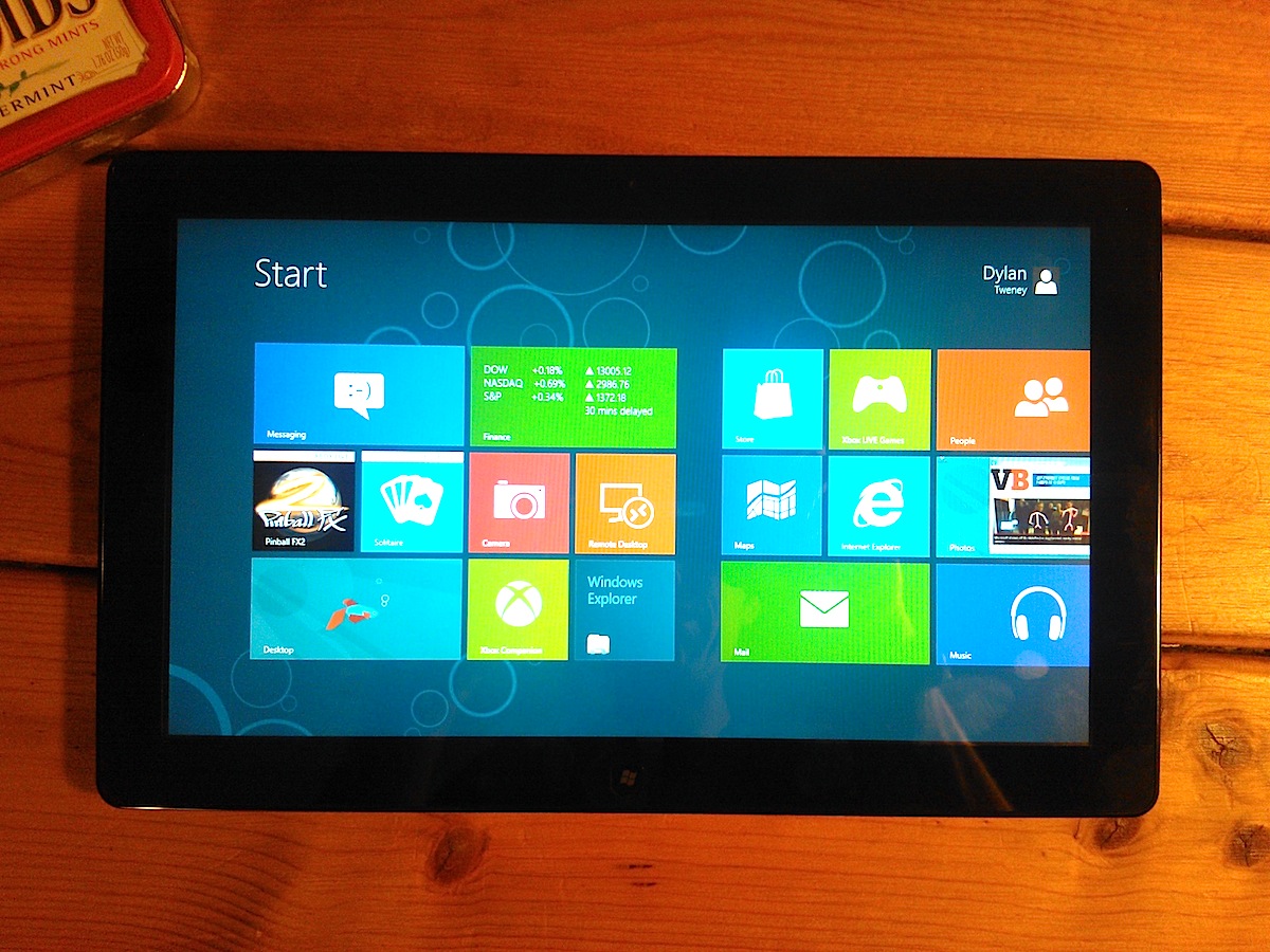
Microsoft is doubling down on the “Metro” design language first seen in Windows Phone 7. That means big, bold, multicolored tiles. Many of those tiles update themselves with current information, and not just digits (like the number of unread messages), but actual data (like what your next appointment is, and when it is).
The Start screen display is speedy and pleasingly animated, and I like it.
More significantly, Metro-optimized apps run full-screen. There’s no ability to stack up windows and only very limited tiling options (if you want, you can put one app in a narrow panel on the left and a second app on the remaining 2/3 of the screen).
And there are no toolbars, no menus, no floating palettes. When you’re looking at an app, the whole screen is nothing but content. If you’re browsing the web, you don’t see Internet Explorer: You just see the web page you’re looking at. If you’re reading email, the emails fill the screen. And so on.
If you need to control apps, you swipe in from the top or the bottom of the screen, or right-click on the app, and menus will appear. You can also access “charms,” which are icons to do basic things like adjust settings or share the current page, by swiping in from the right. And you can switch between apps by swiping in from the left, so each app becomes its own full-screen panel.
It’s simple, attractive, and clean-looking. It’s also a little baffling at first. The Microsoft guys who demonstrated the OS to me clearly want people to explore, play, and have fun discovering nifty new gestures as they go. But when you’re trying to find the settings applet that will let you connect to a Wi-Fi network or add an external keyboard, this interface can drive you up the wall.
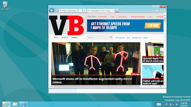
But what about legacy Windows applications, the kind that you’re probably using right now and have been using for the past decade? Windows 8 supports those too, in “windowing” mode, which looks just like Windows 7. In practice, the “old Windows” view becomes just another app panel, and you can swipe to and from that view just like any other app.
Oh, and there’s no Start button, as we reported a few weeks ago.
You can control it with a touchscreen, mouse, or keyboard
Microsoft has taken pains to make Windows 8 accessible to almost every conceivable input method. The Samsung device I tested it on is a multitouch tablet, and I found the interface fast and responsive to all the gestures I expected: tap, swipe, pinch-to-zoom, and so on.
But Windows 8 is not just a tablet OS; it’s also a PC OS. Accordingly, all those colorful Metro-styled tiles have to work on computers that have mice instead of touchscreens. Microsoft has provided mouse gesture equivalents for every touchscreen gesture, though they’re not always identical: For instance, to bring up those “charms” or system commands, you swipe in from the right edge of the screen, or move the mouse pointer to the lower right-hand corner.
Windows 8 also contains a wealth of keyboard shortcuts, including the classic alt-tab for switching between apps (thank goodness, as that gesture is hardwired into my left hand by now). The company says you should be able to do anything in Windows with any one of these input methods, or a combination of the three.
The system breaks down a bit when you wind up on an old-school Windows screen and you’re using your fingers on the touchscreen. Many buttons and links designed for mouse-only use are way too small to hit accurately with your fingertips, and there’s no way to zoom in. Frustrating.
Add a Kinect, and you can add voice commands and whole-body gestures to the operating system’s vocabulary.
Microsoft has completely overhauled the underlying system
Windows 8 is more than a mere facelift. It’s clear that Microsoft has spent a lot of time rebuilding the underlying architecture of the operating system. I haven’t delved into the particulars of the underlying system, but here are a few indicators of how deep the changes are.
- Microsoft has introduced a new kind of high-level application programming interface (API) that it calls “contracts,” which aim at simplifying communication between apps for common activities. For instance, there’s a “sharing” contract. Any app that wants to offer something to share (like a web page, a picture, or a document) only needs to code its app to be compatible with the sharing contract. On the other end, apps that can be shared with (like email programs, or a Twitter client) simply need to be compatible with the sharing contract on the receiving end. Neither app needs to know anything about the other app’s APIs, they only have to work with the contract in order to be compatible with any current or future apps that also work with that contract.
- Windows 8 uses your Windows Live ID to authenticate you, and provides many options for syncing data (like your desktop wallpaper or Internet Explorer favorites) so that these options can follow you whenever you log in to any Windows 8 machine. That integration points to a future where your desktop account lives partly in the cloud, partly on a variety of devices — and presupposes a deep level of architectural compatibility with cloud-based data.
- Windows 8 will run on ARM microprocessors — the kind currently found in many tablets and smartphones — as well as the Intel architecture chips that the current Windows uses.
- Apps in the background take up zero processing resources, with very limited exceptions for downloading data or playing music. To make that feasible, every Windows Metro-compatible app has to be ready to shut down completely in 5 seconds or less.
- Windows 8 boots faster than any desktop OS I’ve used in the past 20 years. It takes about 10 seconds from cold start until the login screen appears. Once you log in, it’s only 2 or 3 seconds until you’re looking at a usable, fully responsive Start screen.
There will be a market for apps
I can’t say much about the actual market or the apps in it, because the Windows Store wasn’t available until today. The only apps on the tablet I tested were the ones pre-installed by Microsoft, and those aren’t necessarily the same ones that will be on the shipping version of Windows 8.
What Microsoft has said is that it will be easy to create Windows 8 apps using current Windows development tools, XAML and C#. But it will also be easy to build apps using HTML5 and JavaScript, the company promises; indeed, several of the demonstration apps, like the maps application, are basically simple wrappers around existing web sites or web applications. One developer even found that he could re-use 90 percent of the code from a Windows Phone game when porting it to Windows 8.
Lots of developers appear to be interested in the possibilities. Microsoft says that 3.5 million people downloaded the Windows 8 developer preview (the version before this one), which came out in September.
Security and management will make Windows 8 attractive to businesses
Built-in security features such as a trusted boot architecture that should prevent a huge number of malware attacks will help reduce Windows’ exposure to viruses and Trojan horse software.
There are other nice touches that will simplify IT management. For instance, remote access is built-in to Windows 8, as it has been in previous versions. No big deal, right? Except that Windows 8 will run on any device, which means you could use your Windows 8 tablet to log in remotely to a Windows 7 machine across the country and diagnose problems without even getting up from the comfy couch in your IT dungeon.
The Windows Live-based login scheme means that it will be even easier to separate user accounts from physical hardware; you can log in to any computer with your ID and all your preferences and apps will follow you. Add Skydrive or another network storage source, and your data will follow you too.
Microsoft also promises that there will be a version called Windows 8 to Go, which will put the entire operating system on a bootable USB stick. Plug it into any compatible machine (even a Windows 7 machine), boot from the thumb drive, and you’ve got your entire computing environment right there. When you log off and remove the drive, it leaves none of your data behind.
It’s not quite there yet
This is a “consumer preview” release, which would have been called a beta in previous days. It’s free to download, because Microsoft is using you as a guinea pig, and they hope you’ll give them feedback. But basically, you’re getting what you pay for.
The Metro interface is confusing unless you’ve been shown some key gestures, like how to swipe in from the edges of the screen and which corners to send the mouse pointer to. My guess is that Microsoft will need to add some kind of hinting, or maybe pop-up videos or interactive help dialogs: “We notice you’ve spent the past five minutes jabbing aimlessly at the screen. Can we help you find something?”
There are missing pieces: For instance, Flash support is incomplete, and that means you can’t play every video on YouTube, for instance.
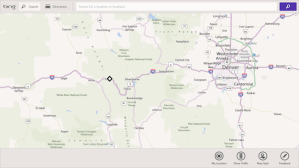 Not all the apps, even some by Microsoft, got the memo about leaving the controls off the screen. For instance, the maps app has a persistent toolbar at the bottom and a search bar at the top. Neither one ever disappears. If the Bing Maps team can get away with this, you can bet other developers will be pushing the limits too, and then it’ll be toolbars all the way down again.
Some of the gestures aren’t consistently implemented: For instance, you can swipe in from the left of the screen to see every running app plus an icon that will take you back to the Start screen — unless you only have one running app, in which case nothing happens.
It’s way too hard to find your way to the system settings. There needs to be a Metro-styled settings app, complete with a prominent tile, right on the Start screen.
Also, it’s a bit buggy. Sometimes the system just stops responding. Weird things happen sometimes with beta software.
You can pretend all the new stuff doesn’t exist
Switching between Metro and classic Windows is still awkward, and probably always will be, to a certain extent. It’s kind of how running DOS applications in a window used to be: Microsoft wants to provide support for legacy applications, but they coexist uneasily with the new paradigm. This difference is especially pronounced this time around, because Windows applications are legion.
But suppose you just really hate all those colorful, animated tiles, and want nothing to do with Metro at all? Apart from the Start screen, you can probably avoid Metro entirely — for now. Just open up a desktop window and carry on using Windows the same way you did before, with all your old apps. Of course, the Start button is gone, but that’s no big deal, just push your mouse pointer into the lower left corner where it used to be.
My prediction is that people will spend most of their time in the Windows environment, not Metro, until a few years have gone by. However, Metro will become more ubiquitous slowly, as Windows spreads to tablets, if Microsoft is able to increase its market share among smartphones, and if app developers jump on the Windows Store bandwagon.
Eventually, Windows users will be living in a majority-Metro world, with more tiles than windows.
And who knows? Maybe, eventually, Microsoft will drop the name “Windows” altogether.
