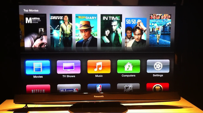
Earlier today Apple debuted the third version of its Apple TV set-top box, which enables higher-definition video playback, a new user interface, and some additional integration with the company’s iCloud service.
Overall these are nice changes, and they show the device is coming into its own. But most of what’s new about this Apple TV version is purely cosmetic and shouldn’t have taken over a year to see the light of day.
For instance, the ability to watch videos in 1080p is hardly a new concept for set-top boxes. Many competitors — such as the Boxee Box, Roku, Playstation 3, Western Digital WD Live, and Logitech’s Google TV Revue — already offer the high quality video. And since you can purchase 1080p HD movies and TV shows from the iTunes store, Apple fans have been increasingly annoyed that those purchases weren’t available (in 1080p) on the Apple TV. It’s also worth noting that, as was discovered in September 2010, you can play 1080p quality videos on Apple TV, but the output resolution remains 720. That said, this seems like a minor upgrade.
The reason Apple held off so long on enabling the 1080p playback probably had something to do with the notion that the old Apple TV’s hardware wasn’t good enough to support the high quality video without affecting the user experience. With the new version of the device, Apple has replaced the A4 chip with the faster single-core A5 chip. And while Apple hasn’t indicated that it’s upgraded the device’s RAM, I’d expect some kind of improvement over the 256MB offered in the old model.
When it comes to the updated user interface, there’s really no reason Apple couldn’t have pushed it out sooner. The old UI was mostly columns of text-based options you could scroll through that sat underneath pretty cover-style artwork along the top of the screen. At best I would describe this as acceptable for 2010, but not at all for any stretch of time in 2012. By comparison, the new interface is much more focused on images that I can easily identify from across the room. It’s similar to what I’ve come to love when using my Roku box. This doesn’t change the fact that Apple could have offered a sleeker, more TV-friendly UI at least six months ago.
The new UI also helps Apple further its goal of having the combination of iTunes and iCloud serve all of your digital media needs. The only problem with this is that Apple TV owners were not able to experience it sooner — like when Apple launched the iCloud service in October 2011.
Judging from the comments on VentureBeat’s Facebook Page, most people are still angry that Apple has yet to add access to a full App Store to the Apple TV. Earlier this year, Google rolled out its Android App Store (now called the Google Play Store), which allowed third-party developers to create “app channels” made specifically for a TV watching experience. Right now, the only way to get a third-party channel on the Apple TV is to work with Apple directly and then have them approve it. Apple is pretty particular about who it lets in. Only eight different third-party app channels are available on the Apple TV, and I doubt more will be added prior to the new Apple TV model hitting shelves next week.
Check out the demo video embedded below that VentureBeat’s Heather Kelly shot during the Apple event earlier today.
VentureBeat's mission is to be a digital town square for technical decision-makers to gain knowledge about transformative enterprise technology and transact. Learn More

