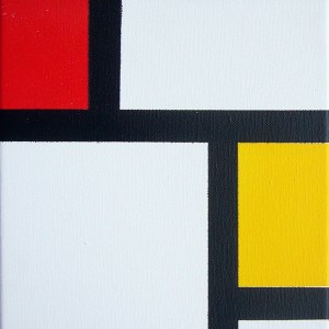
 Last year’s big fashion trend was the color block, and this year’s tech trend follows suit: It’s the square.
More precisely, it’s the big, colorful rectangle filled with a solid color (like Windows 8) or a photograph (like Pinterest).
Mondrian would have been proud.
What this signals is the triumph of the grid and the disappearance of overt user interface cues like window borders and menu bars.
Designers, take note: When I wrote almost two years ago that the hot new trend was “undesign,” I was attacked by some of the smartest hipsters in Brooklyn. But I was right. My point was not that design had become less important, but rather that it was becoming subtler. Instead of pages crowded with links, buttons, and display type of all different sizes, designers were simplifying their layouts. The smartest designers stripped away the nonessential elements of their designs, leaving clean pages that let the eye focus on whatever images or words had been put there by writers and editors. Why? Because if the designers didn’t simplify their web pages, readers were going to use utilities like Readability and Instapaper to do it for them.
The undesign trend followed the introduction of the iPad, which made web browsing a far more immediate and concrete experience than it is on a desktop. Suddenly you’re holding a web page in your hands, with very little interface getting between you and the page you’ve called up. That makes extraneous design elements look even worse than they used to. Thus: undesign, a minimalist, tablet-friendly approach to website design.
Squares are similar. Like undesign, they come from the mobile world. One of the first apps to embrace this sort of rectangularity was Flipboard, which launched in mid-2010. It transformed the process of browsing RSS feeds into a magazine-like experience by putting stories into a boxy, more readable layout. The app’s home page is a straightforward 3×3 grid of photo squares. The iPhone app (and now the iPad app too) extended that concept with “Cover Stories,” a feature that blows up your channels’ biggest stories into an extra-large image with coverlines superimposed on it, just like a magazine.
Google’s image search has also had a dense, tiled layout since mid-2010.
Instagram made ordinary smartphone photos into precious mini-artworks, not just by adding filters but also by cropping the images down to perfect squares.
Pinterest has a photo-centric layout that stacks up images with a minimal amount of text about each one right below the photo.
Tumblr’s Inspire Well theme offers a flexible grid of tiles that predates Pinterest by about a year.
And now Pingram mashes up Instagram photos with a Pinterest-like layout, completing the circle of hipsterdom.
The above sites are part of what might be called the “visual web,” which is basically just like the web we all know, except more image-centric. But the trend is not limited to websites.
Windows Phone 7 introduced Microsoft’s “live tiles,” a color block layout where each block gets real-time updates with data from the application it represents. Sometimes that data is a photograph, or a grid of photographs, and sometimes it’s a snippet of text. Combined with a large, striking, sans-serif font, this tiled layout is striking and a sharp departure from the icon-centric approach of the two dominant smartphone operating systems, Android and iOS.
Windows 8 extends the live tile metaphor, making it the centerpiece of the next version of Windows and taking the first step towards eliminating the desktop metaphor. Since Windows is the world’s most popular operating system, that’s a significant endorsement of the grid of rectangular tiles approach to laying out information.
A host of iPad and tablet apps now use blocky, image-centric, rectangular or square-grid layouts, including Pulse, Feedly, CNN’s news app, and the BBC’s news app.
What these designs have in common is that they make interfaces recede. Gone are the buttons, but gone too is the chrome: the title bars, scroll bars and window borders that used to be ubiquitous in graphical user interfaces. By the same token, the cruft that piles up on most websites — sidebars, navigation menus, widgets, and more — is stripped out, leaving content and ads front and center.
That makes sense for phone- and tablet-based interfaces, where the interface elements appropriate to mouse cursors are unnecessary or downright difficult to use. Why use scroll bars if you can just tap on the page itself and push it up or down? But it’s increasingly a good way of making your content stand out, regardless of platform.
If you’re designing an app or a website, pay attention to this trend. Big, colorful rectangles are in, and excessive interface is out.
Top image: Kent Wang/Flickr

