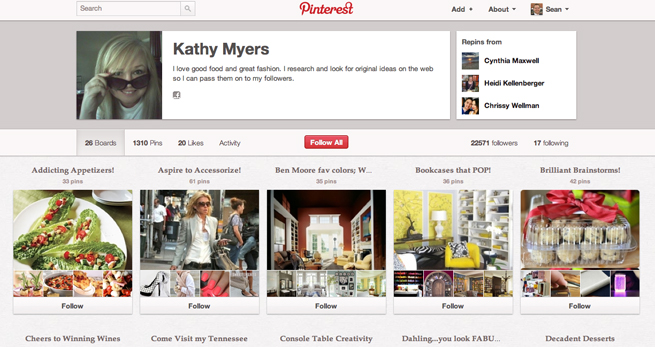
Hot-as-heck startup Pinterest has just introduced brand-new profile pages, its first major design change since its major rise in popularity over the last six months.
Pinterest launched in 2010, but recently it has seen astronomical growth and counts as one of the top 10 social networks on the web. According to recent comScore data, Pinterest users spend an average of 89 minutes per month on the site, which easily bests Twitter, LinkedIn, and Google+ for their site engagement. Pinterest still lags behind Facebook in terms of user engagement, which has users spending an average of 405 minutes per month on its site. The hot opinion Q&A app Thumb also claims to have twice the engagement of Pinterest.
With all this hubbub, you can see why even a relatively small change like profile page design might be a big deal for users. The new profile pages make it easy to see each person or brand’s boards and pins, with pictures easily sorted for viewing. Clicking on a board opens up the layout most Pinterest members are already accustomed to. Previously, the profile showed up as a vertical column on the left-hand side.
Next up for Pinterest will likely be an iPad app and open API for developers. It also will add the ability to pin content from sites like Hulu, Vimeo, and Netflix.
Let us know in the comments if you like the new design changes.
Pinterest profile screenshot: Kathy Myers’ board
VentureBeat's mission is to be a digital town square for technical decision-makers to gain knowledge about transformative enterprise technology and transact. Learn More


