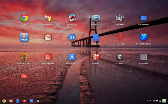
Google’s Chrome OS has always been about the web — indeed, the first version of the operating system was literally just a Chrome web browser that filled the screen. But with the latest developer channel update, the OS has received a visual upgrade that makes it look more like a cross between Windows and OS X.
We don’t yet know how many Chromebooks Google has shipped, but it’s clear they haven’t taken off, so it’s no big surprise to see the company steer the OS into something more consumer friendly. Chrome OS is still centered on the web, but now consumers won’t have to change the computing lessons they’ve learned to use it.
The new Chrome OS window manager, dubbed Aura, adds a traditional desktop (along with support for wallpapers), stacked windows, a task manager, and an app launcher similar to Launchpad in OSX. Aura is hardware accelerated, meaning it takes advantage of the Chromebook’s graphics processing instead of the CPU for intensive tasks. Google says the framework will offer “large-scale animated transitions and effects.”
It’s also worth noting that this new interface is appearing about a year after Google announced the Chromebooks, so I expect the company to push the upgrade heavily and announce new Chromebook partners in the next few months.
The visual redesign is a rare bit of exciting news for Chromebook owners, though unfortunately it won’t be available on the original Cr-48 Chromebook prototype (blame that device’s lackluster hardware). The update is available now on the Chrome OS development channel for the Samsung Series 5 and Acer AC700 Chromebooks.


