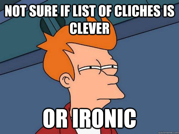
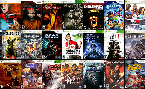
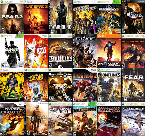
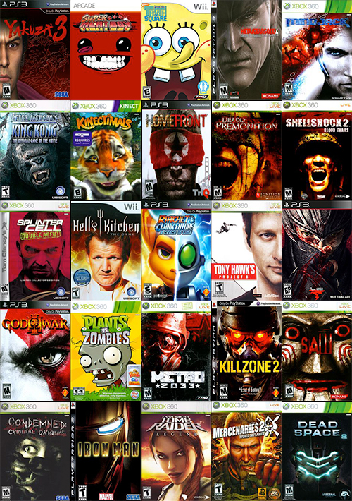
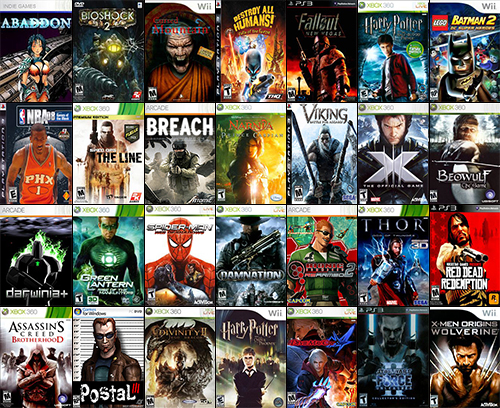
You might have seen this collection of movie poster clichés earlier this year (courtesy of French blogger Christophe Courtois). It shouldn’t surprise you that video game box art has its own recurring visual motifs, and I’ve collected 11 of them here.
For simplicity’s sake, I’ve mostly limited this to titles from the current generation of hardware (Xbox 360, PlayStation 3, and Wii). Otherwise, we’d be here all day.
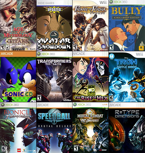
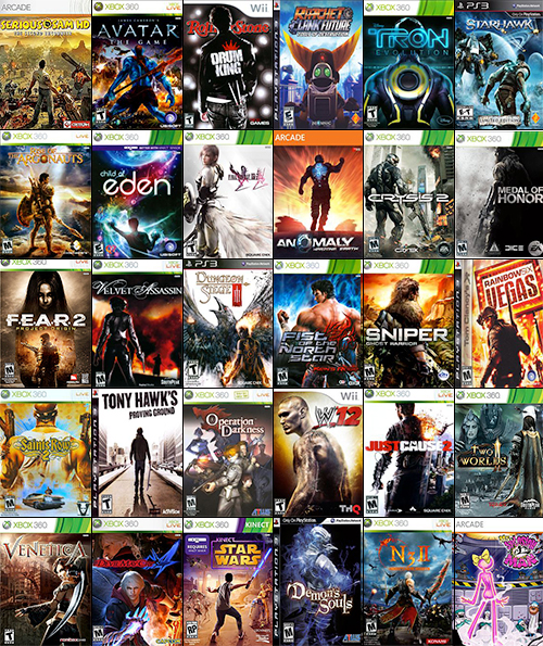
Face-to-face
TV screenwriter Eddy Canfor-Dumas says, “Conflict is drama.” And he would know because he wrote Supervolcano.
Even non-narrative games like Pac-Man center around two forces in opposition, and the designers of game covers can express this in any number of ways. You can’t beat the classics, however, and sometimes it’s enough to just have two characters demonstrating their antipathy by getting into one another’s face.
Notable offender: Developer/Publisher Rockstar’s Bully: Scholarship Edition mixes up the formula with a difference in height between the two people staring each other down.
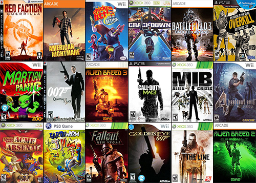
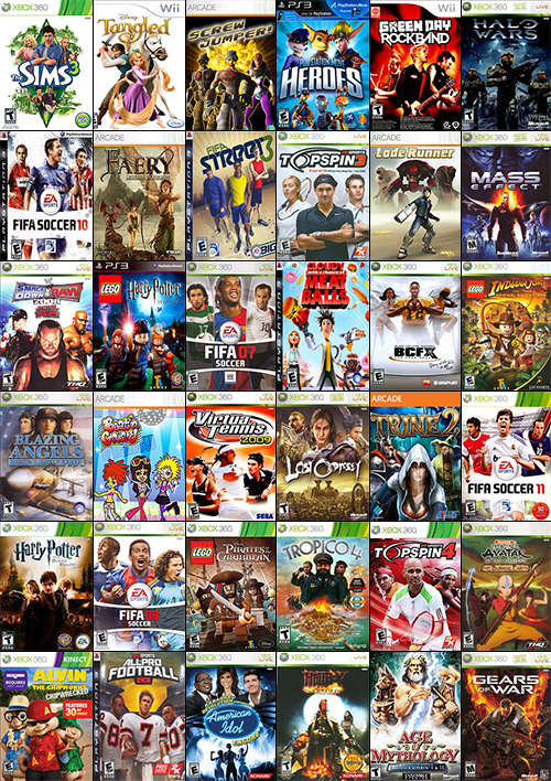
Guns pointed up
Modern video games are just straight-up full of guns, so it makes sense that many covers focus on their characters’ relationship to their hardware. It’s hard to show people holding guns without making them look too threatening, however, so the workaround is apparently to show them casually pointing their weapon into the air.
Notable offender: See that woman on the box for House of the Dead: Overkill’s Extended Cut? She’s pointing two guns up.
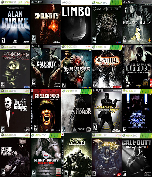
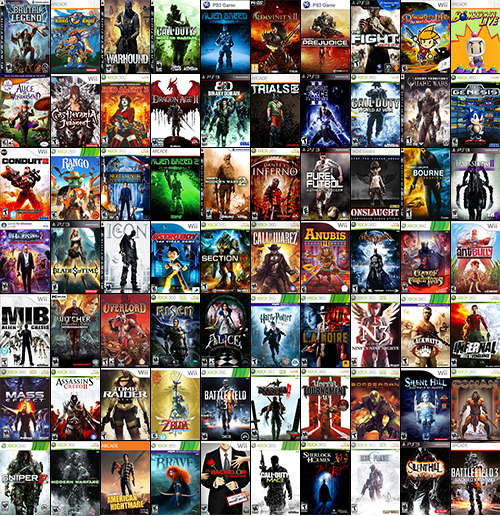
In the shadows
In this age of gritty reboots and cynicism, some video games have gotten pretty dark, and their covers reflect this in the most literal way possible. Apparently, the quickest way to convey to a prospective player that your game is for-reals serious is to design a cover in which your hero glowers in a poorly lit room.
Notable offender: Limbo’s and Alan Wake’s shadow-intensive covers make sense, considering the darkness inherent in their design. But why does a boxing game like Electronic Arts’ Fight Night: Champion need to go all monochromatic?
Screaming
Good visual art expresses emotion, and I can’t think of a quicker way to do so than to just have a picture of a person screaming.
Screaming probably appears on so many game covers because it can mean so many things, like anger, pain, fear, or aggression. But mostly, it gets us a bunch of pictures of people with their mouths open.
Notable offender: Dead Space: Extraction’s screaming heroine was so memorable that gaming blog Joystiq devoted an entire day to sneaking her into every image they posted on its site.
Explosion in the background
A game’s box is often the first impression a title makes on us, and it only has a few seconds to let us know that its contents are fun and exciting. Some can accomplish this with brand recognition and scantily clad warrior princesses, but it never hurts to goose up the excitement a little.
And in many cases, the shortest route to excitement is blowing some shit up.
Notable offender: Developer Infinity Ward’s Call of Duty: Modern Warfare 3 flips the script by featuring the only non-orange explosion in this image.
Face in your face
Some games discard the old reliable guns and explosions in favor of something a little more character-focused…and nothing focuses more on a character than an extreme closeup of their face.
Notable offenders: Super Meat Boy, SpongeBob Squarepants, Billy the Puppet from Saw, and God of War III’s Kratos are so in-your-face that their covers don’t have room for anything else.
From the waist up
If all those faces in your face made you uncomfortable, this batch of game art will be a little easier on your territorial bubble. It may not help that so many of the people on these games appear to be threatening you, though.
Notable offenders: This may be the preferred format for superhero games. Wolverine, Spider-Man, Batman, Thor, and Green Lantern all appear from the waist up.
“Look at my back”
Some characters are just rude. Here we are, just trying to pick out a game, and they can’t even be bothered to face us. You can’t take it personally all the time; occasionally, the subjects have their hands full with some kind of giant monster or an explosion. But others couldn’t care less and look back over their shoulders as if asking if we like the view.
Notable offender: Developer Capcom’s Devil May Cry 4 manages to sneak in a back shot of series hero Dante, who appears behind Nero, the game’s new character. Nero, for his part, appears from the waist up (see above).
3 people in a row
Three, as we know, is a magic number, which is probably why so many game boxes feature three characters standing in a row. Some of them mix it up by just putting three giant heads or torsos in the sky, but they’re not fooling anyone.
Notable offender: Publisher Sony’s PlayStation Move Heroes gets a special mention because it has not one, but two sets of three characters arranged in a row.
Hero in the middle
Main characters are at the center of the action, so why not get superliteral and put them in the center of the cover? Also, make sure it’s just them, so nobody is confused over who the game is about.
Notable offenders: War games like the Call of Duty and Battlefield franchises all favor this look.
The White Void
A lot of cover artists are into minimalism. That’s what I tell myself, anyway; the other possibility is that the designers of these covers just forgot to add a background.
Notable offenders: It’s easier to name platforms and companies for this one than specific games. Wii titles, Electronic Arts’ sports franchises, and Red Faction: Armageddon publisher THQ love the White Void.
In conclusion
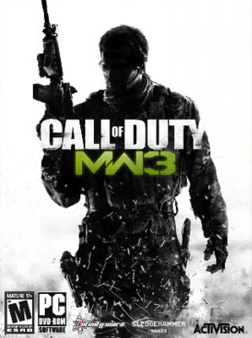
If you’ve been looking closely throughout this article, you might have seen a few games pop up in more than one category. One title in particular contains four of the elements I’ve discussed here, and for that, I am declaring it the Ultimate Cliche Box Art.
Cover tropes: This is your king.
VentureBeat's mission is to be a digital town square for technical decision-makers to gain knowledge about transformative enterprise technology and transact. Learn More
