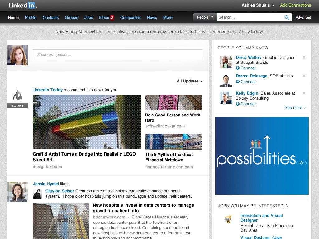
LinkedIn has unveiled a pretty new homepage today. The redesign strips away all the clutter, leaving you with news from your network and a chronological and algorithmically weighted stream of updates from your professional contacts.
In short, it’s looking a lot more like a professional version of Facebook or Twitter — or a Yammer that includes news and extends beyond your own company. It’ll start rolling out to all users within the next few weeks.
The redesigned homepage comes at the end of a string of mobile redesigns and new mobile launches — beautifully designed apps that were sexy enough to leave the LinkedIn homepage looking like the proverbial redheaded stepchild by comparison.
But the new homepage seems like a much better fit with the rest of LinkedIn’s increasingly good-looking product suite. Here’s a sneak peek:

LinkedIn product manager Caroline Gaffney wrote today on the company blog that the overhaul was intended to give users a simple, social, modern way to navigate through the news and happenings in their professional lives.
“We’ve revamped the entire Homepage experience with a new look and feel to make it easier to scan and find the information that matters most to you. This simpler and cleaner design makes it easier to navigate the page and quickly find the updates you’re looking for — whether that’s a news article your boss has recently shared or it’s to see who has just started a new job,” Gaffney said.
The new stream is intended to be lightweight, easy to scan, and easy to interact with in a way that doesn’t burn up too much of your own personal CPU. Quick sharing, liking, and commenting now seems more natural from the new homepage.
We’re hoping to see a new profile page in the near future, as well.
LinkedIn revamped its mobile apps last summer, and it rolled out an all-new iPad app just a couple of months ago. Both are clean and pared-down yet full-featured, and they pull the best influences from modern social media apps.
Also, both featured some pretty exciting technology under the hood, including a heavy reliance on Node.js.
“We’re always looking for new ways to make the homepage experience better, more efficient and a place where you can come everyday to get what you need to be productive and successful,” Gaffney said. “This is just the beginning of many more exciting, new features we plan to bring to the Homepage to offer more customization and functionality this year.”


