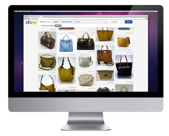
In an effort to step up its game against other online retailers, eBay debuted a brand new website design today to match its updated company logo.
eBay’s previous design is similar to something you’d recognize from late ’90s websites, with products/auctions arranged into boring vertical lists. The only eye-catching elements were thumbnails for each auction listing. By contrast, the new web interface concentrates much more on product images. The homepage adopts the familiar pinboard-style design used on Pinterest, while the product and profile pages are much less cluttered.
“We’re delivering a cleaner, contemporary look and feel; a more intuitive, convenient way to browse, decide, and buy,” said eBay president Devin Wenig in a statement, adding that the new interface will also allow users to curate and share products more easily.
The new site design should begin rolling out to eBay users over the next few weeks, but if you’re impatient, you can check it out early via eBay’s official announcement page. (Or, check a gallery of redesigned eBay screenshots embedded below.)
The company also officially announced it’s new eBay Now same-day shipping service, which it first launched in beta back in August. The eBay Now service is currently only available in San Francisco and will allow shoppers to gain same-day shipping on goods sold by local retailers. Purchase orders must be at least $25, and users can only shop via the official iOS app at the moment. The real perk is that orders should orders arrive within an hour.
Via AllThingsD
VentureBeat's mission is to be a digital town square for technical decision-makers to gain knowledge about transformative enterprise technology and transact. Learn More


