Want smarter insights in your inbox? Sign up for our weekly newsletters to get only what matters to enterprise AI, data, and security leaders. Subscribe Now
Slacker Radio rolled out a pretty drastic makeover today aimed at making its streaming music service seem fresh in the face of heavy competition from the likes of Pandora, Spotify, Rdio, and others.
Despite offering a combination of music, news programming, and OnDemand tracks, Slacker has always lagged behind those competitors (Spotify, Pandora, and XM Radio) in terms of both paying customers and listeners. (Spotify has over 5 million paying subscribers to Slacker’s 500,000.) Slacker Radio currently has a larger library of music than Pandora, news/sports/talk stations from ABC and ESPN, and over 200 curated smart radio stations.
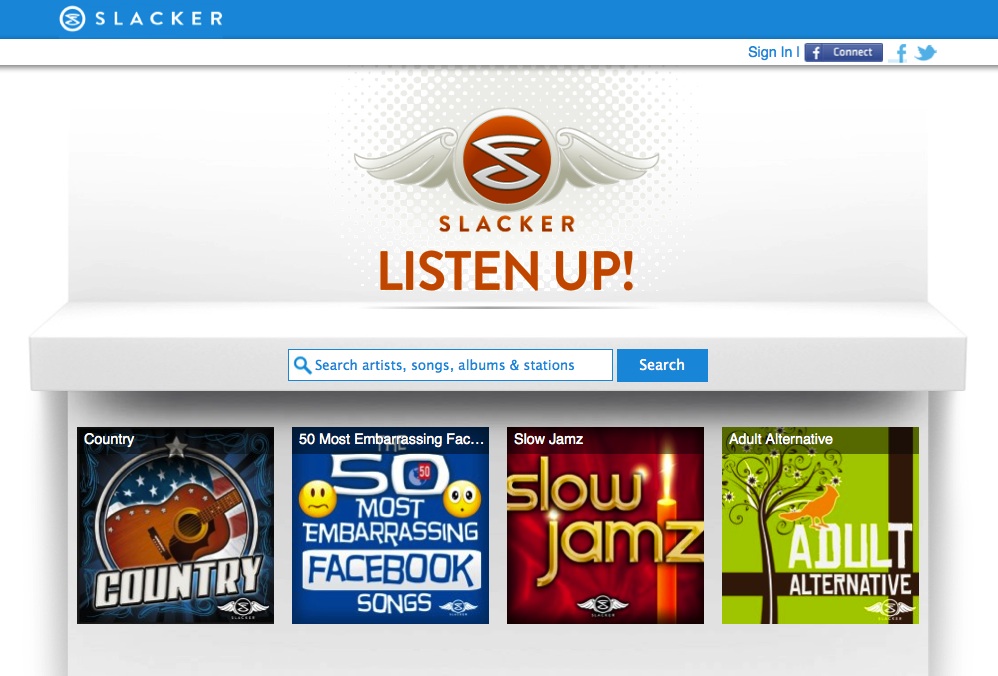
But being a more complete streaming music service may have contributed to Slacker’s obscurity. People like simple, straightforward services that perform a few tasks and then build on those tasks. Slacker’s new design zeros in on this logic, offering a much cleaner user interface that strips out a lot of the clutter found in the previous version.
Gone is the heavy black and gold interface, which has been replaced with mostly whites, grays, and lots of light blue. The U.I. also seems to keep a forward approach in terms of how it could translate to mobile devices, which is a big area of growth for streaming music services. However, Slacker’s new interface will also appear on native apps for Android, iOS, and Xbox Live.
Admittedly, I haven’t spent much time using Slacker’s service, but the revamped interface does make me want to give it a second chance. Check out some screenshots of the new site below.


