After a year of promises and hints, Yahoo is finally giving consumers a glimpse of its future: beautiful apps, modern design, and full participation in the future of mobile computers.
“It would be crazy not to be looking at Google Glass or Apple’s watch.”
–Lee Parry, Yahoo
Today, the company launched two new apps, a tablet experience for the ever-popular Yahoo Mail and an iOS stunner for Weather. Both applications show a night-and-day shift in how Yahoo works. Information is pared down to the essentials. Each page is perfectly suited to the screen size and use case at hand.
And, as we learned in a call with Yahoo mobile and emerging products director Marco Wirasinghe and senior director Lee Parry this morning, both apps are a great indicator of where Yahoo is headed: into a much cooler future where it makes gorgeous apps instead of cluttered homepages.
“You’re going to see us do a lot more things that are visual, rich, and have engagement that’s absolutely delightful,” said Wirasinghe.

‘You don’t need a weatherman …’
Visually rich is a great way to describe the new Yahoo Weather app for the iPhone. It uses Flickr community images to illustrate the weather in glorious, full-screen color rather than a boring table of temperatures with some tired pop-meteorology icons.
“It’s more than charts and numbers; it’s about places you’ve been, places where you have family. It’s connected to emotion, and visually, we can get to that connection faster than any other format,” said Wirasinghe.
“The idea [for using Flickr photos] came from internal meetings,” Wirasinghe said. “We were looking for something to do with Weather. It’s the most profound daily activity on a smartphone, but we didn’t have an experience that made it really shine. We asked what would be delightful and what do people really want.”
Also, getting the development team working on the app to work in a new way — a more collaborative way — was instrumental in making the app better.
“What you’re seeing now is the combined efforts of design and engineering and product all sitting within ten feet of each other and working in a very agile and dedicated way,” Wirasinghe said.

Leaning back into Mail
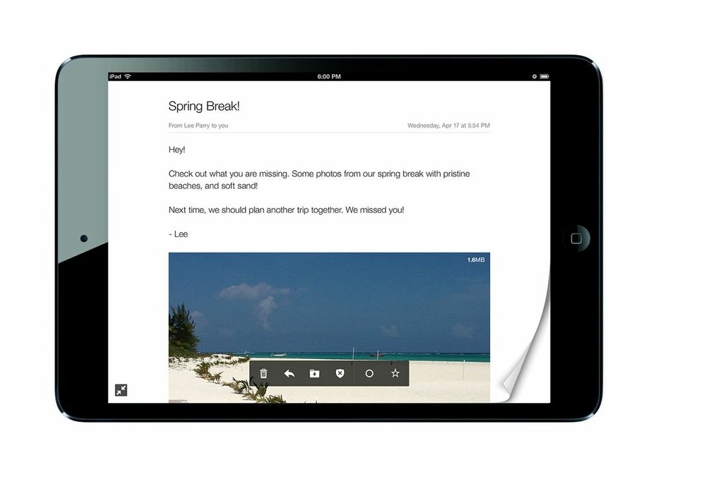
Today’s other launch was Yahoo Mail for iPad and Android tablets. One of the company’s most-used apps, Yahoo Mail has been getting facelifts for its other incarnations lately. But the tablet app took that redesign a step farther.
“We wanted to start by looking at how users use tablets,” Parry said. “Our competitors were shoehorning the same interfaces into a tablet screen. They weren’t making the most of the larger interfaces.”
Internally, the Mail team talked about their own tablet email use. They were checking in on their inboxes over the weekend; they were reading a ton of messages but not writing many. As it turned out, their users were doing pretty much the same thing, the data would show.
“We wanted to make that better for them,” Parry continued. “On the fullscreen stuff, we looked at how people read on tablets — browsers, news readers, photo apps. There’s a pattern of swiping through pages. And in fullscreen mode, we wanted to re-create that light, airy experience.”
It’s a lean-back way of reading email that works for a larger form-factor in a more casual, living-room-couch use case. But it’s also indicative of Yahoo’s future plans for its other apps.

The right design for the right device
“I’m really loving what we released today,” Parry said with more than a hint of smile in his voice. “Mail definitely aligns to our priorities, the user experience on performance and on design. If we can focus on those to each of the daily habits Yahoo has a strong presence in, we can really improve the lives of our users.”
Mobile design, Wirasinghe said, “is an evolving exercise for us. When it comes to design, we have to look at the medium, the device. We have the content, which varies from each daily habit, and we have to think about the user experience. behind all of it. … It really comes down to taking full advantage of the really great screens [on mobile devices].”
Parry and Wirasinghe also talked about Yahoo’s tentative, hypothetical plans for newer devices and prototypes, suggesting that a Flickr or Weather app for Google Glass or Apple’s iWatch might be in the works, as well. Read the rest of our interview on VentureBeat.
Image credit: yodelanecdotal/Flickr, acme/Flickr, and Yahoo
VentureBeat's mission is to be a digital town square for technical decision-makers to gain knowledge about transformative enterprise technology and transact. Learn More

