Want smarter insights in your inbox? Sign up for our weekly newsletters to get only what matters to enterprise AI, data, and security leaders. Subscribe Now
 I knew something good was happening when I saw the rectangles.
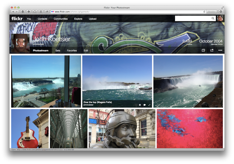
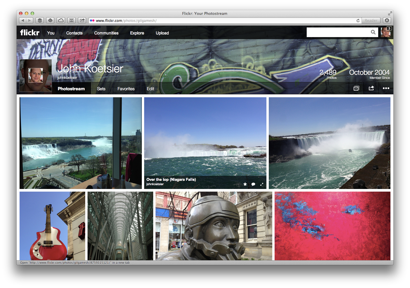
This week I did something that I hadn’t done for five months and 12 days: I went to Flickr on my laptop, accessed some photos on my hard drive, uploaded them, named them, tagged them, and organized them in a set.
The magic of the Internet happened before my eyes, and they joined the other rectangular images on the venerable photo-sharing site. And finally, for the first time in almost half a year, I had something beside square pics on my Flickr photostream.
Yahoo announced its massive revamp of the Flickr service with three missing Es, calling the updated site Biggr, Spectaculr, and Wherevr. But really, the update boils down to two massive changes: Dropping freemium and making an old and tired user interface awesome.
Since I was just wondering about reupping my Pro account, the first is really significant.
Yahoo’s giving each Flickr user a full terabyte of space for images for free, which essentially means you don’t need to be a Pro user anymore. You still can, for an ad-free account, or to add even more space … but I don’t mind a few ads, and I’m only using 0.8 percent of my freely available terabyte anyways.
But the best and most important is the incredible new look.
There’s varied response to the new look, to say the least, and the official forum thread on the new layout has a staggering 241 pages of user comments: 24,102 in total so far. The vast majority of them are negative, and most of those appear to be from long-time users who liked the site the way it was and are asking Flickr to change it back.
Good luck.
Flickr as it was was turning into a byway, a leftover, and an also-ran. Which is why most of the pics on my photostream and home page were square: They were exports, shares from Instagram photos. In other words, Flickr was changing from the place where you went to share photos from, to the place where you shared photos to. That may be a small change in the English language, but it’s a massive change in user engagement.
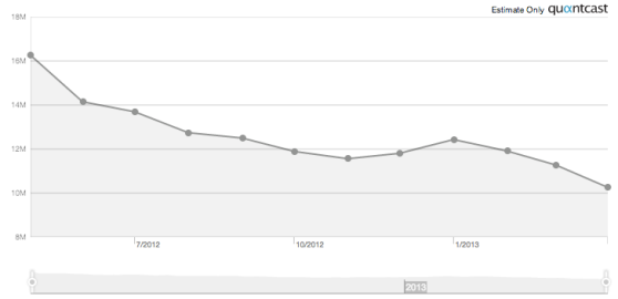
And it had huge effects on Flickr’s traffic, which dropped about 40 percent in the last year alone:
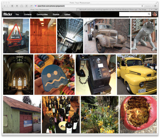
The new look is gorgeous and photo-centric, giving photos — the raison d’etre of Flickr — center stage.
Sure, it’s Pinterest-ic and Tumblr-y. But if you love images and imagery, the new Flickr displays photos immeasurably better that the previous iteration. In a funny modern way, your digital photostream now resembles an old-fashioned photography album, without any cheesy in-your-face design elements attempting to highlight the fact.
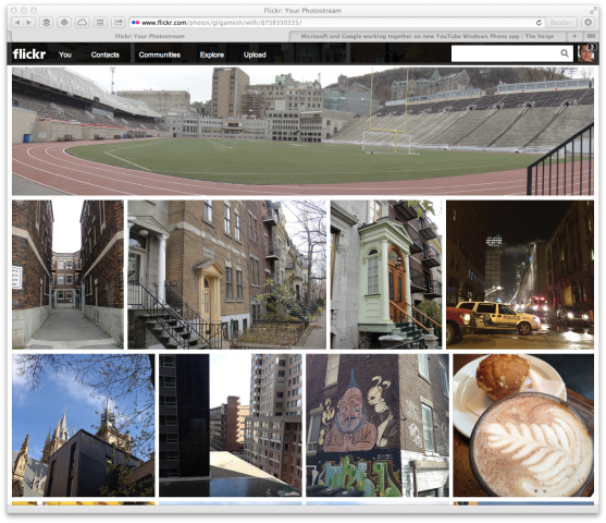
In addition, the new layout options gave Yahoo the option of displaying images with much more creativity while honoring the photographer’s shot selection — such as Flickr displaying panorama shots across the entire page:
I’m sold. Flickr, I’m back.
“I think Flickr is awesome again with these new announcements,” Yahoo CEO Marissa Mayer said. “Photos make the world go around. Flickr was awesome once. It languished. But now it’s awesome again.”
I agree. And so does one of the more famous photographers on Flickr, Thomas Hawk:
despite all of the naysayers about the new @flickr, my page has never had more engagement than it has there in the last 3 days.
— Thomas Hawk (@thomashawk) May 23, 2013
Image credits: John Koetsier
