Yahoo has unveiled a refresh of its web search look and feel today.
As is the wont of consumer applications in our media-saturated day and age, pictures take a prominent role in making the experience feel richer and even more tactile.
Here’s a quick before/after:

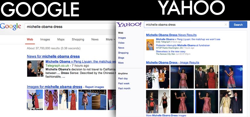
And here’s a Yahoo/Google comparison, for good measure:

The new UI is available in the U.S. only for now. It’s a slight change from other interfaces, but it’s just a bit prettier — and when dealing with millions of users, incremental change can be a good thing.
This interface includes a new top navigation bar and was designed to be more consistent with the new Yahoo homepage.
“Over the coming months, you’ll see more from Yahoo! as we work to deliver a search experience that combines utility with beauty and gets you to your results faster,” writes Yahoo search SVP Laurie Mann today on the company blog.
“Today’s news is just our first step.”
As per usual, there’s nothing new under the hood. Yahoo search is, as per a longstanding agreement, powered by Microsoft/Bing.
But the new focus on experience and interface is consistent with the company’s other recent moves. Lately, Yahoo has been focusing on mobile with an emphasis on great design, a promise that’s playing out in Yahoo’s reimagined Flickr UI and its apps for Yahoo Mail and Weather for iOS.


