Apple’s new mobile operating system ships to iPhone and iPad owners around the world today. I’ve been using it for the past three months, and while I think it’s the best version of iOS ever — and indeed, the best mobile operating system ever — there are still some things that new users are going to have to get used to.
And some, frankly, that they might just downright hate.
Here’s my top seven.
1. Swipe to unlock, jump into app
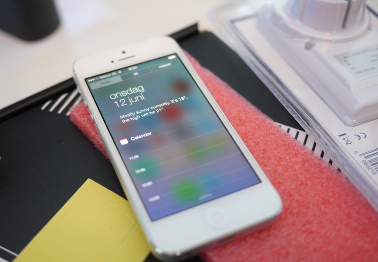
Apple’s fancy new lock screen displays more data from more apps than ever before, which is great. It also enables you to swipe anywhere on your phone to unlock, not just in a small restricted area at the bottom of your phone’s screen. Which is also great.
Put the two together, however, and you’ve got a situation in which you’re jumping right deep into apps when you just wanted to turn your phone on — because if you swipe to unlock on a notification, you’ll be taken right into the app that generated that notification.
Oops.
Eventually, you’ll learn to just start unlocking at the bottom of the screen again.
2. Swipe up in-game, open Control Center
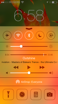
 Apple’s hand-dandy new Control Center enables you to turn your Wi-Fi on and off, access music controls, open your camera app, and turn Airplane mode on right from one convenient location. It’s even got a built-in flashlight feature.
That convenient location is conveniently accessed simply by swiping up from the very bottom on any screen on your phone. Which is also a gesture that many apps and games use.
So next time you’re in Temple Run, you might try to jump by swiping up, only to find yourself unexpectedly in Control Center. Your game will automatically pause, but there’s no guarantee that you’ll be able to time your move correctly when it un-pauses … and I have killed more than a few sad little Indiana Jones over this little conflict.
Oops.
Other apps such as the Olive Tree Bible Study app use a swipe from the bottom to reveal dual zones in the app for multiple layers of content. Same effect, except no virtual archeologists need die.
3. Overlapping data in layered views
iOS 7 is probably the biggest change to Apple’s iPhone operating system since 1.0 turned two. That means that developers of third-party apps haven’t necessarily got all the kinks worked out yet.
And even Apple apps, during the beta, sometimes had overlapping text.
iOS 7 permits system-wide font-size changes, so apps that rely on a certain font size inside dynamic buttons or a set amount of space can see odd reactions. Don’t bother getting used to it; it’ll disappear as apps get updated.
4. More pocket dialing due to onscreen controls
Because Apple’s new lock screen has more features (see No. 1), there’s also more that can go wrong.
I can’t tell you how many times I’ve pocket-dialed someone or found my phone in some app I didn’t select while my iPhone 5 was in my pocket (mostly because I didn’t count), but it was far more often than with iOS 6. In fact, I don’t ever remember pocket-dialing anyone in iOS 6, while I frequently find my iOS 7-upgraded phone doing something odd in my pocket.
Not a biggie, perhaps, but odd. And potentially annoying, depending on who you accidentally call.
5. Killing misbehaving apps
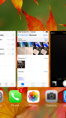
iOS users learned from long practice how to kill a crashed responsive app: double-click the home button, find the app icon, tap and hold until the X appears, and tap the X.
That doesn’t work anymore.
Now, you still have to double-click the home button, but you’re presented with a side-scolling view of currently operational apps. To kill one, you have to swipe it up from the list toward the top of your phone. That’s easy — once you know — but it’s entirely nonintuitive.
My point is not that the previous method was intuitive (it wasn’t, either) but that Apple replaced one method for another equally nonintuitive way. A lot of people will search for “how to kill crashed apps iOS 7” in next few weeks.
6. Finding search
Search used to be supereasy on any iPhone: Click home to get home, and click home to enter the search interface. Now, search is better and faster to get to, but it’s an entirely different interface.
Instead of going home and going to search, you can now swipe down on any screen in your iPhone to access search. Unless, of course, you’re in an app that includes that gesture in its vocabulary. On, and don’t swipe down from the very top of the screen, or you’ll enter the Notification Center.
So yeah, there will also be lots of searches for “how to search iPhone iOS 7” in the coming days.
7. Siri is still just Siri
OK, so she can now be he, and there’s a few more options for search Wikipedia or Twitter, and Apple added the capability to buy stuff earlier this year. But if I want to search for something, I’ll go to Google — sorry, Apple.
What I want Siri to be is that amazing personal assistant that she was supposed to be.
The assistant that you could tell to research flights to Cupertino, find the best price that gets me wheels down on Monday and home on Friday, pick a 4-star hotel not more than 15 miles from 1 Infinite Loop and not more than $200 a night, and rent a midsized sedan for the duration of my trip. That’s the Siri that we were initially promised before the technology became part of iOS at all, and that’s the gee-whiz-I-can’t-do-without-it Siri that would sell iPhones.
But alas, we wait.


