This is part of our ongoing series about games and trends of the upcoming next generation. For the Xbox One version of this article, go here.
The PlayStation 4 controller:
- Part 1: What could’ve been
- Part 2: What’s new with the analog sticks and D-pad
- Part 3: What’s new with the buttons and triggers
- Part 4: A close look at the touchpad, light bar, and everything else
The changes to the PlayStation controller that we outlined over the last three articles in this series [check the links above] are enough to make the PS4 version much superior to its PS3 counterpart. People would be nutso to argue that. And we’re not done discussing every little upgrade, either.
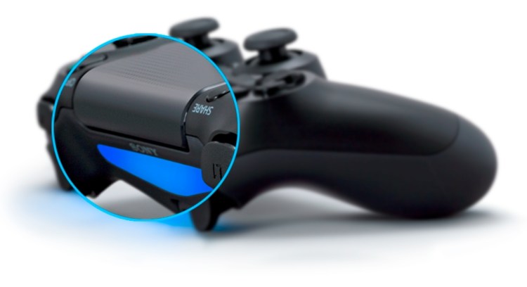
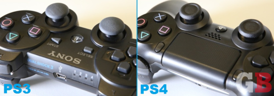
But when gamers start bringing home the PlayStation 4 on Nov. 15, the first thing they will notice about its DualShock 4 controller won’t be the new ridges on the analog stick tops. Or the deeper D-pad. Or even the trigger-shaped shoulder buttons. It will be the black slate sitting right in the middle where the word “Sony” used to be — the new touchpad.
Let’s take a closer look.
The touchpad
The DualShock touchpad is a small surface that you can press and swipe on, similar to the equivalent on a laptop.
You might not have realized this, however, but it is also one giant button. It only has one general click, but the system knows where you’re pushing. This enables developers to map different parts of the touchpad to be different “buttons” that you can press. For example — and this is something launch title and first-person shooter Killzone: Shadow Fall does to control its OWL drone — a game can have four commands here, one on each edge (top, bottom, left, right). So if you press down on the right side of the touchpad, you could activate a different behavior than if you press down on the left side (and so on).
When discussing accessibility and more mainstream gaming, the last thing a modern console controller needs is more buttons. Don’t gamers have enough to think about? “Initially, I was skeptical about the touchpad,” Shadow Fall director Steven ter Heide told GamesBeat in one of our exclusive interviews. (His studio, Guerrilla Games, contributed a lot of feedback to the DualShock 4’s design.) “You’d have to lift your thumbs off of the sticks to control it, so what kind of things could you do with it? Would it feel gimmicky? How responsive is it? How accurate is it? Is the area large enough?”
Sony tried many different variations of the touchpad — see part one of our series for some of the crazier ideas, including moveable panels — but ultimately settled on something that wouldn’t alter the basic blueprint of the PlayStation controller too greatly. Because it fits into the existing DualShock design, it’s not that big — much smaller than the Wii U’s GamePad, as a comparison — so it has limits to what it can do. But Sony’s developers see a bigger, long-term picture here. “I think it’s one of those features that’s very forward-looking,” said ter Heide. “We can come up with things that work right now, but maybe a year down the line, people will come up with more exciting uses and even better functions. They’ll integrate it even better into their games. It doesn’t feel like it’s something gratuitous or that shouldn’t be there.”


