Tired of hearing about the importance of data analytics? What if tapping into an all new layer of data was as easy as installing a browser extension?
Data startup Knoema has come up with a new Chrome browser extension, World Data Finder, that can help users see and start thinking about data right away by unearthing useful information about the site you’re visiting.
Knoema, which was chosen by VentureBeat to launch at the DEMO Spring 2012 event, isn’t laser-focused at the moment on selling enterprise-class software. But its browser extension could be the seed for a novel way of surfacing data at just the right time.
I arrived at that notion after installing the new World Data Finder extension in Chrome and taking it for a spin this morning.
As I opened up articles in the browser, the tool’s little icon with a magnifying glass and a bar graph popped up at the right end of the URL bar. When viewing a recent article I wrote about new venture funding for Primary Data, I clicked on the icon hoping for a stock quote for Fusion-io, the company where Primary Data co-founder David Flynn used to be the chief executive; or perhaps a timeline of news on Primary Data; or anything else that could get me thinking in a different way. Instead I got the data equivalent of a 404 error message — nothing found:
![]()
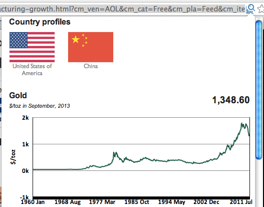
So I moved on. A Quartz article about the fancy facility Google is building in London was enough for the browser extension to point me to a data-rich “country profile” of the United Kingdom on Knoema’s website.

The “country profile” contains a wide range of data sets available on the UK. It happens to includes data on land use, employment and high-tech exports, which sort of relate to the Quartz article, but altogether the country profile data is a bit too general to be a good supplement to the Quartz article. If anything, this was a nice diversion that made me think more about the UK more than I have in a while.
The browser extension also recommended I check out a Knoema “region profile” of London. Its data sets on education, health and research and development expenditures were more interesting to look at in the light of the article, but perhaps some of those could have been pulled out and graphed based on the text of the article.
Also, it might have been better to surface the “region profile” on top and the “country profile” below it. Finally, the link to the “region profile” of the Congolese section of Pool that was presented to me had no connection to the article whatsoever — except for the article’s one-time reference to the swimming pool Google is building in London. Oh, well.
When I pulled up a New York Times article on changes to a federal food-stamp program, I was offered a line graph of the U.S. gross domestic product.
![]()
The line graph can also be embedded into the article itself, which is a nifty trick if you don’t want to click the icon every time it shows up.
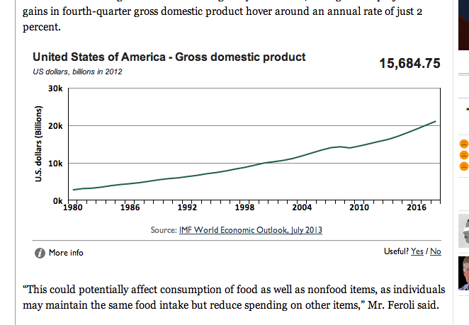
GDP is indeed mentioned in the article — and the chart was rightfully placed just under the reference — but more relevant metrics could have been charted instead, such as fiscal funding for food stamps, or maybe the amount of money a family of four receives each month, or even the number of people on food stamps in the country. Perhaps all those things could have been displayed.
After spending a little time with the tool as an ordinary reader of articles, I think it’s nifty but in need of some improvements. Now, if Knoema wants to move beyond just providing a gizmo for people to play around with for free and one day take on business customers, it would be wise to visualize lots more data that can be wrangled into the system, and also devise a method for businesses to make certain kinds of data available for its analysts to visualize on the fly.
For example, if a startup’s business development manager starts reading an article containing a reference to a company’s quarterly net income — like this one, which says Facebook posted $425 million in the third quarter of this year — not only should the tool chart Facebook’s profitability, it should also query the startup’s internal financial database and visualize data on the startup’s profitability.
And while we’re at the drawing board, it might be a good idea to add context with economic indicators such as unemployment and stock market indices such as the S&P 500.
While the tool clearly needs more refinement, the concept is smart: Get data in front of people’s eyeballs without much effort.
The technology is automatic, hard to miss once installed, and actually sort of fun. That’s why, with some work on Knoema’s part, the browser extension could become one of the tools that helps turn the world into a more data-driven place, where decisions are influenced by what the numbers say instead of what the most influential member of the team says.
Hat tip: Journalism.co.uk
Editor’s note: Our upcoming DataBeat conference, Dec. 4-Dec. 5 in Redwood City, will focus on the most compelling opportunities for businesses in the area of big data analytics and beyond. Register today!