This is part of our ongoing series about games and trends of the upcoming next generation. For the PlayStation 4 version of this article, go here.
The Xbox One controller:
- Part 1: Projectors, smells (!), and other stuff that didn’t make it in
- Part 2: What’s new with the analog sticks and D-pad
- Part 3: What’s new with the buttons and triggers
- Part 4: A close look at the new rumble, faster speed, smooth design, and everything else
When Microsoft calls its Xbox 360 controller “best in class” (which it does a lot — see part one of this series), we can probably point to three components that are almost universally loved by gamers: the triggers, the analog sticks, and the overall shape and size. What we doubt anyone would bring up, however, is the joypad’s much maligned directional pad. The eight-way digital “D-pad” always felt like an afterthought, especially to anyone trying to throw a fireball in Street Fighter.
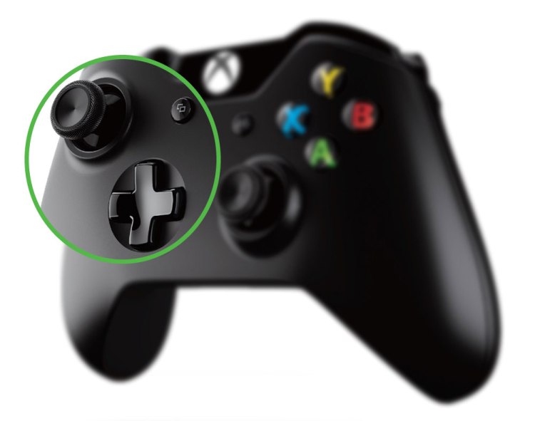
In part two of our exclusive inside look at the new Xbox One controller, we examine just how much work Microsoft put into improving not just the D-pad (it’s leagues better now) but also the analog sticks that you probably felt didn’t need any particular tweaking (not necessarily “leagues” better, but this writer definitely wouldn’t want to go back to the old style now).
The analog sticks
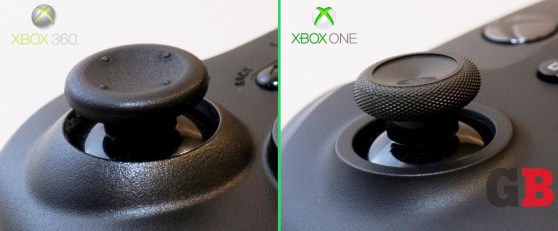
The first thing you’ll probably notice about the new sticks is their new grippy tops. The edges and bottom are covered in a knurled texture that has a rubberized sandpaper feel to it — all the better to keep thumbs from slipping, especially if you push from the sides. “The amount of effort,” Xbox’s general manager for accessories, Zulfi Alam, told GamesBeat, “that went into selecting the materials and the texture for the periphery of the thumbstick — this took months of work. It’s amazing how much effort goes into something so seemingly small like that.”
This semi-rough surface stops in a tight circle on top of the analog pads, forming a ridge before transitioning to a smoother middle. In essence, this creates a small, circular dip with a sharp ring surrounding it that helps to keep thumbs in place.
The overall diameter of the pad tops is smaller, though — by our eyeball estimate, about five-sixths the width of the 360 originals. You’d think Microsoft would have some sound, technical reasoning behind this shrinkage, but it’s strictly psychological. “The smaller discs give the perception of greater accuracy,” said senior industrial designer Quintin Morris. “But it doesn’t affect performance otherwise.”
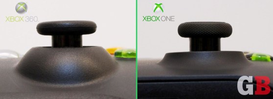
The sticks also appear taller, but that’s just an illusion. From tops to the pivot points, the analog sticks are exactly the same height as they were on the 360. They simply look like they’re standing on their tippy toes because the “volcano” that surrounds them is shorter and less pronounced.
The D-pad
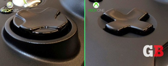
Microsoft actually designed the disc-based D-pad of the Xbox 360 controller for Street Fighter-style maneuvers. “The current disc we have on the 360 was meant to prioritize for sweeps and gestures, where the whole top moves with you,” said Morris. That’s ironic since fighting games are commonly the genre that gamers say the D-pad is weakest with. It just wasn’t good enough for competitive gamers who are constantly thumbing circular motions on the thing, and it didn’t feel quite precise enough for cardinal (up, down, left, right) directional presses, either. “The D-pad was an area where we knew we could improve,” admits Alam.
But where to start? Morris raises a good point that one solution doesn’t fit for all games. “The D-pad is a tricky input to design,” he said, “because people do different things with it. You think about Call of Duty — it’s really alt keys. It’s another set of buttons. It’s not about directional input. But you think of Street Fighter, it’s very much about sweeps and combinations and being able to do these gestures on top of this thing.”
The final product on the Xbox One controller has a classic “plus” shape with four distinct sides — gone is the thick, puck-like hunk of plastic. It seems to work fairly well for Killer Instinct’s old-school fighting-game moves, but Microsoft actually designed it more for the shooter crowd. “Because the D-pad has the raised four [sides], it would feel more like distinct keys,” said Morris. “For a Call of Duty player, that would be an advantage because you can find the button that is the weapon selection or whatever.”
This is further emphasized with small clicks when you push down on any side of the D-pad, coming from little dome switches sitting underneath (these are bent pieces of metal that snap when depressed — sort of like a vacuum-sealed jar lid). This helps each edge of the D-pad feel like its own button.
It may appear that, with this D-pad redesign and some of the other changes you’ll see in part three of our series, Microsoft is trying to cater to the Call of Duty demographic — not exactly a terrible strategy considering the popularity of that series and others like it. But Morris insists that’s not the case. “No, we try not to [design for specific genres],” he said. “If you play Forza and you really want a driving experience, you buy a wheel. If you want something better for Street Fighter, you go to an arcade stick. But the controller is the controller for every genre. We try to make sure that we’re developing a general tool that works great for all games.”
To be continued:
- Part 1: Projectors, smells (!), and other stuff that didn’t make it in
- Part 2: What’s new with the analog sticks and D-pad
- Part 3: What’s new with the buttons and triggers
- Part 4: A close look at the new rumble, faster speed, smooth design, and everything else
Photo credits (non-stock shots): Jeff Emtman. Special thanks to Tom Cheredar for the Photoshop help.
VentureBeat's mission is to be a digital town square for technical decision-makers to gain knowledge about transformative enterprise technology and transact. Learn More


