This is part of our ongoing series about games and trends of the upcoming next generation. For the PlayStation 4 version of this article, go here.
The Xbox One controller:
- Part 1: Projectors, smells (!), and other stuff that didn’t make it in
- Part 2: What’s new with the analog sticks and D-pad
- Part 3: What’s new with the buttons and triggers
- Part 4: A close look at the new rumble, faster speed, smooth design, and everything else
We gotta admit — if you were to ask us to figure out how to improve the Xbox 360 controller’s face and shoulder buttons, we’d have no clue. They all seem pretty good as-is. That’s why we’re not engineers and designers at Microsoft. Those folks actually did find a way to upgrade them for the Xbox One console that’s due out Friday.
The tweaks to the face buttons are pretty minuscule, though they were made to appease the more hardcore gamers out there. What may surprise you, however, is just how much money Microsoft spent on just making them look the way they do. The triggers, on the other hand, went through a major redesign and are much improved in various ways. Like we wrote yesterday in part two with the analog sticks — we wouldn’t want to go back.
Here’s what we learned in our exclusive inside look at the Xbox One controller.
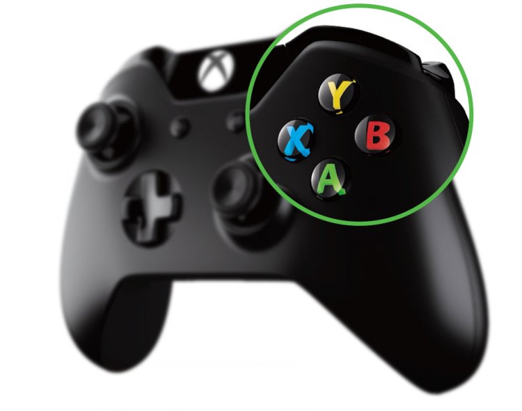
The face buttons
The spacing
Microsoft tightened up the spacing between the X, Y, A, and B buttons just a hair for the new joypad, mainly for the competitive scene. “We got feedback that some gamers would like the buttons to be closer together,” Xbox’s senior industrial designer Quintin Morris told GamesBeat, “to cut down on the time it takes for your thumbs to travel between them.” We don’t have “golden hands,” so we can’t really appreciate such a seemingly minor adjustment. But it does show that Microsoft is looking after the hardcore crowd.
Above: Microsoft literally spent millions of dollars to get the letters to pop just right on the buttons on the Xbox One controller.
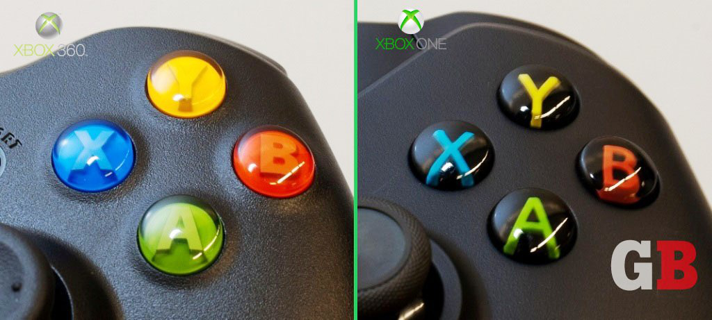
The design
For more casual gamers, Microsoft went through a lot of trouble to redesign the look of the face buttons to make them stand out a little better. “We find that a lot of people read color first and then letter second,” said Morris. “If your friend’s saying, hit A, what you see is green. You don’t necessarily see A on the first read. We wanted to make those keys equally readable from a letter and color point of view.”
On the 360 controller, the buttons and their respective letters are almost the same color. The green button has a slightly lighter green A sitting on top, the red button has a slightly lighter red B, and so on. Microsoft said the process to create this two-tone effect is called a “double shot” — and that just wasn’t enough for what the designers had in mind for the Xbox One controller. “We wanted to go with the idea that the letter is sort of hovering, almost in three dimensions,” said Zulfi Alam, general manager for accessories at Xbox. “To do that, you need a triple shot. This technology only existed in a very rudimentary form, so we invested millions of dollars trying to get this thing right. It’s a seemingly small thing, but we said, ‘Hey, let’s do this right.'”
The triple shot creates three separate colors in three different steps: a black base, a colored letter on top, and then a clear layer enclosing the whole button. “By going to this triple-shot technology,” said Morris, “we were able to make the letters stand out better while still representing the colors — and overall improving the appearance of the [controller]. Every little detail was considered.”
The letters are definitely more distinct and readable now but at the cost of a solid color enveloping an entire button — you definitely see less blue, yellow, green, and red now. This may be a big positive for color-blind users, but did Microsoft take it too far in the other direction? “Possibly, yes,” admitted Morris when we asked about this. “But with Xbox One, we have a new spec and way of indicating how these letters are represented onscreen that’s in line with the design of these. It should tie both of those things — the physical artifact and the digital experience — together better. A lot of that trouble happened more for the casual gamer, someone who wasn’t so in tune with the intricacies of A versus green. For those people it’ll become way more clear and a lot more intuitive.”
