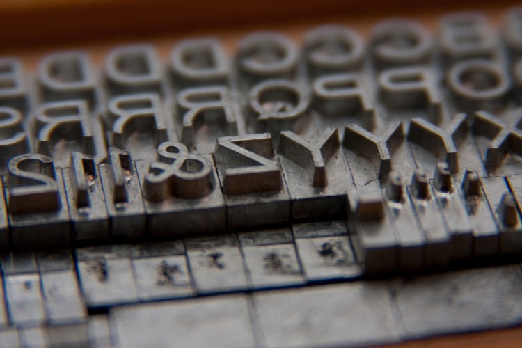
Once again, it’s time for our (and your) favorite end-of-year roundup: The typefaces!
And holy moly, what a whirl of typefaces this year has been. Thanks to the magic of CSS (specifically, @font-face kits and kit generators), there’s pretty much no such thing as a print-only font anymore, unless you’re talking about hot metal and heavy machinery.
This web-scale liberation has fueled an explosion of amazing typography (and some really, really bad uses of otherwise good typefaces) all around the Internet in its many forms. As the fonts rolled out month after month, we kept tabs on our favorites and how we liked to see designer use them.
For a walk down memory lane, check out the 2011 list of web/mobile fonts and the 2012 roundup for digital typography. Laugh, cry, rage, and then come back here to see what’s new this year.
You’ll also want to check out our exhaustive list of design trends from 2013/
Best hipster-native-meso-summer-festival face
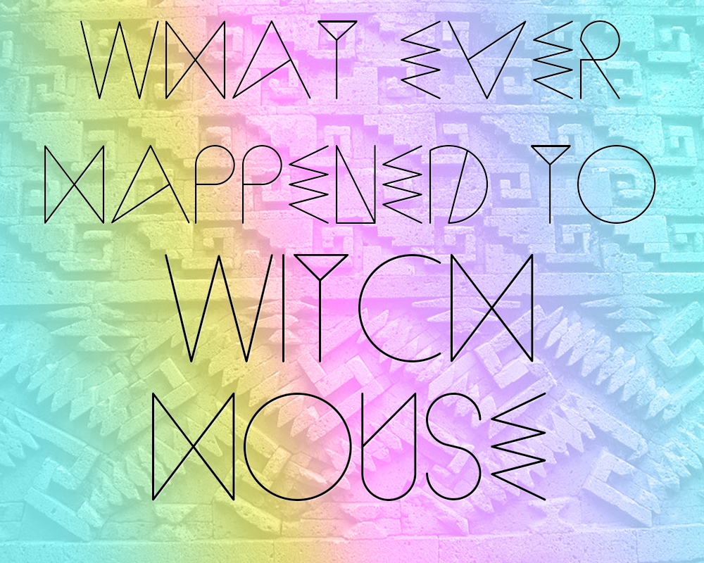
Hey, 24-year-old underemployed designer. We see you there in your cutoff jorts and across-the-forehead headband. In between Coachella and eating a burrito, you managed to piece together a few precious, oh-so of-the-moment typefaces that truly capture the spirit of American youth today: exploitative, rail-thin, and utterly confusing. We think your influences include cuneiform, crop circles, and early-1990s snack food packaging. (Not even kidding.)
We nod in the general direction of your horde of hipster display fonts, and we particularly single out Sequi (FREE), with special mention but no illustration of Pixacaism (FREE) and its more legible cousin, Bisurk (FREE). We wanted to hate them all, and we do; but you simply made too many of them to ignore. Lay off the drugs in 2014, will you?
Best skinny display
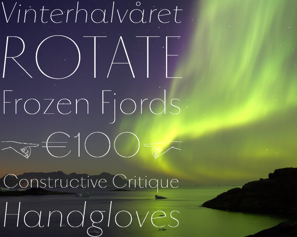
Technically, Vinter ($90-$120) came out in December 2012, but we’re letting it slide. Vinter is delicate and lovely and all that, but there’s a real, legit reason we went looking for a skinny display font. One of the bigger design trends of 2013 was the emergence of stick-thin icons and navigational elements. Sticking those onscreen next to a clunky slab serif or condensed version of another family just wasn’t gonna cut it.
Enter Vinter, which manages to be both lightweight and contrasty. We dig it!
Best running-text sans
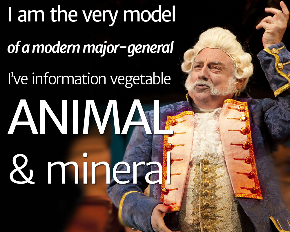
When you need to look good at small sizes, give Merriweather (FREE) a shot. This thoughtful sans serif gives just enough contrast in stroke weight to be super legible, and an all-caps application brings on the charm.
This full-fledged family features four weights in regular and italic variants.
Best semi-serif
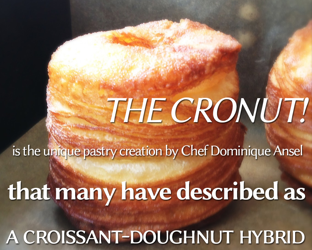
Mid-2013, mid-week, mid-afternoon. Interior. A group of five sorta professional-looking young adults are sitting around a table. Behind them, a website is projected on the wall.
Taylor: We can’t go over this again. We just can’t. Every blog I read specifically said not to use a serif —
Alex, interrupting: No, we can’t go over this again! Serifs themselves were created for legibility in running text. You so-called self-educated quote-designers-end-quote are killing me. For the last time —
The Last Sane Person on Earth enters the room.
TLSPOE: Folks, we’re using a semi-serif: Linux Biolinum. It’s not a serif. It’s not a sans. It looks great in running copy. And it’s FREE. Now everyone is happy.
Everyone: Hooray! Let’s get cronuts!
[Ed.: Any similarity to conversations that may have happened in the VentureBeat editorial offices is purely coincidental.]
Friendliest serif
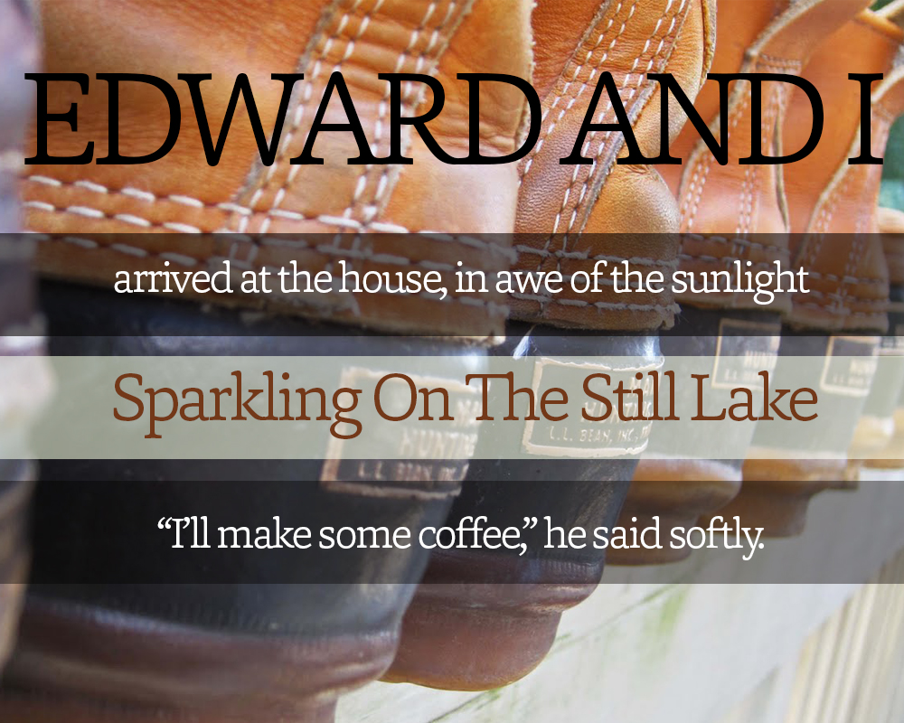
Here’s a great serif with a curvy personality. Capita (FREE-$50 for the full family) is a face you want to cuddle up with after a long day on the slopes or in the mines or whatever. It’s sturdy and strong, yet it manages to be fluid and warm. It embodies Jungian archetypes of mother and father. It’s legible enough for small sizes, but it packs enough interest to stand as a display or headline font.
Capita is a bona fide go-to.
Best slab
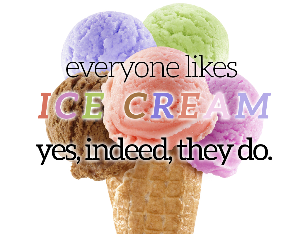
In 2013, we saw the decline of the hokey, Western-style slab display face. What we got in its stead is Aleo (FREE), a typeface that looses the heavy-handed cowboy schtick and retains the accessible slab personality.
Best of all, since its letterforms aren’t as slab-dominated, Aleo actually looks great as an italic or even as running text. Seriously! The flexible family has a total of six highly readable styles.
Best reader workhorse

You’ve got a blog, an e-book, a ‘zine, a Kindle Single — whatever it is, it needs the most readable font in the freaking world. You immediately reach for Agilis (FREE), a well-designed wizard of legibility. Its blunt serifs finish in subtly rounded edges, and when you zoom in to 500 percent or so, you start to see hella curves throughout the letterforms. At 100 percent, all you see is the literature — and that’s exactly why you love Agilis so much. That and the ligatures.
The Western-slayer
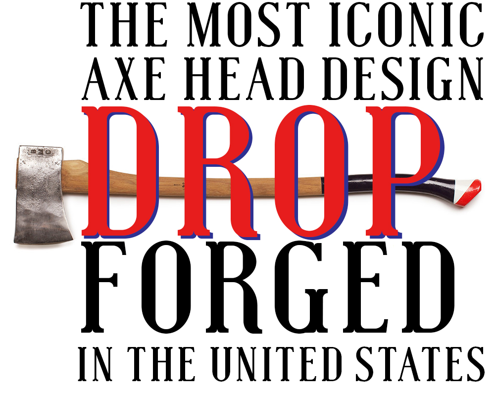
Hey, cowpokes. The whole Western-inspired typography trend is so over. Oh vee eee are. Before you get your rustic britches in a twist, wrap your grubby fist around Muchacho (FREE-$14 for the commercial license). This face is a subtle departure from the Westerns you know. Its quirky, rounded legs are downright knobby, but not distractingly so.
It’s great for logotypes, magaziney headlines — you name it. If you need big and bold, Muchacho’s your pick.
Best special effects
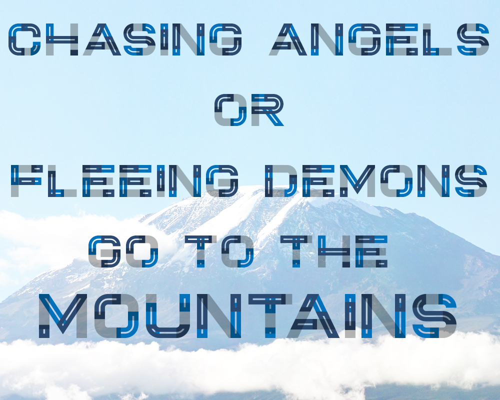
Summit (pay what you want) takes a little more effort. On its surface, this typeface is yet another wide-set, all-caps sans. Before you hit the snooze button, take note of outlines, inlines, and shadow variants available in the full family. Start playing around with them in combination, and you’re onto something. Stack ’em with mixed blending layers, and you’ve got a type treatment that’ll knock your own socks off.
In conclusion, use Summit; buy a few extra pairs of socks.
Most colorful face
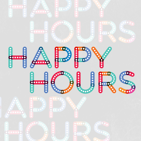
Another huge design trend in 2013 was the use of rainbow hues in interfaces and logos. We’re not talking about monochromatic palettes or muted coordinating/contrasting colors. No, we mean a full-on, out-and-proud kaliedescope of vivid, gorgeous tints and tones.
The typeface that brought color into focus best for 2013 is Multicolore (FREE). You’ll need Illustrator to get to work on this sucker, but once you’ve got it open, the options are endless. This is the face for your startup’s/app’s logotype.
Best geometric throwback
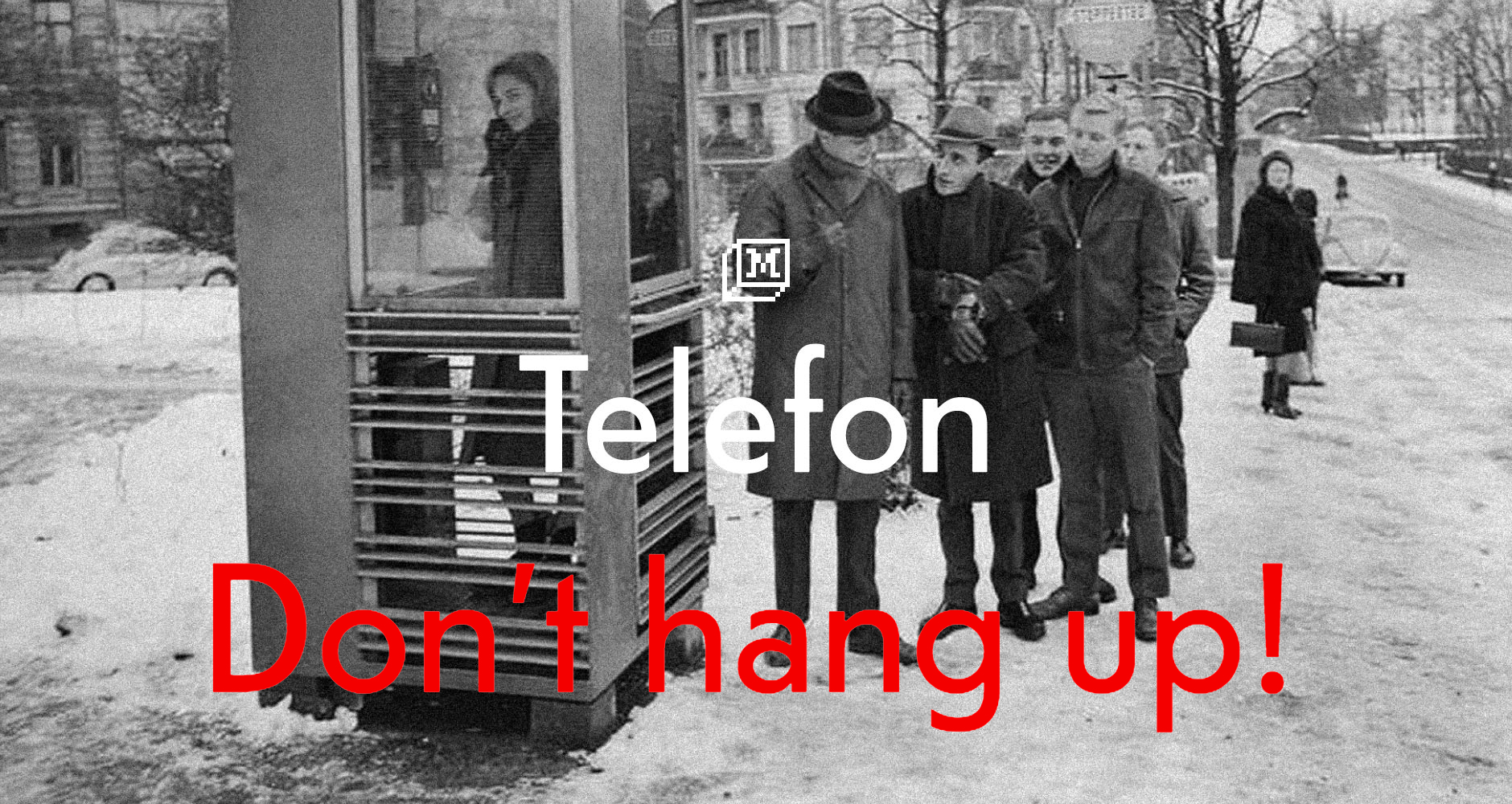
Telefon ($20-$3,000) was released in December, and it’s everything a 1930s-inspired geometric sans should be: charming, slightly quirky, very legible, bold, simple, structured, and more than vaguely nostalgic.
Why switch up Futura or Gill Sans for Telefon? Well, for one thing, it was designed with the web in mind. Its geometry is well suited to screens of all sizes. It’s subtly different from its forebears in terms of letterforms, and it’ll give your company’s pseudo-retro web presence a certain je ne sais quoi.
Best what-the-hell display face
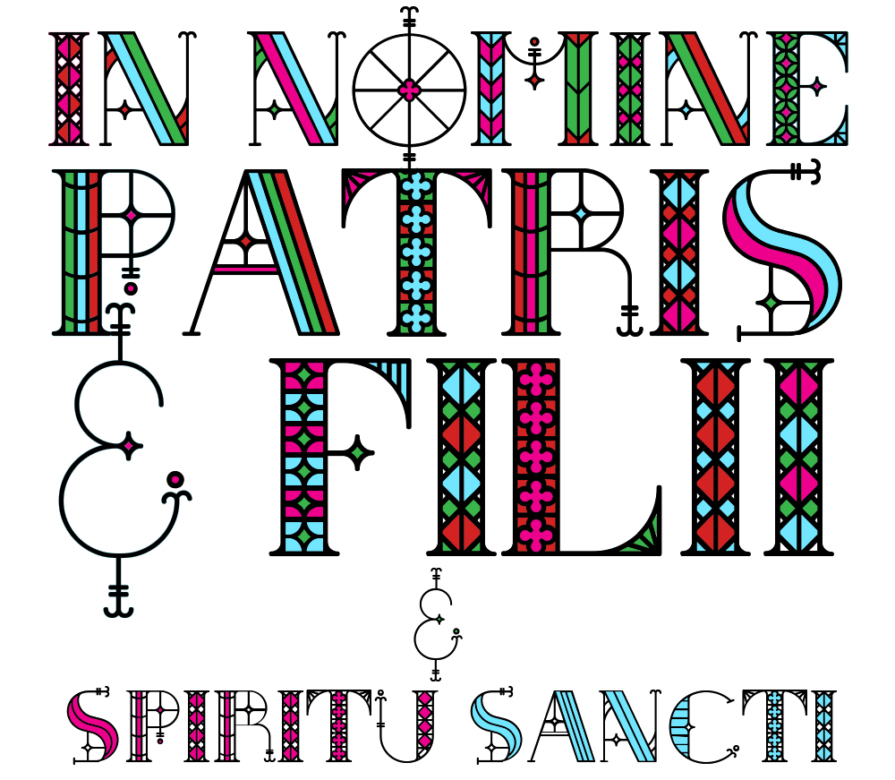
Arts-and-crafts style typefaces are truly hit and miss, with the more elaborate varieties invariably landing in the “miss” camp. So what makes South Rose (FREE) so different?
This award-winning face faithfully marries stained-glass inspirations with an elegant set of complementary capitals. They look like weathervanes or intricate antique quilting patterns. They skip being hip and are instead unapologetically ornate (with a slightly less ornate set of alternates). Best of all, you can choose your own palette — I went for an explosive, Kate Spade-inspired thing here, but an elegant monochrome scheme would be just as lovely.
This isn’t the face for your logotype, but it’ll make your 2014 monogrammed stationery the object of American Psycho-grade obsession. It’s not the face that plugs easily into the project at hand, but it’s fascinating enough that you’ll create a project just for the pleasure of exploring South Rose for yourself.
These best-of typefaces will continue to inform how and what we create through 2014. We’d love to know what font families tickled your creative fancy this year. Comments, yo!
VentureBeat's mission is to be a digital town square for technical decision-makers to gain knowledge about transformative enterprise technology and transact. Learn More
