This year renewed our hope in the future of web and mobile design. A handful of services, apps, individuals, and trends showed us a more beautiful, elegant digital world than we’ve ever seen before, and we’re actually looking forward to highlighting them.
Last year was completely mixed, full of good (grid layouts), bad (cartoony mascots), and downright indefensible (unnecessary navigational bullcrap).
This year, while we’re totally barfing over a small group of standout horror shows, we’re largely impressed. Designers took the best of last year’s trends — full-bleed images, truly excellent typography, magazine-worthy interfaces — and extrapolated them to new heights.
Oh, yeah — speaking of typography, don’t miss our annual post on the best typefaces of the year.
Behold! The very best design trends of 2013:
Flatness
Thank the gods skeuomorphism is finally, thoroughly dead. That wrinkled carcass was on life support last year. Someone, somewhere finally pulled the plug, paving the way for well-designed interfaces featuring shapes, colors, blend modes, and every kind of non-wood-grain effect imaginable.
Gone are the fake-shiny overlays of yesteryear! Gone are the hokey “stitched leather” frames, the linen-textured menus, the ruled freaking paper backgrounds, the letterpress-ish drop shadows.
Now, we got us some flat design. It’s everywhere. It’s nice that iOS 7 rode that train into town, but the train started out long before Jony Ive unveiled his own take on the trend.
Here are a few of our favorite flatness implementations:


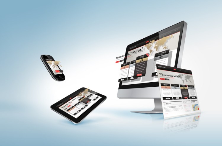
Responsive design
Responsive design was an inkling and a promise in 2012. In 2013, the trend continued to blossom with lots of help from organizations like Mozilla, Adobe, and quite a few others.
For those in the dark, responsive UIs automatically resize and reconfigure based on the end user’s preferred form factor. If a desktop browser window gets smaller, the site’s content changes. Columns automatically adjust and decrease; entire content categories are shuffled around; headlines move in front of images, etc. This all works especially well when you’re designing a site that needs to render beautifully on all kinds of smartphones, tablets, TVs, and other connected devices.
Here are our picks for responsive design examples:


Understated elegance
White space. Pure and perfect typography. Minimalism, but with just a few flourishes that take your breath away. A photographer’s aesthetic for image treatment.
Designers be classin’ the joint up.
Truly, apps like Exposure and (shocker?) Yahoo Weather made a huge impression on us this year with their pitch-perfect design work. These shining examples attained the height of elegance in appearance while maintaining hugely functional user experiences.
Now that, my friends, is the purest essence of good design.
Here are the apps that best showcase the understated-elegance trend:


Dashboards
Making numbers look sexy isn’t always a walk in the park, but it’s what the new school of dashboards is designed to do.
You start out with something like Google Analytics. You cry a lot. Then comes New Relic, the company that lets you build beautiful, functional, real-time dashboards based on any kind of data you’ve got. It’s like a living infographic without all the stupid stock art.
The newest generation of dashboard-generators, such as Geckoboard and Dash, take it a step further with WYSIWYG, flat-design hotness.
Here are some dashboards we love:


The return of color
Monochromatic schemes and desaturated tones gave way to an explosion of rainbows this year. iOS 7 took the whole thing to an obnoxious, neon extreme, but across the industry, we saw designers playing with palettes full of contrast and complement. Every menu item, every button, every icon seemed to be rendered in a new, playful hue.
Truly, it was like being able to see music on a device screen.
Here’s a look at a few color schemes we admired:


Delight in animation
Twirls, flips, bounces, pops — this year, touchable interfaces got a big dose of buttery-smooth animation that brought apps and sites to vivid life.
Some of our favorite examples include Facebook Chat Heads, iOS 7 backgrounds, everything about Windows Phone, iOS game Letterpress, and LinkedIn’s mobile apps. Interestingly, Facebook has started open-sourcing some of its tools for creating awesome mobile web animations.
Sadly, we can’t show you these animations; they’re something you have to experience for yourself.
Slick, skinny iconography
This year, icons and navigation tools got rail-thin and seriously minimalistic, which is exactly what navigation should be: functional, useful, and readily apparent, but out-of-the-way enough so that the user can focus on content.
Thanks in no small part to iOS 7, the new hotness in iconography isn’t just flat; it’s also moving away from chunky, rounded lines and origami-explosion icons.
Here’s what we mean:


Creative typography explosion
Great typography really blew up in 2012 because, you know, web fonts actually increased in number and diversity enough to be actually cool resources in the designer’s toolbox. And in 2013, we saw that trend coming into a more mature state.
Yeah, logotypes still shone. But running text, headlines, menu text — everything got a whole lot prettier this year in terms of creative font uses. Overall, designers shied away from serif fonts in running text, and some even insisted that such typography constitutes the work of our Dark Lord Satan. But, you know, whatever.
At this juncture, we strongly encourage you to read/look at our roundup of the very best typefaces from 2013.
Here are a few well-fonted (can we say that?) apps and sites from 2013:


Design for things besides computers
Call ’em connected devices, call ’em wearables, call ’em the Internet of things. Just make sure you’re calling ’em something and have a design plan for ’em.
From a class of glasses to a swarm of smart watches to a trove of televisions, the web of the future will demand new designs for new interfaces. And you, dear designer friends, will have to deal with “fragmentation” of the highest order. Your work will have to scale up to flatscreen TV breadth and down to wristwatch miniatures.
Can you dig it?


Cards
A closely related trend is the card — you know, those bite-sized rectangles of color and type that convey a snippet of information — a single update or a small collection of commands. Cards dominate the interfaces of Google products such as Glass and Now as well as mobile systems like Windows Phone. And you can bet your biscuits they’ll be mighty handy on the new crop of smart watches and fitness wearables.
Here’s a look at early card designs:


For 2014
So, kids, here’s what we’ve got: For the basics, keep thinking about strong colors, beautiful fonts, slender navigational controls, and drop-dead flatness.
Put the sizzle on your apps with nonobtrusive but playful animations and sounds.
Start thinking about teeny-tiny screens now so as to be prepared for the oncoming glut of glasses, watches, and wristbands. For TV, think with remotes in mind; for Xbox, think about how to integrate gestural and voice commands. Avoid text entry as much as possible for all on-computer devices.
Definitely use responsive design frameworks and tools to scale your apps for a growing panoply of form factors — complaining about fragmentation will get you nowhere. “When you spit into the wind, it lands on your face.”
And always, always find a way to bring the delight. The people are counting on you.
VentureBeat's mission is to be a digital town square for technical decision-makers to gain knowledge about transformative enterprise technology and transact. Learn More