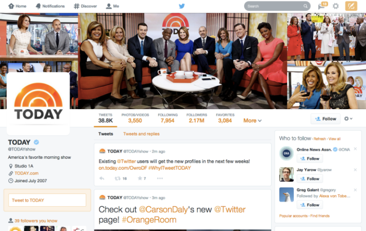
Whether you like it or not, Twitter’s new Web profile design is now available to all.
The new look is technically still rolling out, but Twitter permits users to skip the line by visiting this link. Twitter’s redesign first debuted earlier this month, and this features a photo-centric layout reminiscent of Facebook and Google+.
Twitter announced the new design on the Today Show and began rolling it out to popular users on April 8. Twitter also gave new users immediate access to its redesigned profiles.
The new profiles feature a three-column layout, cover photos, and overlapping profile photos — just like Facebook and Google+. Specific new features include a “best tweets” section to highlight popular tweets; a “pinned tweets” feature that pins tweets that show “what you’re all about”; and finally a “filtered tweets” option, which chooses how you’d like to view other Twitter user’s profiles.
Phew.
Not everyone will love the new profile design; it certainly alters the look and feel of Twitter.com. Yes, change is scary. Still, it represents a key shift for Twitter, as the social network looks to become increasingly media-centric.
VentureBeat's mission is to be a digital town square for technical decision-makers to gain knowledge about transformative enterprise technology and transact. Learn More

