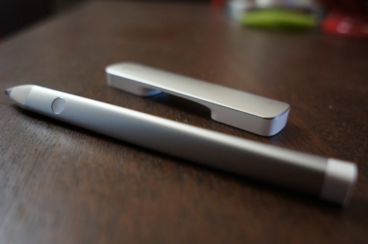
The future of software giant Adobe lies in extensive cloud integration, a new subscription pricing model, and … a stylus and digital ruler for the iPad.
Formerly known by their code names “Project Mighty” and “Napoleon,” Adobe’s new Ink and Slide iPad accessories ($200) are the company’s first-ever hardware products. And they’re yet another sign that Adobe is changing with the times.
Ink joins a crowded market of iPad stylii, though it’s clearly a step above the pack with its unique, twisted metal frame. Slide, which has no counterpart on the market yet, is a digital ruler that works together with the Ink stylus to turn your iPad into a true drafting device.
It’s hard to square the image of Adobe, an aging company best known for industry-standard creative software like Photoshop and Premiere, with fresh new hardware. But according to Michael Gough, Adobe’s vice president of experience design, the company is now opening itself up to new creative opportunities.
“We have for the last dozen years been innovating from the screen down, and there were limitations — now we’re innovating from the screen up,” Gough said in an interview with VentureBeat.
At the same time, Adobe has no intention of becoming a big hardware player. By releasing the Ink and Slide, Gough tells me, Adobe hopes to spur on competition in the stylus and creative accessory space. Because, of course, those devices will eventually push people towards Adobe’s apps and Creative Cloud service.
Ink & Slide: A winning combination for artists
The Adobe Ink feels like a high-quality artist’s tool, rather than just another stylus. Developed together with digital stylus maker Adonit (which is releasing its own new pen today), it sports a triangular, aluminum frame that’s twisted, making it easy to hold for hours on end.
Ink features Adonit’s new PixelPoint tip, which offers a fine, pen-like point for drawing and taking notes. The stylus also connects with your iPad over Bluetooth for pressure sensitivity (unlike Microsoft’s Surface devices, the iPad doesn’t have a screen that’s built specifically for detecting stylus pressure levels, which digital artists rely on heavily).
I’m not much of an artist, but I can compare the Ink to the plethora of stylii I’ve handled over the years. It feels leagues beyond Samsung’s tiny stylus offerings in its Galaxy Tab slates, but it’s bulkier than Microsoft’s excellent new stylus in the Surface Pro 3. The Adobe Ink resembles a professional crayon, while the Surface’s new stylus is more like a digital ballpoint pen (complete with a clip to secure it in your pocket).
That’s not necessarily a slight against Ink. It just shows the vastly different audiences Adobe and Microsoft are aiming at: Adobe wants artists, while Microsoft is targeting people who may want a simple way to jot down notes.
Pairing the Ink to an iPad Air took just a few seconds in Adobe’s free new Sketch and Line apps, which were also launched today as part of the company’s new Creative Suite. Sketch allows you to quickly whip up drawings and share them with Behance, the creative online community Adobe snapped up a few years ago. Line is a pseudo-drafting app meant to complement the Adobe Slide ruler.
The Ink felt comfortable in my hand, and its smooth tip flowed across the iPad’s screen effortlessly. Still, there was a noticeable delay between my inputs with the stylus and the results on the screen. It was clear I was using the iPad’s screen for something that it was never really designed to do. The slight delay is something you’ll likely get used to, but it felt jarring after using the Surface Pro 3 for so long, which has a screen that was designed specifically for stylus use.
As for the Slide, it’s focused specifically on one thing: helping you to make clean lines in Adobe’s new Sketch and Line apps. It’s also a surprisingly simple gadget — you only need to place it on the iPad’s screen to make it work, there’s no pairing process. It doesn’t even require batteries, it sends a capacitive signal from your fingers to the iPad’s screen.
It didn’t take long for me to start maneuvering the Slide like a traditional ruler. And once you find the appropriate angle for your next line for curve, you simply need to trace over it with the Ink stylus. My only annoyance with Adobe’s Slide is that it easily loses connectivity if you move it off the iPad’s screen. When that happens, you also have to pick up the Slide and place it back on the screen — you can’t just slide it back onto the display.
A New Adobe?
Even if the Ink and Slide aren’t huge hits, they show that Adobe is willing to jump into completely new creative territory quickly. Perhaps we’ll see other Adobe gadgets down the line, or perhaps we’ll see the Ink and Slide adapted for new uses. Gough imagines that, at some point, we’ll see tablet screens the size of drafting tables (like Microsoft’s original, failed Surface table), which could open the door for more complex versions of the Ink and Slide.
Gough tells me he wants these new gadgets to promote “drawing as literacy.” After using them for several days, I felt more confident in my drawing capabilities than ever before.
But that steep $200 price tag will likely scare off most consumers and relegate the Ink and Slide to an audience of professional artists who know they’ll be able to get their money’s worth.
VentureBeat's mission is to be a digital town square for technical decision-makers to gain knowledge about transformative enterprise technology and transact. Learn More


