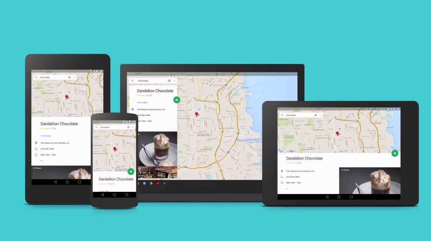
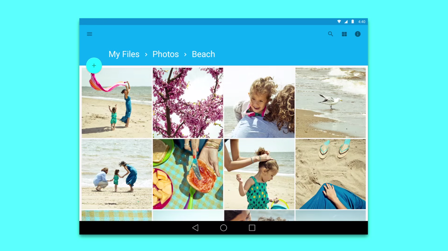
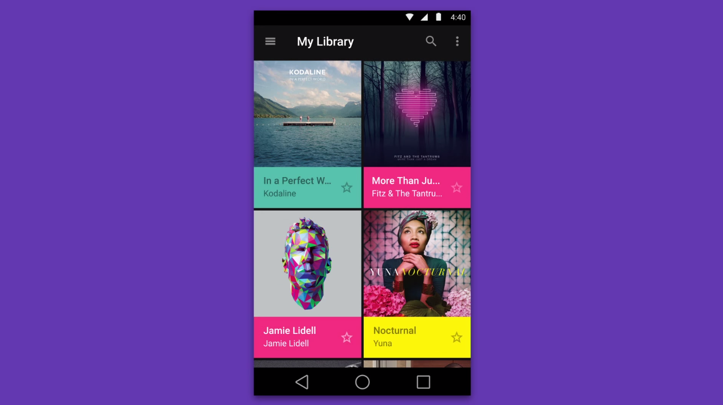
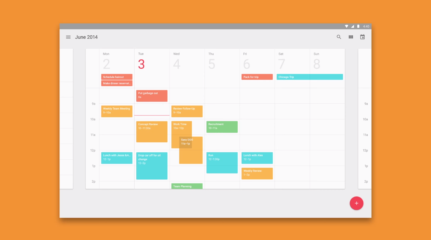
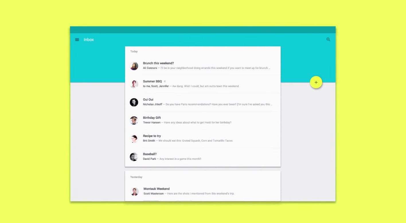
Two days ago, Google revealed its next generation “Material” design language — a departure from past guidelines and a clear reaction to design trends made popular by Apple and Microsoft.
To fully digest the impact Material will have on the future of digital design, VentureBeat asked several designers to share their first impressions. Shift your eyes below for insight from top creators at firms like IDEO, R/GA, Obvious Corp., and more.
This isn’t just an extension of flat design
Marc Edwards, director and lead designer at Bjango: I love the animation and use of depth. Giving designers exact layering hierarchy and shadow sizes is great. Material seems very cohesive and thoughtful. It’s a small thing, but I like how Google has evolved the Android status bar, and how they’re using it as a dragable window title bar on desktops.
We’ll be exploring the importance of mobile design, and how it impacts your mobile business, at MobileBeat 2014 in San Francisco on July 8-9.
Grab your tickets now!
Many will see Material as a further extension into a flat era of design, in the same way Windows 8 and iOS 7 use large areas of solid color and wide open spaces with a focus on typography. I think it’s more than that — the current design trends are the only sane way to support a wide range of display sizes, ratios, and pixel densities. Physics, animation, and some of the layering effects are only now possible because the hardware allows it to be.
While Material, iOS 7, and Windows may all seem superficially similar, I think their similarities exist for deeper, technical reasons. It’s a shame Android L won’t be adopted as fast as iOS updates are.
A post-rationalization of current design trends
Kristy Tillman, designer at IDEO: You can tell Google is trying to get ahead of all of the screen sizes they have going now and provide some real structure. It seems they really tried to set up a fail proof way to design around all of the screen sizes, from the desktop experience to Glass to the watch. The effort is extremely expressive and is obviously about controlling the experience. Experience as brand. This is something Apple has always been better at. Google has put in a real effort to achieve something similar on a much more open platform, which is an ambitious but very necessary goal.
Visually it looks good. This is the first time I’ve seriously considered ditching iOS. Everything seems really considered. With that said, reading the guidelines, it seems that it’s a post rationalization of a lot of current design trends (i.e.: the tiles). Which isn’t a bad thing. I initially thought about Windows’ Metro design upon seeing the new UI, but it looks like they have added their own spin on it.
All in all, I see this a great effort forward in laying the groundwork for a very Google-driven future ecosystem.
Google has really stepped up its design game
Sacha Greif, creator of Folyo, Telescope, and Sidebar: For the past year or so, Google has really stepped up its design game, and it shows. Where Apple often takes their aesthetic decisions to questionable extremes (as we’ve seen with skeuomorphism first, and flat design more recently), Google generally adopts a subtler, more nuanced approach.
So instead of trying to impose a strict visual aesthetic, Google defined a set of principles that leave more freedom to individual designers, while still pushing their numerous apps in the same consistent direction.
And while flat design was all about taking things away (gradients, shadows, highlights, etc.), this new design philosophy seems based on adding movement, animations, and colors.
Maybe this is Google’s way of filling the void left by the demise of richly textured skeuomorphic designs? In any case, we can only hope it will add a little warmth and humanity to digital design and save us from a world where every app looks and behaves the same.
This is about developers
Irene Au, operating partner at Khosla Ventures, former design head at Google: I was really pleased to see the attention paid to design at the Google I/O conference this week. All the efforts featured on the Google Design website are about scaling great design and bringing it to everyone.
They’re teaching developers better design processes and practices and equipping them with design guidelines, principles, and visual language to make it easier for developers to do the right thing. I’m so proud of the team!
The magic shines through in animations and transitions
Renato Valdés, cofounder of Human: I think Material design is another great step for Google, proving design is becoming more and more important in their culture. While overall I think it can still use some refinement, the magic shines through in animations and transitions.
Their guidelines are some of the best around, I must say. And I’m hoping we can quickly adopt Material Design in our Sketch/Framer.js workflow.
Not a massive departure from Google’s current design language
Grace LaRosa, senior experience designer at R/GA: My initial reaction is positive, without a doubt. Despite looking great, however, Material doesn’t strike me as something that seems like such a massive departure from Google’s current design language. It’s clean, focused, minimal; all things we’ve come to expect as makers and users today.
What’s newest and most of note, in my opinion, is how well documented and systematic the language is. After a long era of designers and developers creating Android experiences that often feel renegade or pieced together, Google have undoubtedly stepped up their efforts to standardize and improve the UI and UX across their app ecosystem. If it’s adopted, it’ll certainly lend a much-needed consistency to that world.
The emphasis on motion and nailing microinteractions is an intensely refreshing component. The flexibility across devices is also key. And, despite all the z-axis pizzaz, it’s not flat. Material feels in line with the current trends in interfaces and experiences we see today in iOS and Windows. Some elements, like containers, feel almost like a direct copy of Windows UI, to be completely honest.
Overall? I like it, I’m glad it’s here, but I don’t find myself bowled over by any of the components of the new system. It’s a well-considered stride in a necessary direction.
Material addresses design problems that designers deal with everyday
Tina Chen, designer at Obvious Corp., former senior UX designer at Google: My first impression is that Google has created a modern system that addresses many design problems that designers deal with every day. In particular, animation and touch gestures are an area app design is increasingly focused on, but there’s no consensus yet on which patterns feel the most natural. Animation as radial action and ripples is a promising concept that I haven’t seen used as a system before. The new version of Roboto is lovely, and more versatile, too.
It’s wonderful seeing Google increasingly focused on design, and more importantly, providing tools that help developers bring their apps to a new level of usability and delight. I hope Google continues to invest significant resources in this direction.
A lot of developers pick iOS to build for first, especially if they obsess about design and nuance, and it’ll be exciting if Google makes it just as easy to provide an optimal experience.
For more on Material design, check out our coverage of the announcement at Google I/O 2014.
