Apple revealed some amazing upcoming productivity features at its Worldwide Developers Conference earlier this month — features that move users seamlessly between OS X and iOS. Despite all of the highlights, the Apple team didn’t announce any changes to one of the most important iOS apps: Calendar.
Not to worry! While we’ll no doubt see some updates in iOS’s default calendar application, there are a slew of reliable third-party calendar apps available on the App Store with social network and Reminder integration that make organizing your day even easier.
1. Tempo
The Menlo Park-based Tempo team is “on a mission to save you time and hassles.” Tempo focuses on using artificial intelligence to access your social networks so you can find contact information quickly, regardless of whether the information is sitting in your iOS contact list, on Facebook, LinkedIn, or anywhere else.
We’ll be exploring the future of smart, predictive apps like Tempo and Mynd at MobileBeat in San Francisco on July 8-9.
Grab your tickets now!
Tempo’s interface is pretty slick. Of the five calendar apps we tested for this review, Tempo was the only one to easily and intuitively display time in day, week, and month views, in addition to special “agenda” and list views. The week view, however, only works in portrait and is a little too squished to be effective.
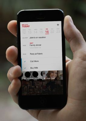
 And while all those ways of looking at scheduling info are helpful, Tempo’s also added in a bit of visual flare by inserting scenic images on the top of the Agenda view, which makes the app feel a little more like fun than work.
Additionally, Tempo provides users with a couple of standout features: Action Alerts and Morning Alerts. Action Alerts let you dial into conference calls seamlessly (without the need to peck in obscure code numbers), check up on your flights, and get directions.
Morning Alerts are push notifications that give you a heads-up on your schedule at about 9am every day. They remind you about birthdays, how many meetings are scheduled, and which one’s first. This functionality is a little redundant for anyone who currently uses the “Today” screen on iOS, but for those who don’t, it serves an interesting purpose.
Like many calendar apps, Tempo lets you tap on the address of a meeting to pop up a maps client. You can choose between Google’s iOS Maps app and the default Apple Maps app by way of toggle. And while Tempo connects to Facebook, LinkedIn, and Twitter, it’s not immediately clear what the benefits of these linkages are to the user.
Ultimately, Tempo gives iOS users a great way to view and track their day, but if the Tempo team really wanted to save you from hassle, they’d focus less on the social media connections and the imagery and instead include drive-time alerts based on either your current location or the address of your most recent meeting, along with traffic and weather advisories to keep you truly prepared for whatever hassles the day throws at you.
2. Cal
On the heels of its award winning productivity app, the San Francisco-based Any.Do team launched Cal. No, it has nothing to do with the local UC school; it’s a calendar app draped in flare. As is the case with all of the apps we looked at, it syncs to your iOS Calendar app, which means anything you do in Any.Do’s Cal will appear on your OS X, iOS or Google Calendar app and vice versa.
The interface is simple visually, though incredibly gesture heavy. After making it through the app’s introduction cards and setting it up, we advise you take a finger and get to swiping. Without clearly defined arrows and back buttons for context, playing with Cal is the only way to get your head around its navigation. We’re not going to give Cal a bad grade here, though, because the trade-offs are positive. Within a few swipes your muscle memory quickly understands how to switch from one view to the next so you can get on with your day.
Cal eschews a Week view layout. In landscape orientation, Cal shows you what’s going on today in addition to what’s coming up for the next few days. Users can swipe left or right to see more days, but by not committing to displaying seven days’ worth of activities on one small, smartphone screen, the app dedicates more real estate to the activities, without having to drill directly into a day, which is preferable to Tempo’s week view interface. It’s interesting to note that iOS 7’s calendar treats week view the exact same way.
Nevertheless, Cal does have some standout features. Like Tempo it makes use of photos to jazz-up the look of the app, but it goes a step further by allowing interested users to choose their own automated photo theme. It also connects with Any.Do, the aforementioned flagship productivity app of Cal’s development team.
Unfortunately, it lacks the ability to connect directly with Apple’s Reminders, Evernote, or any other task management app. Cal also gives users the ability to create a “Cal Moment,” which generates something akin to an Agenda view of the day. Again, this functionality seems redundant in the face of the iOS Today screen, which is accessible throughout the entire OS.
Still, Cal’s beauty and simplicity are impressive. For users of Any.Do its integration is seamless, which is a boon, but other than the ability to send a user to Waze or Google Maps for directions, there’s not much here that can’t be found on the iOS Calendar app, and that leaves us somewhat less enthusiastic about it than the contenders. The name is also a little problematic. Looking up “Cal” on Google, Bing, or the App Store doesn’t get you very far. We had to type in “Cal Anydo” in order to get any useful results.
3. Mynd
The Alminder team out of Palo Alto is responsible for Mynd, an app that it claims “doesn’t just record the things you need to do but actually helps you do them.” The team works hard to deliver on that promise with no fewer than four standout features.
First, we have the event screen. Like Cal, Mynd allows users to get directions from Google Maps and Waze in addition to Apple’s Maps. Mynd takes it a step further however, by giving users that information while they’re still in the app. Mynd’s event screen (also called Mynd Information), works like a mini-dashboard for each event in your calendar. It estimates the distance and drive time between events (or your current location) while showing you the relevant LinkedIn information of the event attendees. If you’re an Evernote user, Mynd’s event screen will show links to relevant Evernote documents based on a scan of your Evernote account.
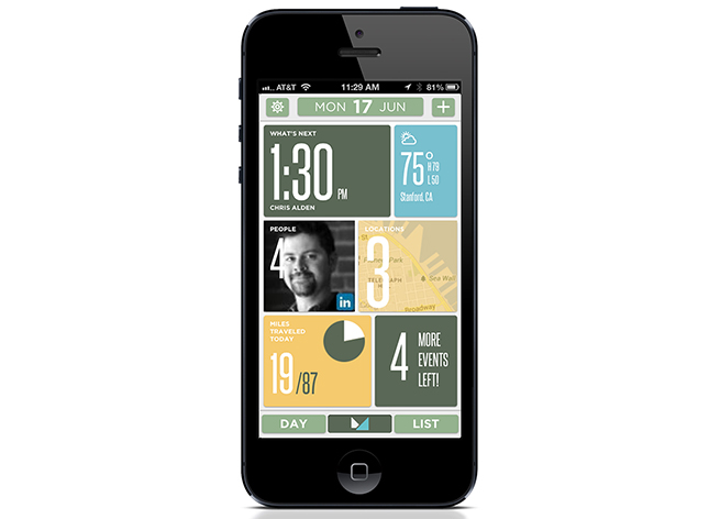
The second of Mynd’s standout features is its version of an agenda, which it calls the Home Screen. The Home Screen lays out relevant information about the day including:
- a note on what’s first on your agenda for that day
- cards representing the relevant people involved (via LinkedIn)
- the relevant locations involved
- a tally of your Apple Reminders (what’s due today or in the future)
- and a quick link to the day view of the app
It’s a lot of information for a little smartphone screen but, interestingly enough, the presentation doesn’t leave you feeling overwhelmed.
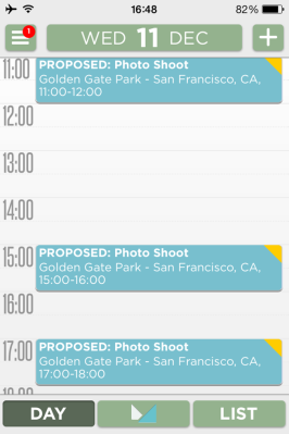
Mynd’s third standout feature is the scheduler. While corporate offices often have the ability to determine free and busy time internally via Exchange or other similar services, knowing when a client, vendor, or anyone outside of the corporate domain is free has always been a hassle.
The scheduler attempts to free you from a lot of email back and forth when scheduling a meeting. You send a message describing when you’re available to all of the people you want to invite to a meeting. The invitees receive an email with times they can click on. You get a notification in the app that shows all of the times everyone is free, and bingo — the meeting is scheduled with minimal hassle.
The fourth standout piece of Mynd is a future feature system that takes user feedback to the next level. Mynd’s engineering team uses the feedback section to solicit feature requests based on user votes. Each user is allotted 10 votes, and you have a choice of applying one, two, or three of those votes to existing feature requests or a request that you create on your own. This feedback feature in turn focuses Mynd’s engineering team by encouraging them to respond to the most voted upon feature requests. The system allows Mynd’s team to quantify the users’ pain points, isolate them, and then solve them. Frankly this is a feature we’d love to see on every mobile app.
Mynd isn’t as beautiful to look at as some of the others we’ve talked about, but we think it more than makes up for that in functionality. If you’re traveling around town from meeting to meeting or want to quickly look up information about whom you’ll be with on a call, Mynd makes for a trusty companion. Likewise, if you’re tired of sifting through myriad email messages to schedule an event, Mynd has made serious progress in easing that pain point.
There’s one more drawback to this super calendar. Between the LinkedIn look-ups and the location-based travel time estimates, users are looking at an app responsible for about 10 percent of your battery consumption over the course of a day. It’s not a deal-breaker, but it’s certainly something to think about if you’re the type that worries about battery drain regularly.
4. UpTo
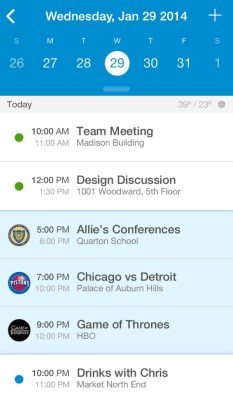 UpTo takes a different approach to the calendar altogether. With a focus on social, UpTo lets you “follow” publicly shared calendars (not unlike Google Calendar’s shared calendars). What’s really interesting is how UpTo’s interface de-integrates these shared events from the user’s regular personal and business calendars. The net effect is an app that’s both full of content and free of clutter.
How do they pull this off? UpTo’s interface looks a lot like any other calendar app’s day view. The difference is that every once in a while you’ll see a blue line between events. A zoom-out gesture will reveal a “rear layer” that displays the events of your followed calendars at that time. If you want to move one of those background events over to your main calendar (which will, among other things, send you a notification when the time is near), all it takes is a swipe or two.
Additionally, UpTo lets you create your own shared calendars so that you can publish events for other UpTo users to follow. It’s worth noting that the novel approach UpTo takes to following and publishing events fundamentally changes the way users will interact with these apps. Normally, calendar apps are accessed for three purposes:
- Sending an invite
- Accepting an invite
- Following up on a notification about an upcoming event
UpTo forces users to interact with the calendar on a more intimate level. Users are incentivized to launch the app proactively and then scour it for content, driving people to tune into relevant media events or go out and take advantage of local happenings around town. There’s a lot of value in a model where users pull the information they want out of the app rather than having it push it to them.
Over time, UpTo’s understanding of which events users are responding to may give it the sort of insight that helps the company offer relevant profile data to advertisers and event planners — without blasting users with ads. There could be something there.
Despite UpTo’s subtle but effective built-in weather, it doesn’t do some things we’ve come to expect from these extra-strength calendar apps. You can’t choose your navigation provider, nor are you notified when to leave for any events. It also lacks a week view, which is even more important when you’re trying to organize your life around your myriad shared calendar events. Still, if you’re looking for a (literally) real-time way to figure out what to do online, watch on TV, or do in your area, the app certainly lives UpTo its name.
5. Sunrise
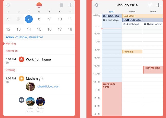
At first, Sunrise from Sunrise Atelier looks basic. The app takes a traditional view of your time with an interface that includes day, month, and a useful week screen. Sunrise also packs in time zone support along with location-based weather and Google Maps support for directions.
But where Sunrise really gets interesting is in the way it’s more of a calendar platform than a calendar app. It’s available on iOS (with dedicated interfaces for iPhone and iPad), Android, and desktop via a pretty powerful web app, which means users can commit to one interface no matter which device they’re on.
In fact, when you launch Sunrise for the first time, you’ll create a user login for Sunrise, rather than have it simply access your iOS calendar and sync with it. That’s because Sunrise provides standalone support for Exchange, iCloud, and of course, Google’s calendaring solution.
Sunrise also stands out as a calendar platform because of its astounding number of third-party integrations. The app lets you pull in data from LinkedIn and Evernote for meeting context, and it automatically creates calendar events from TripIt data to keep you organized as you travel. It does the same thing for Songkick, creating events for when your favorite artists are playing in your town. Finally, Sunrise integrates with Github and Asana to create events that make sure your tasks and milestones remain top of mind.
If that’s not enough for you, the development team has announced that it’s looking for even more partners. Sunrise is focused on becoming the dashboard for its users’ lives — a digital place for them to organize both work and play regardless of which device they’re using.
Between UpTo’s focus on social content, Mynd’s ability to optimize your meeting punctuality, and Sunrise’s passion for being the “One Calendar to Rule Them All,” there are plenty of ways to organize your day when you’re on the go. Apple’s done a great job of creating the kinds of APIs that allow these apps to work well on their own.
During our testing we were never prompted to open up the iOS Calendar app to accept invitations, create events, or receive relevant notifications about when and where we needed to be. We’re left with the feeling that, if you want, your chosen calendar app can be your only scheduling app — which is great for developers and end users alike.

