Check out our Reviews Vault for past game reviews.
You will never look at a pie chart the same way.
The world of Digital Dreams’ PlayStation Vita-exclusive puzzle-platformer Metrico is one of infographics and data visualizations, where bar graphs form plateaus to jump on and asterisks are deadly enemies. Every platform and obstacle moves based on your every action. Few things remain consistent in this data-driven world. You have barely any information to work with beyond the puzzles in front of you. Is there enough in this minimalist adventure to make you want to stretch those middle school chart-reading muscles?
What you’ll like
Minimalist art done right
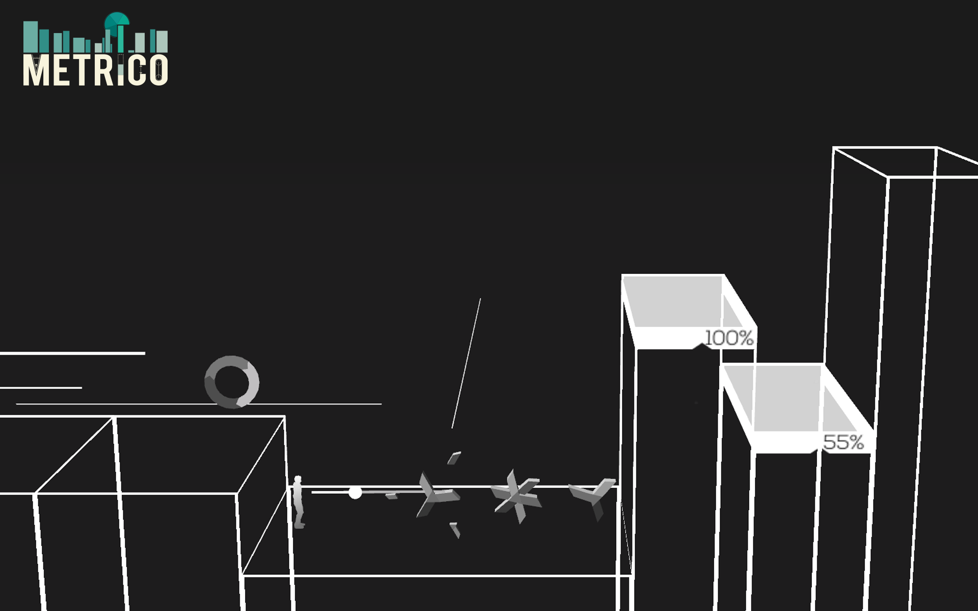
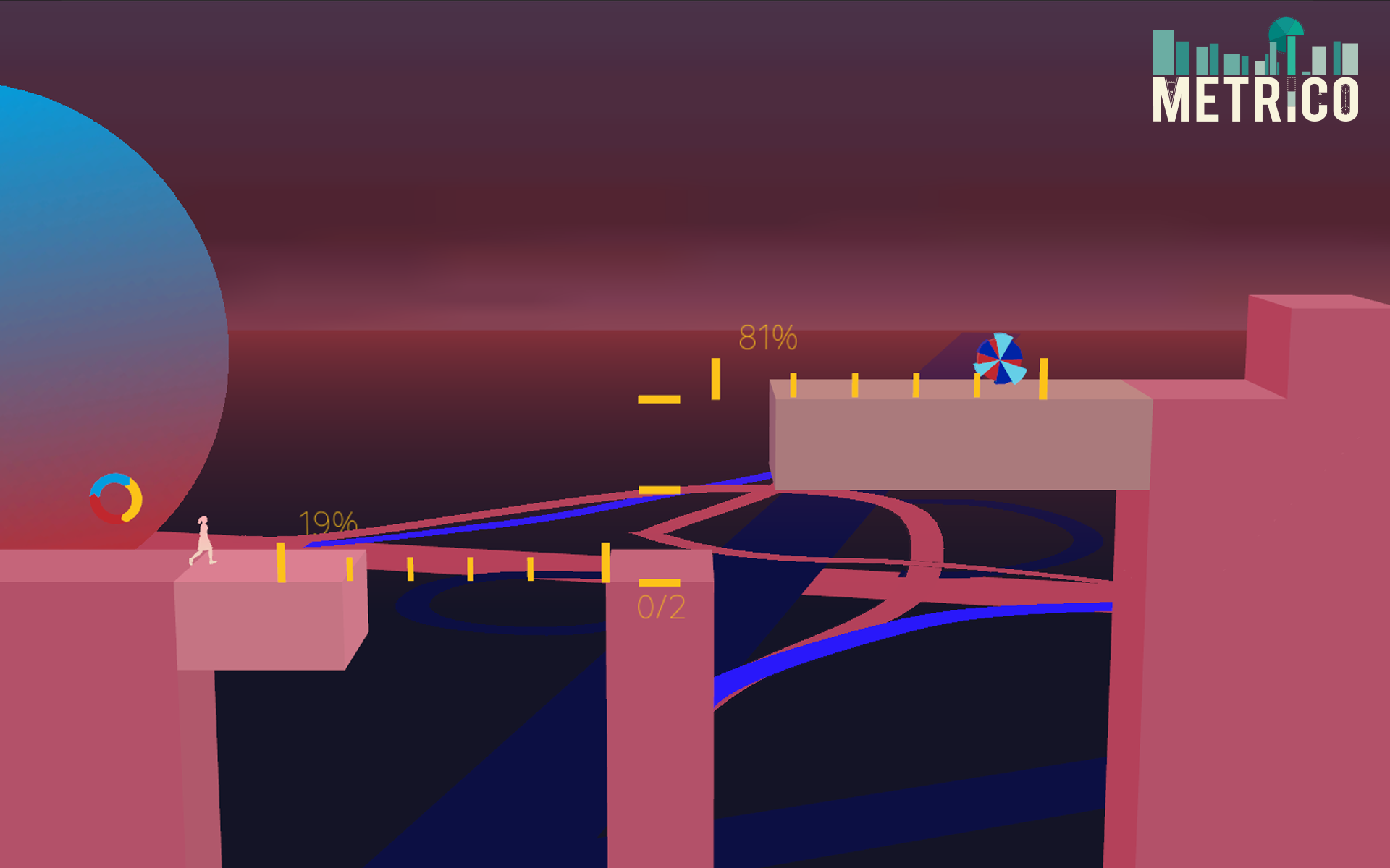
Whether you choose to play as a male or female silhouette in Metrico, a world of data and wide-open spaces spreads out in all directions. Most everything onscreen consists of figures commonly used to display complex mathematical data. A set of pillars you have to figure out how to bring down look and act like segments of a bar graph. Moving platforms perform like shapes within an X-Y coordinate plane, gliding along in one of four directions as you figure out the last piece of a puzzle.
Most of the time, these shapes also have percentages attached to them that emphasize the scale of a change that corresponds to an action you take. A horizontal sliding platform may begin a puzzle at zero but gradually increases to 100 percent as you run toward the right side of the screen. Given what little the brief tutorial images at the start of each world tell you about new mechanics, Metrico does a fantastic job of keeping you informed through constant visual/numeric feedback. The soundtrack, composed of sparse synthesizer and resonance electronic hums, syncs to the visuals so well it would be unfair to ever pry them apart.
The art direction isn’t just for keeping the player on the right track. For a game dominated by simple rectangles, small circles, and speeding straight lines, you are never at a loss of something engaging to look at. Giant scenes of collapsing and re-building geometric shapes dance along in the background of each world, giving even those frustrated with the immediate space of a puzzle screen something to chill out to. Watching a giant diamond shatter into a dozen small rhombuses far in the distance is oddly compelling no matter what emotional state you are in.There is a lot of psychological satisfaction in seeing numbers rise to an even percentage or forming a perfect staircase out of ascending blocks. Metrico’s graphical zen is as infectious as it is practical.
A consistent, unpredictable challenge
Little in Metrico remains the same from one puzzle to the next. The same vertical sliding pillar that you activate by jumping in the previous room will now only move to the left side of the screen if you send yourself back to a checkpoint. The game wisely restricts the total amount of actions you can perform, introducing only one new mechanic for each of the six available worlds. This limits the amount of frustration you will have to muscle through before each new room makes sense. If you can only make four different actions, one of them will activate something in the puzzle.
You start out with the platforming basics of running and jumping before getting a straight-forward projectile attack. Vita-specific features get gradually added in, and almost always to great effect. You will be tipping and turning the handheld system to slide open gates, tapping the screen to fire projectiles, and moving a finger around the rear touch pad to better target said projectiles. A great majority of the time these features are smooth and responsive. It doesn’t take long for you to acclimate to the brief spots of playing the game upside down just so you can keep everything at the proper angle.
But just because the game isn’t frustrating doesn’t mean the path ahead of you is easy. Metrico can be a tricky little puzzler. It’s particularly a fan of red herrings; a significant chunk of its puzzles contain sections that are either unnecessary or counter-intuitive to their solutions. A group of asterisks may be bouncing between two bars in the bottom left of the screen, but that doesn’t necessarily mean you need to shoot them to move on. Far from annoying, these little puzzle cul-de-sacs serve as an often sly reminder to never assume that what worked in one puzzle will fit into the next.
What you won’t like
Its last Vita-specific feature nearly cripples the final puzzles
The Vita’s rear-facing camera is a terrible conduit for gameplay. Metrico is a great example of why this is so. The last mechanic it introduces is a tilt feature focused on the rear camera and the light in the room. Not only does this handicap all play sessions not in ideal lighting conditions, the tilt functionality is also too precise to fit in with the rest of the game. Your judge your angle by a spectrum of three colored circles that grow wider the closer you are to a desired position.
One of the last puzzles demands such precision with this feature that it is almost impossible. You must rise and lower three large columns to an exact percentage (with a margin of error of 1 percent to 2 percent) in order to cross a gap, but the unwieldy rear camera will force you to over or undershoot by an incredibly small amount more times than your patience can handle. It feels like trying to play chess with the Nintendo Power Glove.
The designers would have to strip out everything that made Metrico unique just to make this wholly evil feature playable. We are never told enough of how to guide these colored orbs with any degree of efficiency. The bright colors don’t always fit with the rest of the art palette. The feature amounts to just a tiny amount of the overall gameplay, but it will be all that sticks out in your mind if you can tolerate it long enough to finish the rest of the game.
Conclusion
The Vita needed something like Metrico over a year ago. A void of good platformers has plagued the handheld since the launch-era Escape Plan, and this infographic-driven, minimalist puzzler could have filled it nicely. It remains a solid adventure today despite the late-game efforts of one of the worst system-based game mechanics of this or any other year. The afternoon of graph diving it takes to beat Metrico is all that’s needed to forever see a small silhouette jumping to and fro on all of the financial documents in your future.
Verdict: 75/100
Metrico is available exclusively for the PlayStation Vita on Aug. 5. The publisher provided GamesBeat with a free digital copy for the purposes of this review.

VentureBeat's mission is to be a digital town square for technical decision-makers to gain knowledge about transformative enterprise technology and transact. Learn More


