Want smarter insights in your inbox? Sign up for our weekly newsletters to get only what matters to enterprise AI, data, and security leaders. Subscribe Now
Flipboard eschewed its signature flipping pages for its new web interface, designed to take you down a content rabbit-hole.
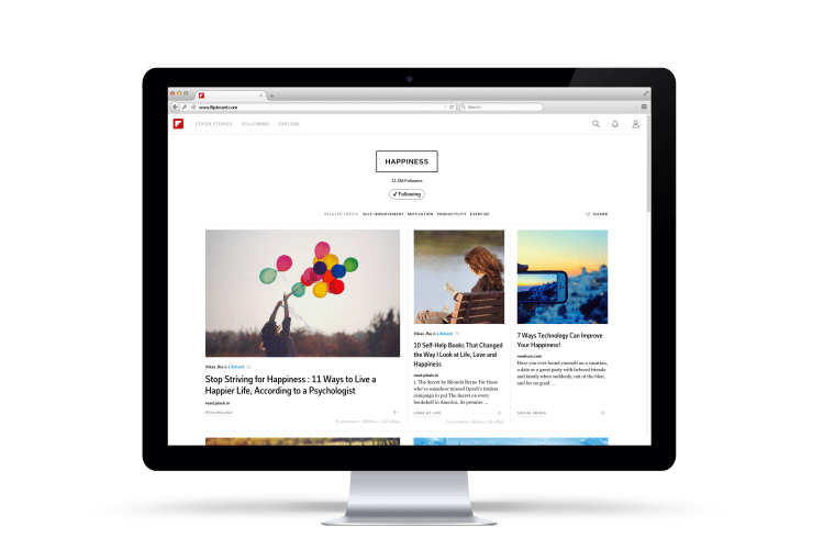
Today Flipboard is unleashing the full version of its magazine-aggregating app on the web, in a sleek new interface that looks like a mix between Medium and Pinterest.
Flipboard has had a web version of its magazine-like reading platform since mid-2013, but it’s more of a placeholder than a functional web app. It doesn’t allow users to log in or get access to their magazine collections, and it also features the iconic flipping pages of its mobile app, which come off as clunky on the web.
In the new web version, rather than flipping pages, Flipboard serves up content in modules containing pictures, headlines, and occasionally a leading sentence.
Here are a few examples that show off the platform’s new visual capabilities:
- Designica, a magazine that combines trippy animated GIFs with trippy soundtracks from Soundcloud, curated by Flipboard CEO Mike McCue
- The Hipster, a magazine of things that are too cool for you, by Gus Gostyla
- The Explorer, a magazine curated by former NFL player and NASA astronaut Leland Melvin
“We had some web magazines out on the web before and those who flip, but it wasn’t a natural experience, so people would jump off the page,” Didier Hilhorst, a product designer at Flipboard, tells me. He says the focus of Flipboard 3.0, which launched in October, was to create a product native to the web. But the web version has been substantially upgraded today.
The company now has 50 million monthly active readers, according to McCue. Its users curate a total of 15 million individual magazines — 5 million more than a few months ago before the launch of Flipboard 3.0.
Social Media Marketer?
Share your thoughts for early access to our data.
To improve the web experience, Flipboard is updating the way it introduces new content to readers. In addition to giving you access to all your curated magazines on the web, Flipboard is also adding a section called “Explore” for content discovery. Explore serves the same function as search in Flipboard’s mobile app, but is more refined, allowing users to dive into narrower topic fields.
The Explore page offers an array of broad topics and related imagery (i.e., art, genius, amazing, autos) that leads to subheads and more specific collections of content (i.e., street art, time-lapse photography, antique cars). In the current search function on Flipboard, clicking on a broad topic kicks up a wide spectrum of articles.
Design capability was also a huge component of the move to web.
“Web technologies are really at a point now where we can do this full bleed stuff,” says Hilhorst of the page layout. Flipboard’s interface features a lot of large, highly saturated photos that “bleed” to the edge of the webpage, giving online content providers the opportunity to replicate the look and feel of glossy magazines.
Flipboard even uses its own, homegrown font in the new Web version, called Fakt Flipboard.
But more than design, Flipboard’s move to the web is about “closing some loops,” as Hilhorst puts it. With Flipboard fully functioning on the web, users can send and receive links to articles on Flipboard without being forced to open the app on their phone — a huge plus during the workday, when many of us are locked to our computers.
The layout even works on mobile web browsers, so smartphone users can access Flipboard magazines without installing the app.
With Flipboard aiming to grow its audience of over 100 million readers, the Web may be the final frontier.


