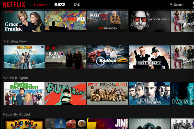
You know that feeling when you’re sideways-scrolling through movies at the Netflix site, and then the scrolling stops but your eyes don’t? I hate that feeling.
That’s why I’m glad that Netflix today has confirmed that it’s finally ditching that slow, single-speed, sideways-moving carousel in favor of a better presentation system. The new design can already be seen by a select group of users, and will roll out slowly to all others.
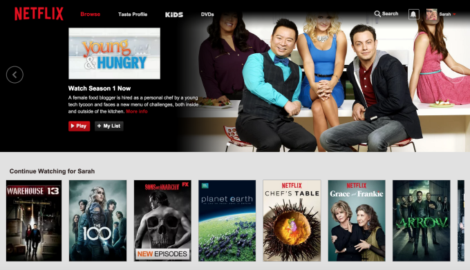 The new design allows you to click on a tile to display more information about a movie. No more do you have to hover over the movie and wait for the popup to give you the details.
You can also see more detailed information with a single click. This includes title, full description, running time, and various stills from the show.
Sources: The Verge and TechCrunch, screen grabs courtesy of the Verge
VentureBeat's mission is to be a digital town square for technical decision-makers to gain knowledge about transformative enterprise technology and transact. Learn More
