Mozilla revealed big plans for Firefox earlier this month, including that it would be bringing the browser to new platforms like Windows 10. We didn’t focus much on that part of the news because it wasn’t much of a surprise: Firefox has supported every Microsoft desktop OS since the ancient Windows XP. As such, we didn’t expect it to look very different than the current release, and now we can say that’s true.
We stumbled on the Firefox for Windows 10 design specifications. While many of the screenshots are technical in nature (they include dimensions, text attributes, colors, margins, spacing, and so on), there are a few that show how it will look for most users.
If you want to see how buttons look when they’re pressed or hovered over, this is for you. For everyone else, here’s Firefox for Windows 10:
At first glance, it really doesn’t look too much different than Firefox today. That’s on purpose.
“Mozilla works in the open. The specs you found illustrate the design direction we’re pursuing ahead of the Windows 10 launch and these specs are being used as reference materials by Mozilla staff and community,” Chad Weiner, director of product management, told VentureBeat.
For the sake of comparison, here is Firefox for Windows 8 with the one for Windows 10 just below:
A lot of the differences you see largely depend on resolution, Windows theme, font size, and so on. Yet there are few other differences worth noting (aside from the fact I haven’t pinned any colorful Firefox extensions).
The refresh icon has been separated a bit more from the URL bar. The magnifying glass search icon is leaning to right, not the left. There are no share or Firefox Hello icons (though we assume that’s to show these features aren’t core to the browser; we doubt they’re going away altogether).
Other than that, there are some subtle differences with the styling of the back button, tabs, and framing. But it’s largely the same browser.
“The design appears familiar because its goal is to provide a smooth transition for Firefox Windows users,” Weiner added. “We wanted to make sure that Firefox showed up on Windows 10 as a first-class experience, so we’ve made a lot of subtle tweaks to the look and feel that both sit well in the Windows 10 context and are definitively Firefox. We’re taking visual cues from style changes appearing in Windows 10 and we’re also reducing the overall browser UI footprint to increase space for viewing the Web.”
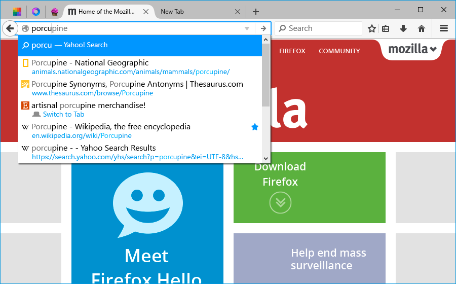
Here is the URL bar (which Mozilla calls the awesome bar) in action:
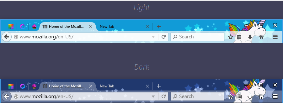
And here’s how the browser will look with light and dark themes:
While the world is moving more and more towards mobile, a lot of browsing still occurs on the desktop. As such, a lot is riding on this release, especially given that Mozilla spent years working on a Metro version of Firefox for Windows 8, but ultimately ended up pulling the plug.
Support for Windows 10 was added in Firefox 40, which is currently in the beta channel and expected to arrive in the stable channel in mid-August. We’ll be watching closely to see how the company’s plans progress, including whether it ends up building a universal app that works across Windows 10 for PCs, tablets, and phones.


