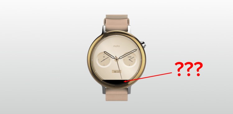
Motorola unveiled the next generation of its Moto 360 smartwatch line today, and much to the frustration of Android fans, the gadget’s screen still doesn’t fill the face of an otherwise perfectly round watch.
That gap, lovingly called a “shelf” by Motorola, and angrily called a “flat tire” by some consumers, existed in the first generation Moto 360 and will live on in the second — though Motorola tells us it would like to get rid of it eventually.
During a prelaunch press event yesterday, we asked Jim Wicks, a Motorola executive leading consumer design, about the flaw, which he called “the right decision.”
VentureBeat: How do you react to criticism of the shelf? Through the leaks, people have reacted negatively about what you’re calling the shelf at the bottom of the watch.
Jim Wicks: We could move the shelf out. You’d have a round display and you’d have a thicker bezel or a bigger watch, and we don’t want to do that. We could have done that in the first one and we chose not to. Um, so we really think this 46mm diameter and the 42mm are really important. That shelf, what it’s doing is it’s hiding some really important sensors — the proximity sensor and other sensors; it’s also where we fold over the display, the display drivers, and by doing that we can keep a very simple, very thin bezel.
… You see some designs that are rectangular, or have some metal coming out, that are really to cover that. We didn’t do that, for the reasons I said. We wanted to have the best fit. The most display for the body … So we look at all of that, we decided that having the shelf was the best design decision.
VentureBeat: Is the goal to have both, though?
Wicks: Over time, it would be great, yeah. But we don’t want to sacrifice the fit. … It’s kind of nice, when you’re scrolling down to have the hard edge there, but it’s really those other factors that drove it.
That’s why we did it. We own that. We believe it’s the right decision.
Wicks’ argument isn’t bad, but it reads like a rationalization of the 360 development team’s limitations. LG’s G Watch is round and doesn’t feature this design flaw (though its bezel is considerably thicker), and Motorola’s own marketing team — or whoever made this commercial — appears to dislike it. Ultimately Motorola aims to eliminate it, if we’re interpreting Wicks’ comment correctly, and that’s a good sign long term.
If you can tolerate the shelf in the meantime, you can preorder the 360 today.
VentureBeat's mission is to be a digital town square for technical decision-makers to gain knowledge about transformative enterprise technology and transact. Learn More


