Cortana isn’t officially in this build of the New Xbox One Experience, but you can unlock it. Here’s our how-to guide.
The Xbox One is about a month away from getting a major overhaul, but we’ve got an early look and want to give you an idea of what to expect.
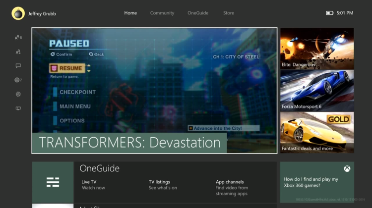
The New Xbox One Experience (NXOE), as Microsoft calls it, is something of a mea culpa. It is Microsoft admitting that it got some major things wrong with the original interface for its latest console. This update, which launches in November, improves the Xbox One’s responsiveness, organization, and overall usability. You won’t need to go make a sandwich to pass the time while friends list loads anymore, and you won’t have any trouble finding important system options. Everything just makes more sense now, and that’s not something you could necessarily say before the NXOE.
Ever since the Xbox One and PlayStation 4 systems launched in November 2013, Microsoft has tried to get past some of its earlier mistakes. Its user-experience choices revolved around using the Kinect camera-microphone device and “snapping” apps to the side of your screen. The problem is that many people do not have the Kinect now and even those who do hate having to wait for a snapped app to load and take up a huge amount of screen real estate. Because of these factors, many gamers and critics have voiced their preference for the PS4’s simple and straightforward menu system. And while Xbox boss Phil Spencer has put his team to work over the last two years on monthly updates that have added powerful features, these have all felt like bandages compared to the NXOE.
Let’s go over the biggest changes so I can show you what I mean.
The new, pervasive quick menu
I played a lot of Titanfall on my Xbox One, and I can clearly remember the thing I hated the most about that game: accidentally hitting the button that would bring up my friends list or info about another player in a lobby. That’s because the Xbox One would take an eternity to load those side apps and information, and I couldn’t immediately back out of it. It was terrible, but now it’s gone.
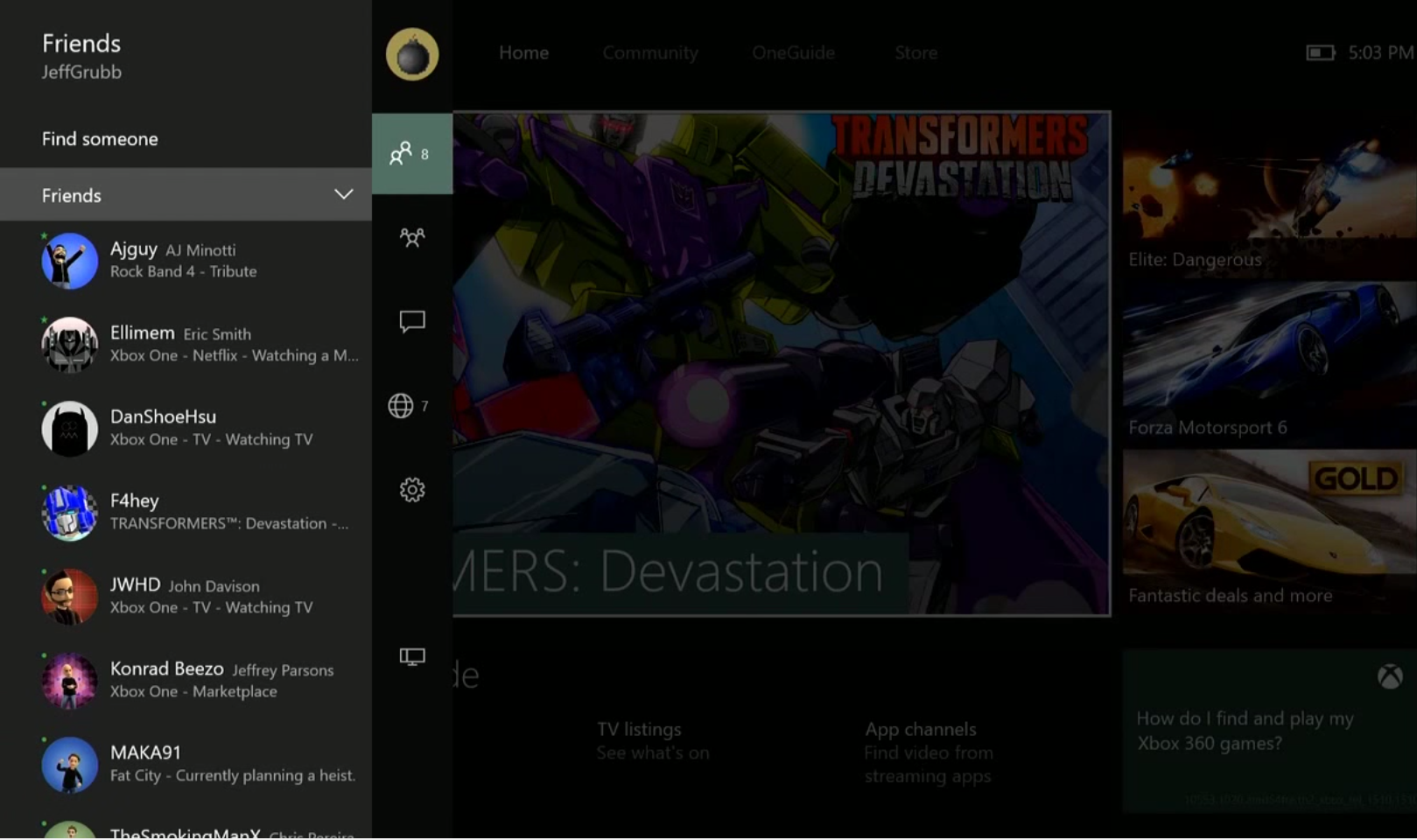
Microsoft has replaced the dedicated apps for social features like “Friends” and “Messages” with a quick menu that slides in over your game or home screen from the left.
You have a couple of options to get to this new social menu.
If you’re on the homepage, you can click your stick to the left. This will bring up the menu you see above. It defaults into your friends list, but you can quickly get to your party, messages, and notifications by hitting up or down. If you’re in a game, you can bring up the exact same menu by double-tapping the Xbox button.
Compared to the old Xbox One method, this is a dramatic improvement. Having immediate access to these functions is crucial, but it’s only possible to get to this information instantly now with the NXOE.
Better organization
An area where both the Xbox One and PlayStation 4 have fallen flat is organizing information. But the NXOE does a major overhaul for this and now everything is easier to get to and easier to find. It’s so much better on Xbox One now that it sorta blows the PlayStation 4 away.
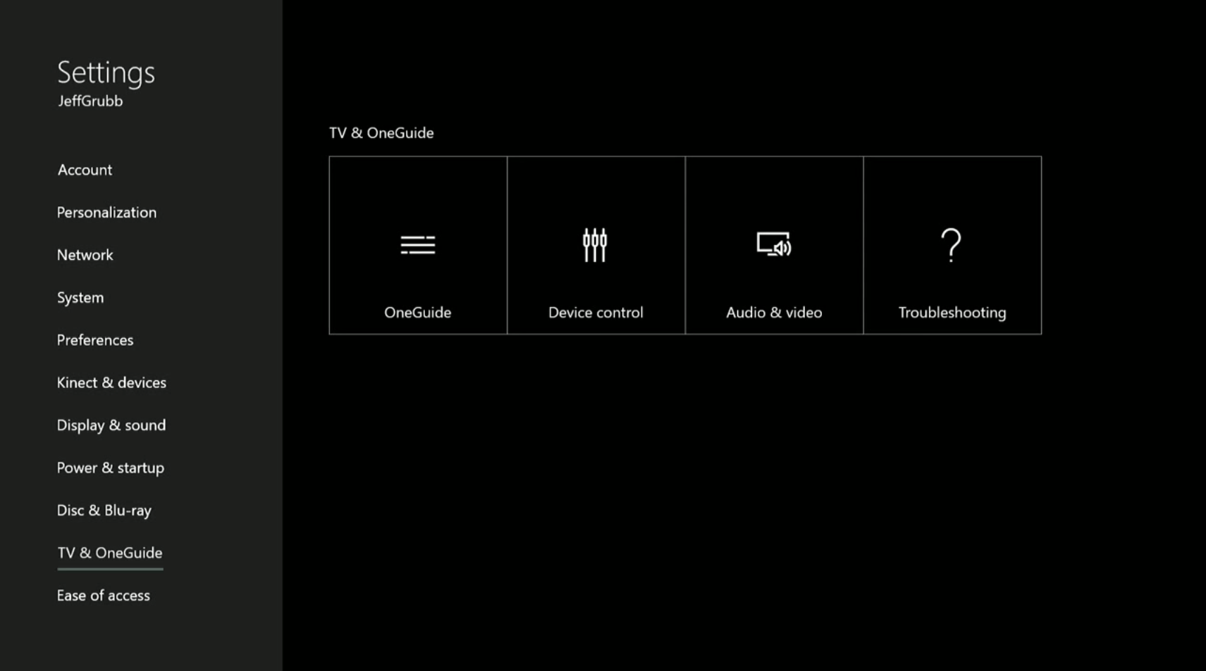
Let’s look at the settings menu. You can now get to the settings by double-tapping the Xbox button and navigating down to the gear.
Once you’re in the settings, everything is laid it out in a clean and concise way. You have the various settings options on the left. These include categories like “System,” “Account,” and “Power & startup.” But you don’t need to click through to see what options and submenus you have in each of those categories. Instead, you simply navigate up and down and you’ll instantly see everything that is available to you.
I point out in the video that this is so much better than PS4’s confusing settings menu, and I hope Sony copies this.
Final thoughts
Microsoft has put a lot of effort into eventually getting the Xbox One right. But I think the New Xbox One Experience is an excellent starting point with room for even more improvements through monthly updates starting in 2016.
Now that basic functionality is quick and responsive, I’ve found myself using features that I previously ignored or lamented having to load on Microsoft’s system before this upgrade. I’m even using the OneGuide to navigate my cable system because it loads and scrolls more quickly than my native CenturyLink cable box.
To me, the NXOE is indicative of Microsoft’s overall philosophy with the Xbox One. The company made plenty of mistakes and boneheaded choices in the early days of the console, but it’s admitting it was wrong and making sweeping changes. That’s impressive for a corporation the size of Microsoft. Under the leadership of Spencer, who has often been one of the most vocal critics of the Xbox One, the company has an awareness and nimbleness that you would expect from a small startup. With that mentality — and Microsoft’s infinite resources — the Xbox One’s future is looking brighter than it did before this update.
VentureBeat's mission is to be a digital town square for technical decision-makers to gain knowledge about transformative enterprise technology and transact. Learn More


