Want smarter insights in your inbox? Sign up for our weekly newsletters to get only what matters to enterprise AI, data, and security leaders. Subscribe Now
All bots promise ease of use, but are they actually, well, easy to use? In 1990, Jakob Nielsen identified 10 usability heuristics for evaluating user interfaces against a set of universal design principles. Inspired by Nielsen, I’ve come up with six relevant heuristics to evaluate bots:
- Visibility of system status and recognition rather than recall — Keep the user apprised of the system and their options at critical points and give the user options to request additional information at any point.
- Match between system and real world and help users recognize, diagnose, and recover from errors — Know your audience. Don’t switch communication styles.
- User control and freedom and error prevention — Get confirmation from the user at critical points, and provide escape hatches for multi-step interactions.
- Flexibility and efficiency of use — Provide accelerators to power users.
- Consistency and standards and aesthetic and minimalist design — Keep the communication style and personality/voice consistent.
- Help and documentation — Provide help within the bot.
Let’s take a look at some popular bots and see how they hold up against these heuristics. I’ve chosen Poncho, CNN and 1-800-Flowers — three bots on Facebook’s Messenger platform — all introduced at the F8 developer’s conference a few weeks ago.
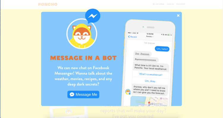
Poncho
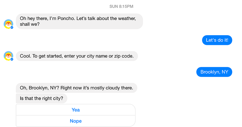
Poncho starts out strong by providing a hint as to what to do: talk about the weather.

Ok, sounds good, let’s talk about it, Poncho!
This is an awesome interaction so far. Let’s recap:
AI Scaling Hits Its Limits
Power caps, rising token costs, and inference delays are reshaping enterprise AI. Join our exclusive salon to discover how top teams are:
- Turning energy into a strategic advantage
- Architecting efficient inference for real throughput gains
- Unlocking competitive ROI with sustainable AI systems
Secure your spot to stay ahead: https://bit.ly/4mwGngO
- There’s no ambiguity about what to do or say
- Poncho has confirmed the information provided (my location)
- Poncho is giving me the ability to “undo” or amend the information I’ve provided.
Let’s see what it looks like if I say “Nope”:

Decent, though I’m not a fan of Poncho running me through identical language here (Is that the right city?). Up to this point, I forgot I was conversing with a bot; now my innocence is lost.
Anyways, let’s keep going and say “Yea.”

I get the weather along with the next CTA; I don’t want to set any notifications for now, but thanks for asking, Poncho.

This is just a fantastic job of providing inline documentation, and Poncho even prompted me to ask for this help. Awesome. Also a great example of structured messages in Facebook to remove any potential for ambiguity.
Let’s see if we can get at some system visibility:
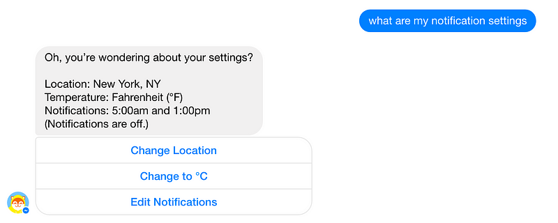
Succinct and clear.
Poncho also does a great job with banter, and when you reach the limits, he pulls you back:

 Verdict
- Visibility of system status and recognition rather than recall — Responds to queries regarding system status. Provides structured messages to guide the user.
- Match between system and real world and help users recognize, diagnose, and recover from errors — Poncho uses vocabulary I’m familiar with.
- User control and freedom and error prevention — I made an “error” entering my location and Poncho let me fix it. Awesome.
- Flexibility and efficiency of use – If I come back, Poncho will remember my location, saving me a few keystrokes.
- Consistency and standards and aesthetic and minimalist design — Poncho is pretty straight to the point, and the structured messages are clear and concise. Poncho is also a delight to talk to, most of the time.
- Help and documentation — Fantastic example of inline documentation done right.
Poncho knocks it out of the park.
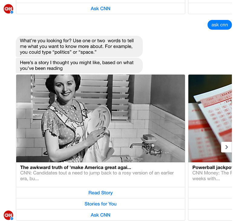
CNN
Next up, CNN.

CNN makes good use of structured messages. However, this already feels less like a conversation and more like a command line.
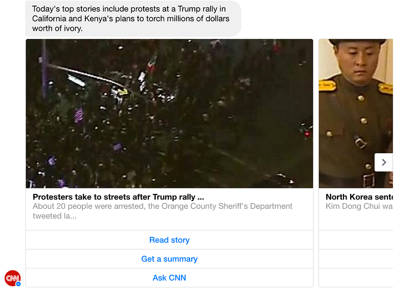
While the CNN bot is definitely not something I’d want to have a beer with, that works in its favor when it comes to guiding my actions; I’m more inclined to treat it like a command line and less like a pal.
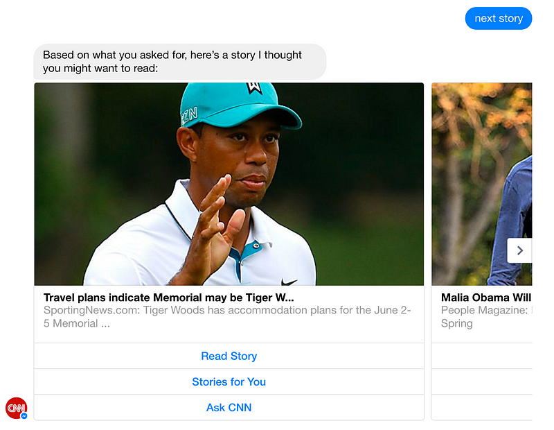
Other than having it give me stories, it’s unclear what I can do with this bot. It seems to rely too much on accepting interactions via structured message, and “Ask cnn” doesn’t really do much.
This bot gets the job done, but it’s a tad underwhelming. I’d rather just use the website.
Verdict
- Visibility of system status and recognition rather than recall — Structured messages are very clear, but fails to accommodate regular messaging; unclear CTAs at times.
- Match between system and real world and help users recognize, diagnose, and recover from errors – Very little opportunity for interacting outside of structured messages.
- User control and freedom and error prevention — Not too many opportunities for errors here.
- Flexibility and efficiency of use — CNN bot all but asks you to treat it like a command line; it seems to not differentiate between power users and novices.
- Consistency and standards and aesthetic and minimalist design — Consistent, but no voice here; it’s like I’m looking at an RSS feed in Messenger.
- Help and documentation — Provides inline help, though it seems like some stuff is missing: For instance, what should “ask CNN” do?
1–800-Flowers

Leads with a structured message. Doesn’t really make me want to have a conversation with this thing. Let’s see what happens if I hit “Talk to support”:

Oh crap, I don’t want to talk to a human. Cancel, cancel!

Coincidentally, that is an awesome example of undo in action right there.

Great use of confirmation right here.

Not a fan of this interaction here. They’re forcing me into using structured messages, which feels limiting. However, it is nice that they prompted me to ask ‘help’. Let’s ask for help.

I let the bot sit fallow for a while, and then this happened:

That’s a really nice touch!
Verdict
- Visibility of system status and recognition rather than recall — Great job using structured messages to guide a user through the interaction.
- Match between system and real world and help users recognize, diagnose and recover from errors – Fails, especially at the end: When I tried to enter an exact date, it choked.
- User control and freedom and error prevention — Did a great job of allowing me to go back and change my order.
- Flexibility and efficiency of use — Nice use of humans to fill in the gaps; novice users would appreciate the human touch, while power users can get right to ordering.
- Consistency and standards and aesthetic and minimalist design — It feels like I’m interacting with a webpage inside Messenger.
- Help and documentation — Great inline help.
Conclusion
While I think there’s still plenty of opportunity to figure out some bot-specific design heuristics, Nielsen’s hold up pretty well. We can see that all three bots do a great job of providing affordance around error prevention and recovery, and all three provide inline help right in the bot. These go a long way toward grounding the user in the experience.
Crafting a compelling, delightful bot experience is going to be a key differentiator between the bots that see adoption and those that don’t. Nielsen’s heuristics continue to provide a great benchmark to point us in the right direction.
A version of this post appeared on Medium.com.
Kevin Scott is a desingineer, half human/half bot.