Want smarter insights in your inbox? Sign up for our weekly newsletters to get only what matters to enterprise AI, data, and security leaders. Subscribe Now
Apple Music has undergone a redesign with a few new added features.
Apple VP Eddy Cue announced the refresh today during the company’s WWDC keynote. He called it “redesigned from the ground up,” but it’s largely been scaled back to make the experience less confusing.

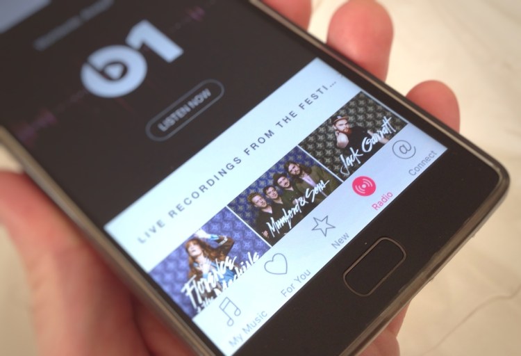
The tabs toward the bottom of the app look more or less the same, but Apple has redesigned the interface inside each tab.
When you launch the app now, you’ll first see your own music library, with a designated section for any music you’ve purchased and a “recently added” section.

When you play a song, you will see a new “now playing” UI that is black-and-white with a splash of color.

Apple Music now features lyrics and a personalized, curated playlist called “For You” that updates daily. The “Browse” tab shows off charts, new releases, and other browsing-oriented lists.


And the “Radio” tab still beams users right to a live feed of Beats1 Radio.
During the keynote, Apple made no mention of its push for exclusive releases. In the past year, Apple has cut lucrative deals with artists like Drake and Ariana Grande for exclusive releases. Drake’s Views from the 6, for example, was an exclusive Apple release for a week before becoming available on other platforms.
Apple Music launched last year, also at the WWDC conference. Since then, it has accrued 15 million paying subscribers.


