By refreshing its Apple Music music-streaming app in time for the launch of iOS 10, Apple has improved the overall design, as well as the experience.
It’s a matter of taste, but I prefer the bold typeface that’s now prevalent in the title pages of the new app, instead of the thin, small, and delicate look introduced in iOS 7. That cosmetic change is reflective of an app that’s a little more confident about its role in life: a tidy place for the music you own, a vast warehouse of songs to play, and a tool for discovering new music.
Apple Music now makes use of carousels in many places to navigate shows, stations, and playlists, resulting in app pages that are shorter and more interactive. It’s a design change, but again, this is really the second generation of the app. Apple has stripped out the visual clutter that it threw at users the first time around, and now presents the most important things more prominently.
In keeping with that theme, the Connect social network is no longer one of the five big sections of the app that you can open up on the bottom of the display. Connect has been tucked away in profile pages for music artists, curators, and DJs. You can still find it, but its buried status suggests that Apple has accepted that Apple Music is not itself a social network as much as it a music streaming service that happens to include tools for letting artists communicate with fans and for fans to say things in response.
Similarly, there are other users on Spotify you can follow, and you can follow artists, but Spotify’s role in people’s lives is much greater than that, and the user interface reflects that. Now the same is true for Apple Music. While you could argue that de-emphasizing Connect means giving up on a distinguishing feature, I would say the move shows Apple is being more honest about what people use in and expect from the app, rather than promoting something even if it isn’t necessarily popular.
Changes throughout
In the iOS 10 of Apple Music, the personalized For You section prominently promotes a new feature called My New Music Mix. It’s the Apple Music equivalent of Spotify’s Discover Weekly playlist, updated every Friday with “new music from artists we think you’ll like,” as Apple describes it. It was only added a few days ago, so I haven’t gotten to test it extensively, but so far I’ve liked what it’s presented.
And the redesigned For You section dispenses with the confusing mix of recommended playlists and recommended albums. Instead you now see a Recently Played section, along with carousels for playlists and albums that are labeled by the day of the week. There are also Artist Spotlight Playlists, New Releases For You, and posts from Connect.

The app’s New section now goes by the more accurate name Browse, and it’s less scatterbrained.
Gone is the seemingly endless page containing Hot Tracks, New Music, New Music Playlists, Apple Editors Playlists, Activity Playlists, Curator Playlists, Music You Need to Hear, Top Songs, More Top Charts, Beats 1 anchors, New Artists, Top Songs on Connect, Top Videos on Connect, Videos, and Featured Curators. Now there’s just a carousel of a few selections, and then links to a few pages you can dive into only if you want: New Music, Curated Playlists, Videos, Top Charts, and Genres.
The vaguely titled My Music section has been wisely renamed Library. Now it includes your Playlists, rather than forcing users to choose between the Library and Playlists subsections within the app’s main Library. You can add and remove categories of content from your Library. And the art for your recently added albums is bigger now.

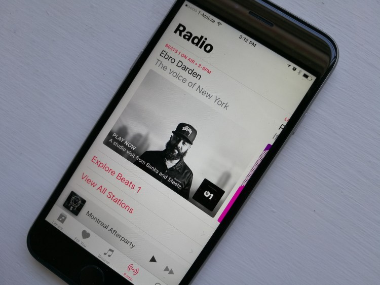
In the Radio section, previously when you swiped left or right while you were looking at a radio show, you would toggle among Featured, Playlists, and Connect. But you could also do that by tapping the buttons with those words near the top of the screen. Now Connect is hidden at the bottom, below On Demand, Playlists, and a short About biography. The Follow button for Connect has been dropped inside the ellipses menu.
What hasn’t changed, fortunately
But the real gems of Apple Music, still, are the talent, specifically Beats 1 DJs like Skrillex, Deadmau5, and DJ Khaled, and anchor Ebro Darden. When you’re listening to their shows, you feel like you’re in the same room with them as they’re playing music, speaking, and switching up the tracks. It’s great when guests are around, too. It feels like you have an intimate connection with these people. That’s something you just don’t get in apps like Spotify, Google Play Music, Pandora, or 8tracks.

Once you’ve listened to Beats 1’s shows for even a few hours, it becomes obvious why Apple is spending money to bring on more music artists and secure more exclusive albums. Bona fide stars have no trouble picking up and keeping followers. But while Apple does have a variety of genres represented in the radio shows available through on Beats 1, it could use more — no-namers won’t cut it, which is why the app’s playlists and radio stations aren’t as compelling. For example, it would be great to see Jay Z and Beyonce get radio shows, and that could happen one day if Apple ends up acquiring Tidal.
Apple Music has been gaining momentum, picking up more and more paying users — more than 15 million as of June. I expect that people who open the app for the first time and see this revamped version will be more likely to stick around than those who took a look at the initial iteration.
VentureBeat's mission is to be a digital town square for technical decision-makers to gain knowledge about transformative enterprise technology and transact. Learn More
