Want smarter insights in your inbox? Sign up for our weekly newsletters to get only what matters to enterprise AI, data, and security leaders. Subscribe Now
We are at the very beginning of a fundamental shift in the way that humans communicate with computers. I laid out the beginning of my case for this in my essay The Hidden Homescreen, in which I argued that as internet-powered services are distributed through an increasingly fractured set of channels, the metaphor of apps on a “homescreen” falls apart.
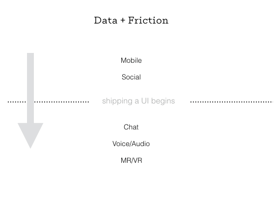
The first obvious application of this concept is with chatbots, but as new unique interfaces come online, the metaphor becomes even more important. To understand this shift, it’s worth examining how platform changes have created entirely new businesses and business models. At its heart, it’s about the relationship between the reduction of friction and the resulting increase in data collection.
Two easy examples to look at are the shift to content distribution through social media and the move of internet connectivity to mobile. Social media reduced the friction for sharing media (e.g., links), which resulted in more data about what people were reading. It also reduced friction for people to Like, Retweet, or Favorite a post, creating additional metadata around each link shared. This new dataset created the opportunity for a social news feed to emerge, which fundamentally changed media distribution.
Mobile phones — specifically smartphones — have increased the percentage of time we are able to spend on the internet, allowing people to share more content during more hours of the day. Smartphones have also reduced the friction associated with generating visual content (mobile photos and videos) and made background location sharing as easy as granting permission. This newly reduced friction has led to even more data for social media companies and has also led to the building of new companies, such as Instagram (because of reduced friction of sharing photo data) and Uber (reduced friction of sharing location data).
In both cases, reduced friction led to more data being collected. That combination has created new, extraordinarily valuable companies.

On-demand user interfaces
In this change of how we speak to computers, it’s worth separating on-demand user interfaces from the related rise of conversational software.
When I say “on-demand user interfaces,” I mean that the app only appears in a particular context when necessary and in the format which is most convenient for the user. This is important because it changes what we should think about as the product.
The product is no longer just an “app” or a “website,” it’s the brain behind many different instantiations. An analogy that might be helpful is to think about tech products through the lens of a media company. What is the product of Vice Media? It’s a set of reporters who focus on edgy themes that appeal to a certain demographic. It’s a brand. In computer science terms, Vice is instantiated natively in a number of different interfaces. On HBO, it’s a show. In the physical world, it’s a magazine. On Snapchat, it’s a dedicated channel, and on Instagram it’s a set of short video clips and photos. I’m sure a number of additional instantiations of Vice exist elsewhere. The interface into Vice Media is tailored for each specific context, taking different forms where users want it, when they want it . A Vice fan doesn’t point to just one instantiation and say that’s what Vice is.
One way to think about new technology companies is by abstracting away their interface from the “brain” underlying it. A single interface — an app or a website — is no longer the product. The product is the brain itself — the set of assets behind the instantiation in any single interface.
The difference between a media company and a technology company, in my view, is that a technology company doesn’t only push information, it pulls it back from users and uses technology to provide a better service over time, hopefully amassing a valuable set of data in the process.
Many of the most interesting new technology companies separate the service itself, the brain, from the instantiation of that service into the user’s everyday life. These instantiations are extensions of the service. Tentacles extend from the brain (to mix metaphors) with the ability to take the form of whatever is most convenient for a user at the time.
As an example, the Poncho weather service has an email version for people who prefer to get it in email, as well as a Facebook Messenger app that will push notify a user in the morning with the weather report and then wait until the user asks for more information. The Android app functions as an alarm clock with different wake up music corresponding to the weather (perhaps the most native experience for a user who hasn’t opened their eyes yet). In the future, one could imagine a voice-based version of Poncho that lets a user ask for a weather update at any time. In the much more distant future, it might be an umbrella stand that moves next to your door if it’s going to rain and hides itself when it’s not relevant.
There are interesting and important consequences to this approach. Suppose that, after launch, the Poncho team finds a great set of data that can tell you which side of the street it’s legal to park your car on today (in reality, Poncho already does this). Poncho only wants to share this information with people who drive; for all other users it’s irrelevant. In the Mobile + Desktop model, Poncho would have to wait for the next time you log in, and somewhere in its existing interface would have to ask you whether you drive to work and, if so, if you would like to get these parking updates. Then it would track over time whether users navigated to that part of the app or clicked on that part of the email on that particular day. It would take a long time for each user to be pulled through the funnel to get the benefit, and it would be at the expense of showing other relevant information in the app.
But this shift to on-demand user interfaces means that Poncho can now ask a specific question of a specific user in the exact context the user wants to see it. So if Facebook Messenger is where I get my Poncho weather, it can easily send me a message that simply asks, “We’ve got some new street parking data. Do you drive to work?” If I say “no,” it disappears (i.e., shuts up). If I say “yes” it can follow up by asking me where I live and whether I’d like that data included in my morning weather report.
Just as services now have the ability to ask the exact question using the most convenient interface for the user, users have the same ability to ask exact questions back to a service. So if I wonder “what’s the 5 day forecast,” I don’t have to figure out where that feature is buried in a UI, I can simply ask the question, which serves as a deep link into Poncho’s data (“brain”). Either I’ll get the answer, or, if it hasn’t been set up yet, the company will now see it almost as a feature request, which it can then build and prioritize relative to how many other users have also asked that question. All of this insight goes to the Poncho team as quickly as users can think to ask the question, faster than putting together surveys or user tests. Poncho can simply look at what users are asking in different contexts.
Some other examples:
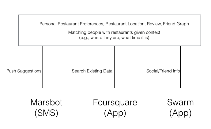
Consider Foursquare‘s location/recommendation platform. The “brain” knows where places are and who has been to them, and an evolving recommendation algorithm is based on this data. Its tentacles are the Foursquare app, which I essentially use as a search tool to communicate with the brain — the Swarm app — which I use to tell Foursquare where I am and who I’m with (the social component of the brain). And there’s Mars Bot, which is a text message service that leverages location data gathered from Swarm and Foursquare to push recommendations based on where I currently am.
Bubby dating app is another example. The brain contains my dating profile, Past Preferences, and a matching algorithm that sits on top of the data. Its tentacles are the Bubby app, which is used to gather my photos, allowing me to create a profile and to share others’ photos. A text message bot will ask me questions, like how my date went.
Why is this so important? Any time you reduce friction to entering data, you speed up the cycle time to make the service better, which is a competitive advantage. For example, the founder of the Bubby app realized there was a correlation between whether two people shared an affinity for skiing and whether they were likely to be a good match. Couples and families go on vacations together, so it’s not surprising that shared vacation preferences correlate with being a better match. The problem is, the service only knows that you like to ski if you happen to have mentioned it. Because one of the instantiations of Bubby is a chatbot, the bot can simply ask all its users “do you like to ski? (y/n)” and it will instantly update all the profiles with that new information, making better matches. Imagine if Tinder wanted to ask that question. It would have to change the UI in the mobile app to direct people away from its swiping mechanism and into their own profile pages, and then hope that some users made it far enough along that user path to answer the question — high friction, which means a smaller amount of data.
It’s not hard to see how in a world of on-demand user interfaces, conversational interfaces become extremely relevant. But chatbots are only the first wave of conversational interfaces. The second is voice, and I see mixed reality as a third.
Voice computing and audio consumption
I define a “voice computing product” as any bot-like service that has no GUI (Graphical User Interface) at all — its only input or output from a user’s perspective is through that person’s voice and ears. This is what we mean by conversational software. To understand why this is so important, let’s separate voice input from audio consumption.
Audio consumption — audio as an output — increases the number of hours in the day that people use an internet-connected service. Just as mobile meant that we could use the internet for the two minutes we spent waiting for coffee, listening to audio via the internet (e.g., podcasts, streaming music services) increases the total pie of hours in the day in which we consume internet content. We don’t use Snapchat or Instagram or email while walking around or while driving a car because looking at a screen is at best inconvenient and at worst very dangerous. However, we can consume audio content in those situations.
Separately, voice as an input is special for two reasons. As with output, it increases the number of hours in the day that you can use a service — Saying “Alexa, set a timer for 15 minutes” is easier than pressing the digital clock on your stove if your hands are full.
Perhaps more interestingly though, speaking is often faster than typing. This means that it’s faster to say “Alexa how many ounces are in a quart?” than it is to open up Google and type that sentence into a search box.
The best voice user interfaces will take care to know a user’s context. If they are cooking chicken, rather than setting a generic timer, the user might say, “i’m cooking chicken,” and the response might be to ask how big the chicken is and suggest a cook time and a temperature. Rather than a timer buzzing after the allotted time, the software might ask the user to check whether the chicken is still pink inside and, if so, suggest an additional amount of time to cook.
The most valuable voice-first services will apply the framework of having a separate brain and will think of a voice interface as a way to collect data faster and give people responses more conveniently. Or they will use voice as one of a number of UI tentacles, but in use cases where voice is perhaps the most natural and native opton.
If 2016 was the year platforms opened up to chatbots, 2017 is going to be the year voice platforms open up to mainstream consumers. Alexa already has a substantial customer base and has made its software available to be used on other devices. Google Home has shipped preorders, and Siri has opened up to app developers. Samsung acquired Viv, a competitor to Siri, which presumably means voice interface will be available on a number of new devices.
The future: mixed reality
As we start to think of apps more as brains with on-demand interfaces, we can start to think of future devices where the same approach makes sense.
What does an app store look like in mixed reality? Maybe we continue with the windows metaphor — a panel of squares — which is still in use on mobile phones. But I suspect it will look different. What if a mixed reality app takes a specific shape, like a stuffed animal or a doll? If I look over and see Mickey Mouse sitting on the bed, perhaps I just start speaking to it to wake it up and get suggestions for the most recent Disney experiences to try. Maybe this Mickey is an “icon” that lets me engage with the Disney experience. In many cases, these “apps” will look more like services and experiences delivered through a mixed reality environment and will have similar properties to what I described above — they will only need to exist in the context where they’re useful.
These on-demand interfaces that live in chat, voice, and beyond appear when needed and disappear when they’re not relevant. A bartender doesn’t follow you around all day asking for your drink order; they stand behind the bar, ready to answer any questions you have in a context that makes sense. Similarly, a mixed reality experience for a weather app might be a character who sits next to your bed and, whenever you look at it, is wearing clothes that are appropriate for the weather outside. It wouldn’t make any more sense for this doll or avatar to follow you around at work than it would for the bartender to follow you — you’re already dressed, and you don’t need a drink.
Conclusion, or “so what?”
The way we talk to computers is fundamentally changing, and new types of companies will be valuable in this new world of on-demand interfaces. Developers are already somewhat familiar with companies that are primarily interacted with via their APIs — perhaps the thinnest UI there is. Consumers are learning too — I think they intuitively understand that Uber isn’t just an app; it’s the notion that there are so many cars driving around, connected by a brain, creating a service that instantiates a car in front of you nearly instantly. Uber exists in different interfaces fluidly — collecting location data from your phone, letting you hail a ride via a watch or Alexa skill, giving you an update of your driver’s location visually through its app, sending you text messages that your driver has arrived, and letting you communicate with the driver by voice in a phone call. In each case, it’s the lowest-friction way to get or share the most data to create the best service and experience.
Ironically, this new design paradigm both elevates and removes the value of design itself. A company’s long-term value will be determined by the unique insights it derives from the proprietary data that it has access to in its brain.This elevates the value of good design, in that one of the most important functions will be finding ways to reduce the friction involved in collecting data and responding to requests for information. But this type of interaction design is copyable and will eventually become a set of standards. The more valuable part of these new businesses will be the uniqueness of the data they collect, and, ultimately, the defensibility of the insights they generate.
This post first appeared on Medium.


