This post has not been edited by the GamesBeat staff. Opinions by GamesBeat community writers do not necessarily reflect those of the staff.
Editor's note: Oh, how I love a good nitpicking. Add yours to the comments below. -Shoe
We probably curse a lot of design features in a typical run through a game. We'd love to claim that, with development duties in our hands, many titles would end up being far better. But the truth is the vast majority of these design ideas are there (or absent) for very good reasons.
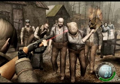
Take as an example your inability to simultaneously run and shoot in Resident Evil 4. Sure, it's infinitely annoying not to be able to back away from the hordes of infected villagers scampering toward you, but the upshot is that the game ends up being far more tactical as a result. You can't just jog into an area and expect to get out unscathed. Instead, you have to think a little more and plan your escape route for when you inevitably have to reload at the worst possible moment.
Some design choices, though, defy any explanation. They exist as part of a tradition, included "just because"…and end up completely failing to justify their presence. Take as an example:
Having to sign player 2 into a profile:
I understand that this lovely feature was intended to allow a second player to collect Achievements. Out of interest, though, how many of you actually keep your Xbox Live profile on a portable memory card? In addition to that, how many of you keep this profile/memory card on your person, in case you come into a position to play some multiplayer on another person's system?
If you answered yes to both questions, then congratulations; it's your obscure habit that keeps this feature around that's been eating into the rest of our playtime for years now.
Of course, give me the option to sign in to a profile if I want to collect those Achievements with friends. But please assume I don't care, and don't make me waste my time creating profiles on friends' systems just so I can jump in a game.
Quitting to the main menu when you die
I love some features in Japanese role-playing games. The way many of them kick you out to the main menu when you die, however, is annoying and an immersion-killing function that has no place in modern games.
Perhaps this is the developers' noble attempt to force you to give up. “Look,” the game's saying, “you kinda suck at this. Why not go outside, get some fresh air, and then come back later?”
I don't want to, of course. I want to jump right back into the game and beat that challenge that had me stumped the first time around. In addition, I don't want to have to rely on my saves as checkpoints — it means I have to spend more time worrying about the next save point rather than actually enjoying the game. It can also result in entire half-hours of game time lost when it could've been saved with a little automatic checkpointing.
Starting over at the main menu wastes the player's time. Just load up where I was five minutes ago, because I could really do without loading your company logos, the game's introduction, the main menu, my list of saves, and finally the level itself. It's lengthy, it's boring, and above all, it makes me seriously think about walking away from the console, and that's never a good thing.
Choosing whether to pick up mission-critical items
A feature which seems (in my experience) to be exclusive to Capcom games is politely asking the player whether he wants to pick up that item necessary to finish a level with. The issue here is not so much one of wasted time but of the paranoid doubts it causes to enter my mind.
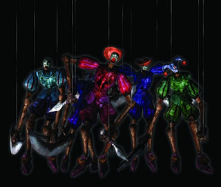
I may be alone in this, but whenever a game asks me if I want to pull a lever I've just come across rather than just doing it for me, I immediately think I have some sort of a choice. Obviously this lever has to be here for a reason, but if the game's asking me whether I want to pull it or not, then maybe there's a reason I shouldn't be pulling it. Maybe the lever's booby-trapped; maybe it's going to open a secret passageway filled with puppets intent on turning Dante's body into mincemeat…and maybe I'll be kicked out to the main menu as a result.
I think I'll go search around a little bit more before I commit to a decision….
Agreeing not to turn off the console during saving
We gamers are an impatient lot. We get that games have to load and everything, but while that's going on, we're probably going to leave the room and do one of the other hundreds of important things in our lives.
We might leave the room and make a sandwich for example, or possibly just a cup of tea. We might unload the dishwasher or do some other menial task we've been putting off because, let's face it, if it takes so little time then why bother? We might take a moment to punch a goat in the face or maybe write a blog post about how much we hate waiting for games to load.
When we re-enter the room after a lengthy initial load we expect at the very least for the menu screen to be sitting there with a "Continue?" option happily flashing away. If you're Rockstar then you can take this even further and actually chuck us directly into the game, ready to unleash chaos upon the world.
So please, developers, the next time you're examining your product's interface, don't make the entire booting-up process come to a halt as the game waits for a button press confirming the fact that we understand not to turn off the console when it's trying to save.
Letting everyone edit game settings in multiplayer
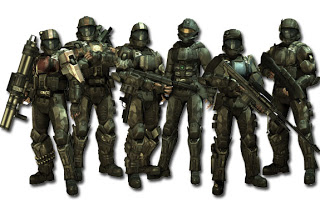
“OK fellas, thanks very much for coming. Let's get into some Halo splitscreen. OK, game mode? Alright we'll start with some Slayer…no…stop it…will whoever's pressing up please stop? OK, Slayer it is. No, stop messing around with character customization player three — let's worry about that later. Who's editing respawn times? What's the point? Let's just get into a game and change anything we need to later. Someone's pressing the up button again — kindly stop. Everyone ready? It's game time.
"No! Alright, who quit us out to the main menu!?”
Please, just give all the control to player one, because nine times out of 10, that'll be the person in charge, and you know what? If we need someone else to pick out options, we can use this amazing feature called "passing the controller."
The point of this article is not to say that these minor niggles are the bane of gaming's existence or even that they waste much time at all. The fact remains that they're still annoying though, aren't they?
So what game features really piss you off? Can you work out the reason for their inclusion, and even then do you think this reasoning justifies them?


