This post has not been edited by the GamesBeat staff. Opinions by GamesBeat community writers do not necessarily reflect those of the staff.

Punch-Out!!, the classic NES game, has a rather clear narrative theme. The player is the underdog.
It's the classic sort of David-vs.-Goliath story — someone small can defeat someone that is much larger. But it also shares another theme with the Biblical tale: Intelligence trumps physical strength.
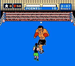
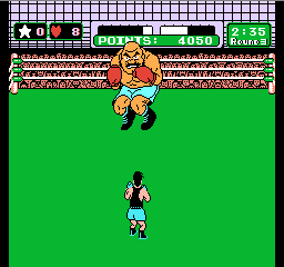
What is interesting about this concept is how the entire presentation of Punch-Out!! is based around reiterating it. Nearly every visual aspect of the game is about making the player feel small and making the player’s opponents feel larger than life.
This is not just due to the size of Little Mac’s sprite compared to the sprite of the other boxers. It also shows in the amount of space they are able to move in. The visual language, along with the game-design decisions for Little Mac’s movement, are about making players feel confined — almost claustrophobically so — in order to make them feel smaller and weaker compared to their opponents.

For example, as Little Mac, you have very little area to move around in. You also have very few options for what you can do in that area. Your only defensive moves are to either dodge to one side or the other or block.
Visually, when you dodge, you don’t appear to move very much from where you are normally standing. So even when you dodge a punch successfully, it seems as if the blow is just missing you.
If you choose to block, Little Mac puts his hands up to cover and protect his head. This gives Mac the appearance that he is almost cowering from his opponent.
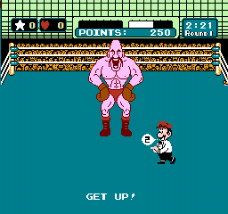
In comparison, the opposing boxers are not only much larger than your character. They also use a lot more of the screen space. And they often have moves that cause them to move around the ring quickly. This makes them more visually impressive and also adds to the player’s feeling that the enemies are much stronger than Little Mac. Especially in comparison to what Mac can do.

All of these design choices make Punch-Out!! players feel like the underdog, which puts it in their mind that they are going to lose. This means that, when they do lose, it doesn’t feel as punishing. On the other hand, when players succeed in defeating a boxer, the elation and feeling of accomplishment is much higher.
These feelings build into the next theme: that brains beat brawn. In the story of David and Goliath, it was David’s use of technology (in other words, his intelligence) that defeated the giant warrior. In Punch-Out!!, players don’t level up Little Mac's stats to make him as strong as the other fighters. Instead, they defeat their opponents by recognizing patterns and finding ways to take advantage of them.
And even if the players themselves are not able to figure out the patterns, they are able to acquire that knowledge from others. Back when the game came out, that meant asking one’s friends or reading a gaming magazine. In either case it showed the power of knowledge, because even getting a small clue about the way in which one of the boxers fought could make a battle with them much easier.

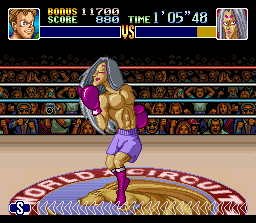
This version of Punch-Out!! is the only version visually set up like this. The other titles in the series show the other boxer from the perspective of Little Mac. And the other boxers, while still bigger than Little Mac, are not as unnaturally large as they are in comparison to Little Mac in the NES version.
While the perspective is a visually interesting one, these other series entries don’t have as strong an underdog theme. That's because Little Mac feels more comparable to the other fighters since they look more like him. This in turn makes the successes less memorable and less enjoyable while also making the defeats much more frustrating.
