Editor's note: Sometimes, when I've been playing a game for an hour or two, it almost feels like the controller disappears. I think this occurence is the highest testament that I can give to any game's interface. Ben's article digs a little deeper, though, and takes a look at why this happens. -James

In a game you know well, you probably spend very little time thinking about the controls — perhaps the same amount of time you spend thinking about buttoning a shirt or moving your feet to accelerate a car. The nature of your relationship with any control interface is of crucial importance, and the bond you have with it facilitates a productive experience.
In his hugely influential book Being and Time, Martin Heidegger identified a phenomenon he called "ready-to-hand." It is essentially the notion that familiar objects and tools are, in a very real way, a part of us. We don’t consider them physically for what they are, but rather, we see through them to what they do.
In Zen and the Art of Motorcycle Maintenance, Robert M. Persig puts this in no uncertain terms. He states that engrossment in an activity can lead to "an absence of any sense of separateness of subject and object."
Anthony Chemero et al. conducted an illuminating piece of research this year. They experimented with participants using a mouse that they preconfigured to malfunction at irregular intervals.
They concluded that the participant and mouse unified when the device was working normally, but that any malfunction disrupted this unity. Furthermore, the malfunction caused a change in participants’ performance of simultaneous tasks that test givers instructed them to complete.
 Any gamer is all too familiar with this. Once we’re comfortable with a game, we think very little about the controller we’re holding. For the most part, we don’t even look at the pad. The object disappears as it becomes an extension of our hands. This is why some core gamers instinctively respond in a negative way to the idea of Kinect — to us the pad isn’t a hindrance; it’s an enabling mechanical augmentation. I can input more on-screen commands with a control pad than with I can with my hands. Similarly, I can do more to a nail with a hammer than I can with my fists — so long as the hammer (gamepad) responds as I expect.
Predicatable and unfaltering response is key to maintaining this oneness. The malfunctioning-mouse example shows how an unexpected response from a tool can interfere with the "unity" between that tool and its user. For gamers, this could take the form of a faulty pad — a sticky button, for example — but it can also be the result of a "broken" control mechanic.
Broken controls are the result of inconsistencies between the buttons depressed on the pad and the expected actions on screen. Crtiics panned Sonic the Hedgehog (2006), a notable example, for exactly this. It’s wonky camera would often change position quite suddenly, and the player would find the direction that they had been holding the stick, which up to that point had been making Sonic run forward, would suddenly cause him to stop in his tracks.
But an extra layer of complication that didn't have Heidegger in mind becomes a concern when considering the control pad as an extension of the hands– or even a mouse used for non-gaming purposes.
The pad — which always remains physically the same — functions differently from game to game. The same can’t be said of a hammer, for example. The is rarely the case even for a general-use mouse interface, which almost always designates the left button to select and the right button to bring up a contextual menu.
 The developer assigns control-pad buttons to perform any number of desired functions. A gamer might know every square millimeter of their pad, but that alone isn’t enough to achieve the unity described above — even if the pad is working perfectly and the game always responds correctly.
That means developers must consider two other factors when placing buttons: "intuitive configuration" and "conformity."
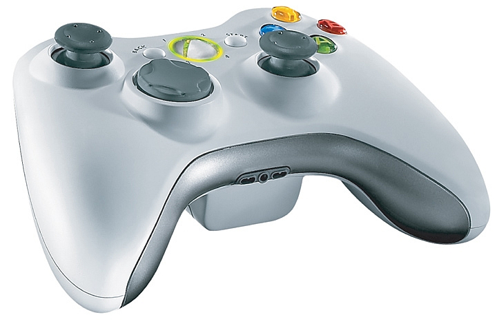
Intuitive configuration means assigning actions to a sensible button. Using the Xbox 360 controller as an example, "RT" (and possibly "LT") is likely the only natural position for firing a first-person gun. The "T" stands for "trigger," it looks like a trigger, and you pull it like a trigger. If you give an Xbox pad to a non-gamer and ask them which button they think fires an in-game gun, you can be reasonably certain they will guess correctly.
But the second factor, conformity, is possibly even more important than intuitiveness. Virtually every game uses the "start" button to pause. If you give an Xbox controller to someone who’s never seen a video game before and ask them to press whatever button they think will pause the game, it's unlikely they'll press the button labeled with the antonym of what you've asked them to do.
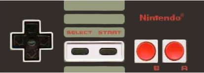
Conformity manifests as a broad standardization of specific controls within individual genres. On the Super Nintendo, platformers such as Cybernator, Contra 3, and Castlevania 4 all assigned the "Y" button to "attack" and the "B" button to "jump." This convention meant that gamers playing any one of those games for the first time would be comfortable with the basic controls immediately and be able focus their attention on the game itself.
Modern games conform resonably consistently, too — despite the wide variety of actions players can perform in different games and the increased number of buttons on the pad. I checked out a few of the top first-person shooters. It was surprisingly difficult to find the controls online — feel free to check my accuracy here. The games were Modern Warfare 2, Halo: Reach, Bad Company 2, Borderlands, and Bioshock 2. As already mentioned, shoot is invariably "RT" (on the Xbox). That’s an intuitive placement. Placing "reload" isn’t so intuitive — no button simply shouts "reload" — yet in every game, the developers assigned it to the "X" button. Cycle weapon is "Y" or "RB," and jump is usually "A" (except in BioShock 2).
It's also worth mentioning that the location of the "A" button on an Xbox controller is the same as the "B" button on an NES controller. The position of "jump" hasn’t moved, even across console generations.
 Toward the end of the last decade, Electronic Arts’ FIFA developers made a concerted — and successful — effort to overthrow Konami’s Pro Evolution Soccer (formerly International Superstar Soccer) as the number one soccer sim. They knew the value of removing the need to adapt to new controls all too well. Konami dominated the genre since the mid-90s, and in a bid to lure players, EA’s FIFA added an alternate control function that duplicated all the key buttons of Pro Evo. In this way, a new potential customer could try it out without constantly performing a chipped pass when they wanted to shoot — or any other control-based frustration. The player would be able to make a decision based on the quality of the action on the pitch, without having to consider whether or not they were willing to learn a whole new control system.
Many discussions I have read about factors that interfere with immersion tend to focus on graphics, plot, voice acting, etc. And rightly so: These are huge obstacles for developers to overcome if they hope to bring a player into their world.
But to be in someone else’s world, we must first be taken out of our own. And in that regard, the control system is the first obstacle. Game makers must configure buttons intuitively and consistently and must implement them effectively and predicatably. Only then can we focus on the game and forget that w're holding a controller. In doing so, we can interpret a game as we should: not as an "other," but as a part of ourselves.
VentureBeat's mission is to be a digital town square for technical decision-makers to gain knowledge about transformative enterprise technology and transact. Learn More
