When we went into production on Trenched [editor's note: now Iron Brigade], we had a clear vision of the gameplay, but the art style hadn't been fully fleshed out. The big, heavy, open-top mechs were in place, but we felt they needed a lot more style so that they didn't feel generic. One of our concept artists at Double Fine, Razmig Mavlian, suggested that we use men’s magazines from the '40s and '50s as the basis for our heroes. He sent us tons of reference material, and it didn't take long for us to realize how awesome this was and what a great fit it would be for the game. Our lead artist, Geoff Soulis, took to this art style right away and fully embraced the manly aesthetic. It was an extremely manly embrace.
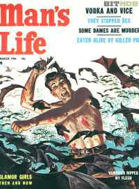
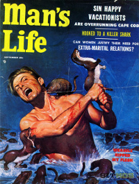
Those magazines have a lot of themes that feel very wrong and outdated when you look at them today. But we felt that we could focus on the sense of adventure, bravery, camaraderie, drinking, and good old-fashioned face-punching violence for Trenched. And there's also something really amazing about a man fighting for his life against a bunch of crazed snapping turtles, bats, or weasels.

Real Man
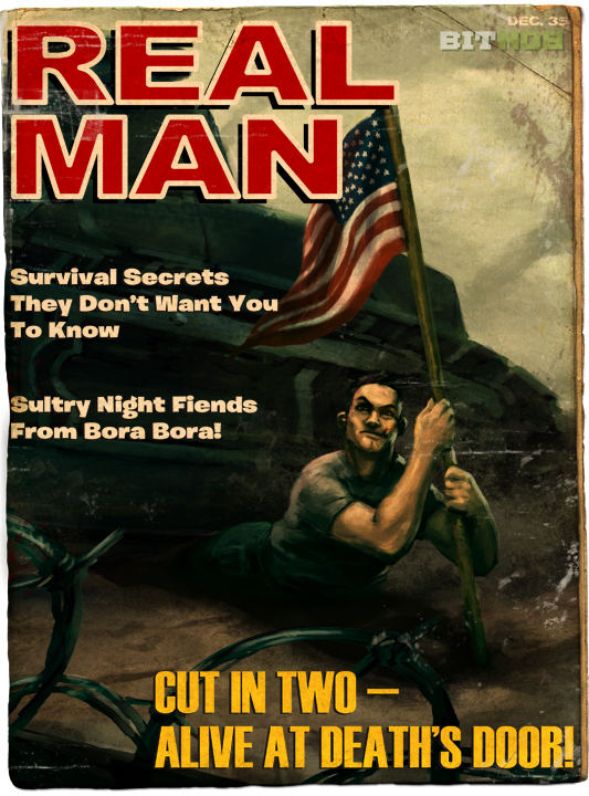
This magazine is the first one the players see when they fire up the game. It depicts the hero of Trenched, Frank Woodruff, being savagely run over by a tank in World War I. We really wanted to capture the ridiculous machismo of those magazines. Frank’s entire lower half is being crushed, but he’s barely grimacing, and he’s still managing to easily hold up the American flag so that it doesn’t touch the ground. You see this sense of over-the-top manliness in all of these magazine covers, and our very own Jeremy Natividad captured it perfectly here. We had to do this one several times to get it right, and in the end Tim Schafer himself had to model the perfect manly pose for us (below).

Danger Monthly
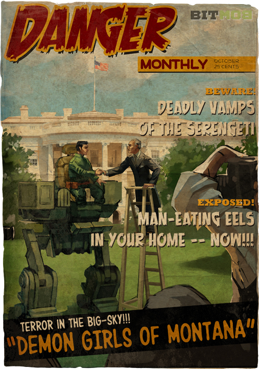
This issue of Danger Monthly shows off Frank Woodruff and his miraculous mechanical-leg technology as he meets with the President. The shot also conveys the extent of his injury. We talked a lot about the best way to show a disabled veteran in the most positive light possible.
When we first started the project we asked Ryan Wilkerson, our art director at Microsoft, to help out with some of the 2D assets. We provided his team with lots of reference material and they did a great job at replicating the style. They also came up with most of the slogans that you see in the images as well. Ryan and his team really got the ridiculousness that we were going for. I especially love the reference to man-eating eels on this cover.
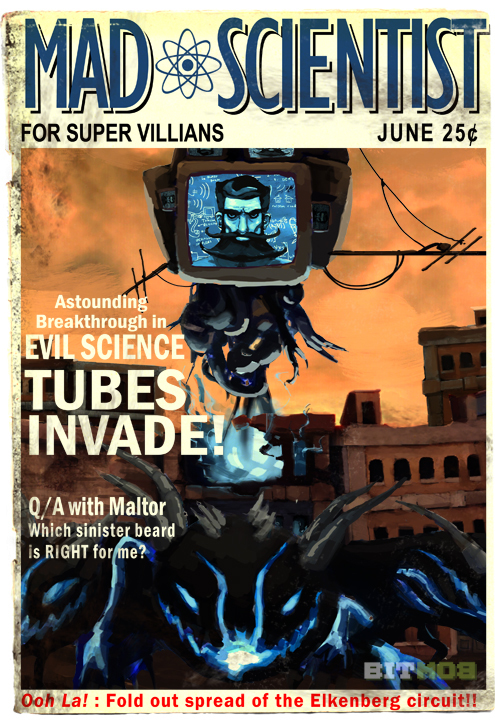
Mad Scientist
We added this magazine late in development as a way to bridge the gap from the first cover montage into the first tutorial section of gameplay. It shows off our villain, Vladimir Farnsworth, using his Monovision technology to take over the world.
This cover has a slightly different flavor than the others. This is not a manly magazine; it's an issue of Mad Scientist — the only periodical for mad scientists, by mad scientists. Jeremy came up with this idea independently as he was working up the art for the cover. Although it's not completely consistent with the men's magazine style we were going for, the whole thing was just too ridiculous and awesome to pass up. His sinister beard reference and the fold-out spread of the Elkenberg circuit (I don’t even know if that’s real) cracked me up, and we just went with it. We let more humor like this leak into the game over time, and I think it was a great direction to go with.
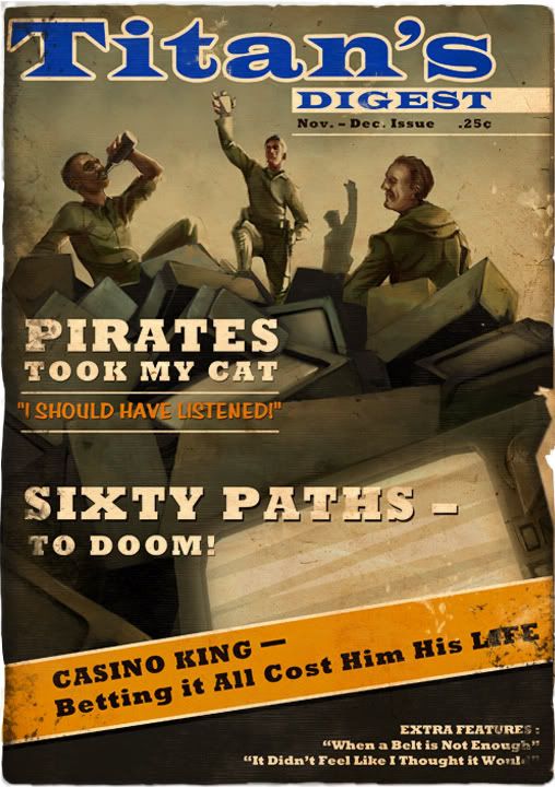
Titan's Digest
This cover shows off a small victory of the Mobile Trench Brigade over Vlad’s Movision hordes. Drinking was an important part of being a man’s man in the '50s, and we wanted to capture that here.
"Pirates took my cat" is probably my favorite article heading in the entire set.
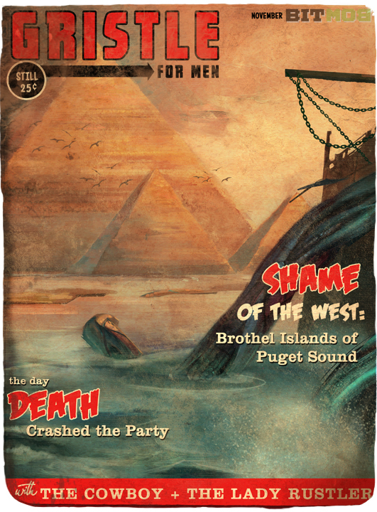
Gristle for Men
Gristle is pretty much the best name for a magazine ever. It's both manly and disgusting…but mostly manly. This cover depicts the Mobile Trench Brigade's entrance to northern Africa after the European leg of the campaign.
Ryan and his team work up in Seattle at Microsoft, so they took several opportunities to put in references to the Pacific Northwest into the magazine headlines. Super awesome. I really like the "Brothel Islands of Puget Sound."
Our UI artist, Luke Nalker, really took the men's magazine concept and ran with it, injecting it into all aspects of the game. The entire look and feel of the UI throughout the game has this same pulpy feel to it. He also did our opening title screen that captures the style perfectly.
I’m super excited for people to play Trenched when it finally makes its way onto XBLA this year. We’ll have a release date soon!
VentureBeat's mission is to be a digital town square for technical decision-makers to gain knowledge about transformative enterprise technology and transact. Learn More
