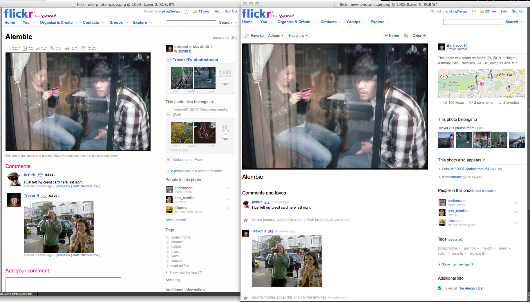
 If you’re not a heavy Flickr user, you might not spot the changes in the Yahoo-owned photo-sharing service’s forthcoming redesign, to which you can opt in now. Click on the screenshot at right to see it full size. The old and new pages look alike at first, but there are key differences:
- The default display size of photos has been increased 30 percent, from 500 pixels wide to 640. Newer computers with larger, more high-resolution displays are put to better use, rather than filling the screen with whitespace.
- The entire photo page has been made wider and taller.
- A light box few darkens the white pixels to black, much like Photoshop, so you can look at photos without being bombarded with white light.
- Photo titles are closer to the description, so you can easily figure out what a photo is about.
- The photo’s owner, date taken, camera, and geographic location are clustered at the right of the page.
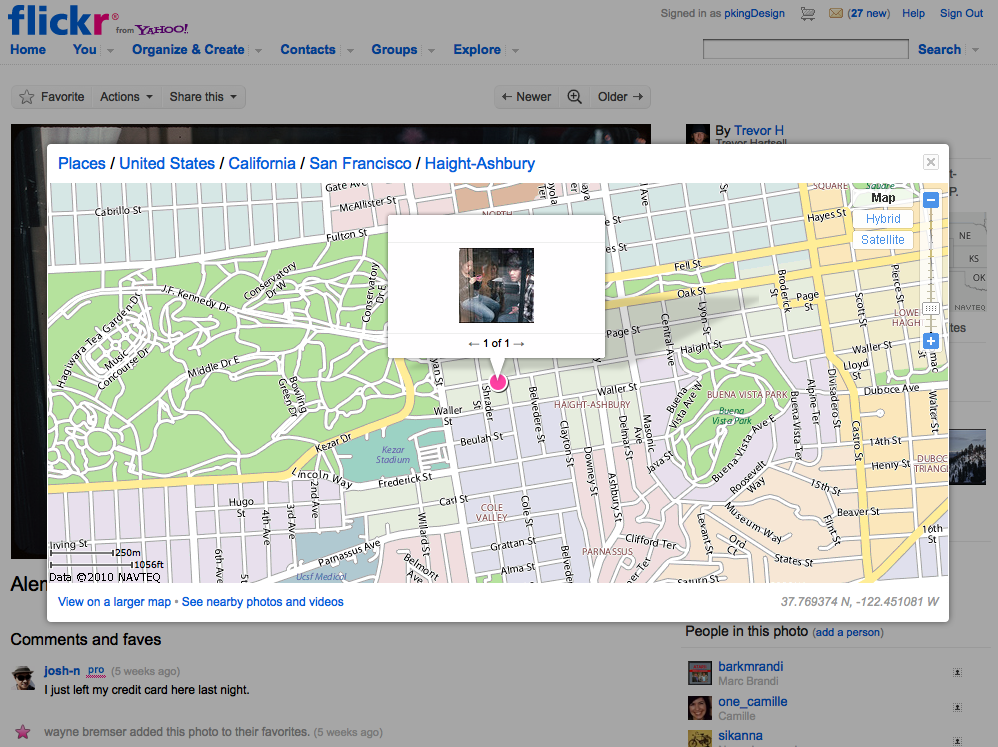
- There’s a map that shows the geolocation data attached to the photo. You can pop up the map over the page for a larger view.
 The photostream to which a photo belongs appears as an interactive filmstrip. You can scroll it within the page.
- You can pop up a map that shows the geolocation data in the photo.
- You, and anyone else, can “star” an image to mark it as a favorite.
- Other users can add to a Facebook-like stream of comments and stars below the image.
- Navigation has been cleaned up. For example, you can now use arrow keys to go back and forth through a filmstrip.
The new Flickr is more of a major overhaul than it seems. Sign up for the opt-in beta test program, use it for two days, then try going back.

