Getting users to install your app is hard — app discovery is rather broken. More than 80 percent of apps do not show up in the top lists in the Apple App Store, and every niche has a lot of competition crowding out the search results. But if you do somehow manage to acquire users, then there’s the bigger challenge of retaining them. A new study by Quettra shows that an average app loses 77 percent of its users within the first 3 days and 90 percent within the first 30 days. So how exactly are you supposed to build a mobile app business?
Retaining your users is as important as acquiring new users, if not more. But adding that additional pop-up or the ninth “we miss you” push notification doesn’t cut it to retain users, although they might be the tactics that come to mind because that’s what most mobile growth blogs and communities out there talk about. Growing your mobile app business doesn’t have to be about ruining the user experience and hurting yourself in the long run.
In this post, I bring you 15 tips that help you grow your mobile app by actually adding to the user experience. Of course, you will have to try them out for yourself and see what the data looks like, but the underlying philosophy is to help the user do her job better.
Onboarding
#1 Focus on the benefit to the user
Unless your app is very simple, has a very intuitive flow, is as popular as Facebook, or you are just plain against having a walkthrough to familiarize users with your app, your app will have an onboarding step. And since this is the first impression your users are going to have of you, onboarding is one of the most important parts of your app.
Before you ask the user to do anything, from signing up on your app to adding topics to populate content, explain how it will benefit the user. When the user knows how the app will make their life better, they are much more likely to take the action you want them to take.
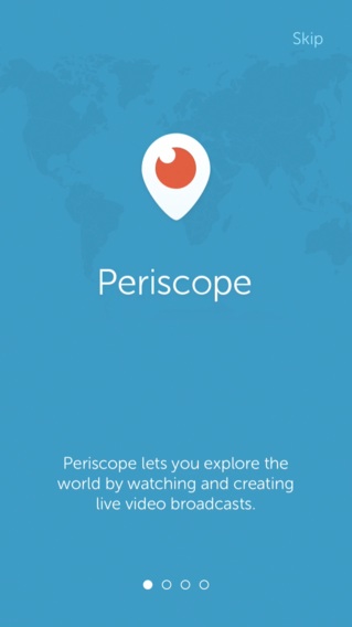
Periscope sums up its value proposition nicely and crisply in its onboarding.
#2 Show, don’t tell
When you are teaching the user how a particular functionality works, it’s easier to just tell them how something works and expect them to remember it. But most users will forget what they read. Instead, have them actually do an activity and they will remember it for much longer. So wherever possible, get the users to actually try out the functionality right in the onboarding itself.
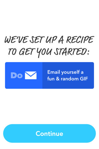
Do Button by IFTTT explains how buttons work in the app by asking users to tap on a button that sends them a funny GIF.
#3 Keep it short and focused
Just because your app can do six different things, it doesn’t mean the onboarding has to explain all of them. Just keep it focused on the main value proposition of your app, and keep the education ongoing — as soon as you think the user has got a good grasp on your core functionality and could handle more, tell her about the next functionality and how it will benefit her.
VB’s new Brands & Mobile Advertising: How to win report is available for
$499 on VB Insight, or free with your martech subscription
Asking for permissions
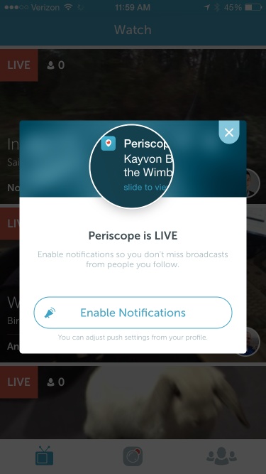
#4 Set the right context before asking for permission to send notifications
Push notification opt-in rates have fallen to 42 percent in 2015 compared to 45 percent in 2013. As apps start sending more push notifications to increase engagement, users are getting more selective about which apps they want sending them push notifications.
While the opt-in rates vary across industry, you can ensure higher opt-in for your notifications by clearly explaining how the notifications help users before the permission pop-up comes up.
#5 Not just notifications, explain the benefit for every permission
Your app also needs permission for accessing a whole lot of other things, including location, camera, and microphone. If, for example, your app is all about displaying people, places, or events nearby based on the location, getting denied access to the location effectively renders your app useless. And getting the access overturned is a pretty complicated process for a phone.
Sure, we can just blame the user for being stupid, but a little explanation of why you need access doesn’t hurt, and even for the ones who already understand why you need location data, it just serves as reinforcement.
Push notifications
#6 Keep it conversational
The phone is a very personal device. If you are going to talk to me in passive voice in support-ticket kind of language, I am just going to feel marketed to. My guard will be up, and I will be drowning out whatever you have to say.
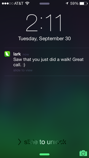
But talk to me like a friend and I will be much more receptive to what you have to say. Lark, a weight and nutrition coach app, does a great job with the tone both within the app itself and in the notifications.
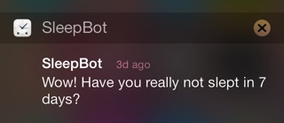
SleepBot, which is exactly what the name suggests, has a very cheeky message to get you back when you haven’t used the app for a while.
#7 Add context with data you have
Even with the right segmentation, notifications can still feel very marketing-ish. After all, they are still being sent to a segment of people who share common interests, and not just to me.
But what if these notifications were based just on my behavior? Based on when I like to run? The kind of movies I like to watch? The content I like to read?
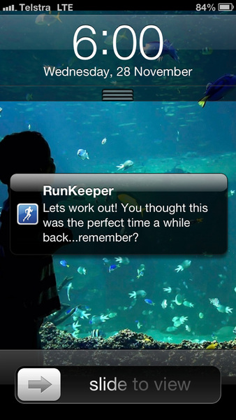
Runkeeper does just that by reminding users to go for a run based on historical data on when they have gone running.
Login forms
#8 Is social login an option for you? It’s a great option for users
If you have the option of using a Facebook, Twitter, or Google login, they are great ways to prevent dropoffs at the login screen. Not only do they remove the need for typing out three fields on the login screen, they also remove all the misspellings that are all too common with a mobile keyboard, thus eliminating the need to recover usernames and passwords later on just because a user spelled it wrong.
#9 Got special rules for passwords? Let the user know beforehand
That upper case letter, number, special character, emoji, and secret code that passwords need to have to be able to sign up your app — well, why would you have them in the first place? But if you have a good reason, write the rules very clearly on the top of the form so the user doesn’t enter a name, username, and password and tap on “sign up” only to discover all the special rules the passwords need to have. And then have to type all of it again.
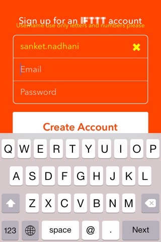
Do Button by IFTTT, which otherwise is a great app, is guilty of this with the username. And they have some spacing issues with the error messages too.
Ratings and feedback
#10 Allow users to report a bug or send you feedback
A lot of users give 1-star ratings to an app because it crashed or there was a bug, and they were just not able to find a way to contact the app developer. Frustrated, they just went and vented it out in the ratings, knowing that they will surely have the app developer’s attention there. These ratings harm both the app store optimization (ASO) and the overall credibility of the app.
It doesn’t have to be this way. Add a feedback link in your app in a very visible section, invite users to reach out to you, and be proactive with your replies. Not only can you bring down the 1-star horror through this channel, you can also use this opportunity to turn some of your detractors into passionate fans. And you can also use this to build relationship with your users at large and get feedback on your product as well.
#11 Ask for ratings at the right time
Unless you are someone who philosophically disagrees with asking for ratings and believes that your app should do all the talking, you have some kind of prompt asking users to rate the app. And why shouldn’t you?
But do you ask for a rating as soon as someone opens your app for the third time (some really famous apps do)? Or because it’s been 5 days since they installed the app? Let the user really get value out of your app and they are done with the task they came to complete — after they have booked that hotel they came to book, successfully shared that file with their team, passed that really difficult level in the game, or checked three to-do lists.
#12 Ask for ratings the right way
Now when you think ratings, popups that ask you to go rate 5 stars on the App Store are the first thing that comes to mind. It surely is the most frequently used method, but many an app ends up getting 1-star review just because they asked. And some tech pundits recommend giving 1-star because the prompt nags them.
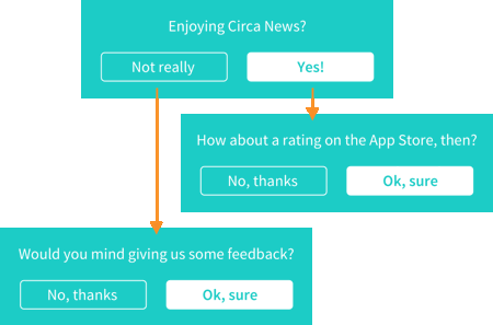
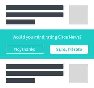
How then should you ask for the all-important ratings? Circa, a news app that doesn’t have a magic moment like I talked about earlier, asks users if they are enjoying Circa News. I mean asking for feedback is a right, right? If they are enjoying the app, that’s when Circa requests the user rate the app.
And they have baked it natively into their news feed instead of a popup that you are forced to interact with — it’s pretty visible as you scroll down the news feed but if you want to ignore it, you totally can without any additional effort.
Another great place to prompt for ratings is if you have a communication channel with your users over email or in-app chat. If you do, right after you have solved the user’s problem or made her happy, ask her to rate the app.
Delight users with tiny little details
#13 Save time in unusual but clever ways
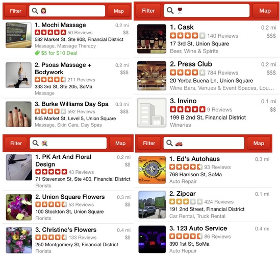
Typing on a phone is not the most pleasurable experience for the most people. Yelp takes a lot of pain out of that by allowing users to search using emojis: car, flowers, bar, massage, you name it. Not only does it save time typing, it’s a lot more fun as well.
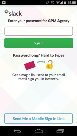
Slack takes the pain out of typing even more complicated passwords by offering to email you a “magic link” to automatically sign you in.
#14 Funny error messages
Who likes an error? No one that I have met in my life. But who said error messages can’t be a place for building some personality into your app?
Again, Yelp shines here. When it can’t find your current location, it suggests that you’re a ninja.
#15 Surprises where you least expect it
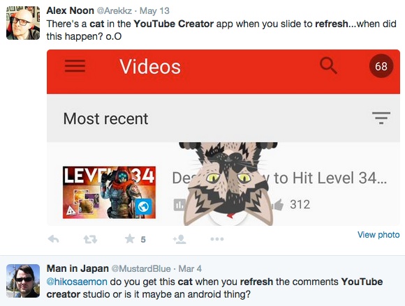
When you find a surprise hidden away where you least expect it on the Internet, you are most likely to tell everyone about your discovery. Maybe you will even take a screenshot and put it up on your Twitter account.
Most people are like you.
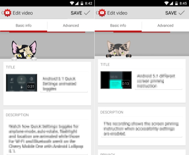
YouTube Creators Studio shows cats peeking from behind the interface when you pull down to refresh on most screens.
And people seem to be quite enjoying it — very much worth the effort, I would assume.
Uber allows you to doodle away while your request for a cab is waiting for approval.
Yahoo Weather frosts at the edges of the screen when it’s really cold.
That’s it. There go the 15 non-hacky ways to growth-hack your mobile app by offering users a great experience. Which one is your favorite? What other hacks do you know of that have brought great success for their apps?
 Sanket Nadhani is currently building Upquire, a free mobile engagement platform for indie developers.
VentureBeat's mission is to be a digital town square for technical decision-makers to gain knowledge about transformative enterprise technology and transact. Learn More

