Facebook began to roll out a new design of its homepage today, with a number of subtle features intended to make feed-based social networking more intuitive for the typical user. When the company first showed off its plans last week, we and many others compared some of the changes to microblogging service Twitter and lifestreaming service FriendFeed. But upon using the service, significant differences become more clear — and point to Facebook’s long-term strategy of gradually opening the site up to the web.
With the changes today, Facebook is trying to make existing features — like sorting feeds by friend lists — easier to use, so people can more quickly gather specific types of information from within feeds. Meanwhile, the company has quietly tied its experimental advertising features into core components of the site.
Feeding friends
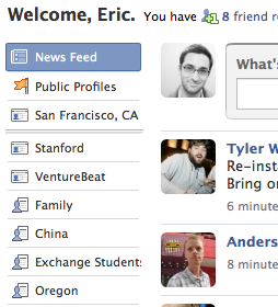
 Friend lists, for example, have gone from the drop-down menu format of the older interface to become a core way to read the homepage. You can sort feeds based on the various official Facebook networks you belong to — your hometown, your college, your company — or sort based on custom feeds, public pages and third-party applications. To re-order the feeds, simply click on any type of feed that you see on the left-hand side of the site; the previous design’s sorting feature was hidden within a now-gone horizontal tab. The new homepage purposefully features your networks at the top of the list, so when you click on any of them you see just feeds from people in those networks — and get a feel for sorting feeds in general.
The ability to easily sort customized feeds deserves special attention. For the few of us who have been manually categorizing every Facebook user we’ve befriended since the friends-list feature launched in late 2007, this new interface is very powerful. Now, I can easily see feeds of information from people who I am friends with back home in Oregon, friends from college, people I’ve met in the tech world, fellow reporters and more. For those getting started with this feature, click the “Friends” button in the top navigation bar on the site to see the menu of options for viewing, editing and creating friend lists.
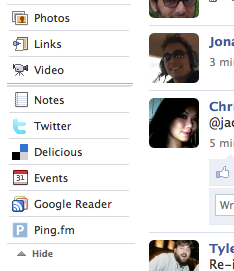
Feed sorting has also become more granular when it comes to applications. You can easily sort Facebook news feeds by individual application, including sorting Facebook’s existing method of adding feeds from other web sites into your Facebook profile — services like Digg, Delicious, Pandora and Google Reader. The new design shows applications on the left-hand side beneath your list of networks and friends. Similar to friend lists, this feature has already been available, but was just more obscure within the interface. As before, if you want to add a direct feed from another web site, you have to go into your user profile page, click on the “Settings” button and choose from its list of sites or the option to add an RSS feed from any blog or site.
However, you cannot manually add your own feeds of applications within the news feed homepage at this time — unlike FriendFeed. Instead, Facebook automatically decides which application feeds appear in the left-hand column of the site, based on how many friends and friend-of-friends have used the application, and how recently they’ve used it, according to Facebook product manager Peter Deng. To me, that’s a problem — I want to decide exactly how to filter feeds, because I want to play around with all sorts of pieces of information coming in. That would be useful for my job as a reporter — and probably many other people’s jobs out there.
While Facebook is limiting use cases, there are probably benefits to doing so. The lack of options could make application-based feed sorting more obvious to users. Instead of being asked about a bunch of options for adding and sorting feeds as in FriendFeed, its just a matter of clicking on any of the subcategories in your list of various feeds.
 But it also biases feeds in favor of Facebook’s own applications. This may not be intentional, but as a result of automated feed storing, you tend to see applications built by Facebook — notes, shared items, videos — rather than feeds from third-party sites that provide similar functionality on the web. For example, while web users may prefer using social bookmarking site Delicious to share news stories, the shared items feature in Facebook provides much of the same functionality — and it’s already how most Facebook users share news stories.
Within the feed, Facebook is also featuring information that its users create on other web sites, using Facebook Connect. If you sign into a news web site to leave a comment using Connect, a news feed item will appear with a link to your comment and the story.
Combined, the homepage’s demotion of third-party feeds of information and the emphasis on Facebook’s in-house applications and Connect data make this a Facebook-centric redesign. But the site is trying to bring this still-new style of interface to its soon-to-be 200 million user base. It could just be wanting to teach its average user how to sort feeds, then eventually introduce more complex features — like manual application feed filtering.
Feeding ads into content
 Facebook ultimately wants these feeds to serve as valuable new avenues for advertising. Either its own applications or third party applications will help it do that, if the information in these feeds proves interesting to users — hence the tighter restrictions and automated sorting. Of course, limiting feeds also means Facebook can serve a greater proportion of ads within its feeds, and in locations of its choosing.
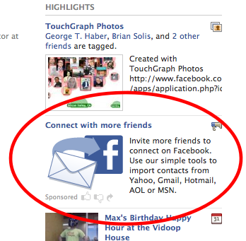
Another aspect of the redesign — the “highlights” section on the right-hand side of the site, is basically a more streamlined view of upcoming events and other information that Facebook previously displayed in this portion of the site. (It also used to let you bookmark links to your favorite applications in this section, but that’s been moved to the menu bar on the bottom of the site.) A key difference in the new interface is that the company has closed the amount of space between items, and turned them into more of a visual feed. Its existing ad space within this section — the second item down on highlights — blends in to the other items and appears to be less of an ad. Facebook has said that items will show up here based on measures like how many friends are interacting with them.
So the redesigns changes to emphasize feeds are the latest in a variety of ways the company is trying to get feed ads to be more interesting. These ads, which don’t appear all the time, also feature polls, questions and other call-to-action messages that encourage users to respond.
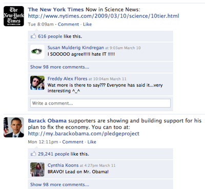
Facebook in turn links these ads to its advertiser “Pages” — public profiles for advertisers that can show a variety of information about a company’s product. In a further example of Facebook mixing ads and content, pages can also be for politicians, musicians and many other types of people who tend to have thousands of fans. Users can choose to become “fans” of these pages, then see updates from page owners within their news feeds. If you’re a fan of the New York Times’ page, for example, you’ll see a flow of the Times’ stories mixed in with a wide range of other information. If you click on the “Public Profiles” tab, you’ll see a feed of all of your pages.
 On the flip side, Facebook is introducing new ways to refine who sees these ads; today, for example, you can start doing things like targeting ads by language. While the new design for Pages hasn’t been fully rolled out yet, marketers and developers are notably interested in how to use them.
Feed your mind
Another big change is what Facebook calls the “Publisher.” This is the area at the top of your feeds that allows users to add something to a feed, depending on what feed you are looking at. The Publisher you’re likely to see most often is the simple input box for adding text to the News Feed. While the change here may not be so obvious, its ramifications are potentially huge.
Rather than asking the somewhat restricting “What are you doing right now?” the new version of the Publisher asks you the much more general “What’s on your mind?” It’s subtle, but now Facebook is basically telling you to put any information in there that you want. That’s big because that’s what has made Twitter explode in growth — people using it to send information other than just what they are doing at any given moment. Twitter, comically, still asks, “What are you doing?” but now Facebook realizes the use of real-time updates has moved far beyond that.
And you’ll notice that Facebook no longer ties this information to your name. So it’s no longer you are doing such and such, it’s just your name followed by your message. This was one of the reasons we previously listed as to why Facebook was not going to “kill” Twitter — because this area had a different use. Now they are much more aligned to go head-to-head (though we still don’t believe one will kill the other).
Big picture
So looking at these changes in the big picture, Facebook is orienting itself around feeds that it carefully organizes to be interesting — and to create a circular loop of advertising within feeds and on Pages.
MG Siegler contributed to this article.
VentureBeat's mission is to be a digital town square for technical decision-makers to gain knowledge about transformative enterprise technology and transact. Learn More


