[Note: We’ve since written another article examining specific Facebook redesign changes in detail, and why we think they’re good or bad. Check it out.]
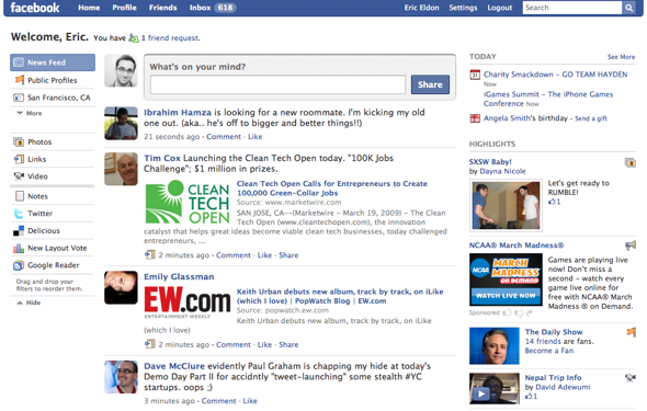
Sometimes when Facebook tries something new, people hate it, and it fails (like the Beacon ads that show you friends activity on other sites). But sometimes when it tries something new and people hate it, those people prove themselves wrong and end up liking the changes. Now, user anger is mounting over Facebook’s latest redesign. The changes further de-emphasize some features that people are used to, like applications, and instead promote existing features that they’re apparently not so used to, like status updates.
The redesign has been gradually rolling out for the last week or so — and once again, we have a vocal minority of the site’s users freaking out because they’re confused by change. Nearly a million people have given the new Facebook redesign a thumbs-down on a third-party application called New Layout Vote. Only around five percent or so seem to like it. Assuming this application’s numbers are accurate, that seems pretty bad.
But I think this poll is a false indicator of what’s happening here. Let’s travel back in time to last fall when a more substantial, feed-focused redesign took place. Several million users joined protest groups against the new design before the company had even introduced the changes to everyone. Oh yeah, and that was when Facebook had around 100 million monthly active users. Now it has around 200 million, so any protesters now will have to really run up the numbers if they’re going to make themselves heard. Right now, the negative voters in the poll comprise less than 0.5 percent of Facebook users.
What’s more, last fall’s redesign appears to have helped Facebook get users doing more of what it wants them to — sharing information with people they care about. The number of sessions per user went up after the redesign.
The whole idea of news feeds was greeted with major protests when it was introduced a few years ago. At the time, people didn’t realize that Facebook could automatically show their friends what they were up to on the site. The redesign today emphasizes sharing and viewing short status updates — a form of communication on the site that currently makes up the majority of the news feed.
In looking at users comments on the app, it seems they’re confused about where to find things on the new interface — presumably Facebook’s own applications, like photos and notes, as well as third-party applications like games. Perhaps a few tweaks to make old interface pieces more obvious would quiet people down? Maybe a more obvious way to select apps from within the news feed is an order. Right now, there’s an automated list of apps that are popular with your friends on the left-hand column of the site, and an automated list of content from around the site on the right-hand side. (Such a move would probably make developers happy.)
Certainly, the redesign needs to make things more clear to users. But that’s a matter of Facebook taking iterative steps with the new version — which it is. What Facebook shouldn’t do is listen to a relatively small number of irate users and stop trying to improve the product in favor of what already exists. After all, Facebook is trying to focus on getting people to do more status updates in order to compete with upstarts like Twitter; going backwards is more dangerous than going forwards.


