Marketplaces are notoriously one of the hardest types of businesses to start because you have to acquire two different types of users at the same time: buyers and sellers.
You need to launch with both, and you need to make sure they both scale together.
Early on, if you have many more sellers than buyers, sellers won’t see many sales, they’ll decide that your marketplace isn’t worth their time, and they’ll give up. On the flip side, if you have many more buyers than sellers, the buyers aren’t going to find products they want to buy, and they’ll all leave too.
When we were preparing to launch graphic design marketplace Creative Market, we found several strategies that were particularly helpful in making sure we built out active buyer and seller sides from the get-go. Here they are:
1. Sign up buyers before launch
It’s really hard to just open the doors to a new marketplace without any pre-launch traction and expect sellers to see the kind of sales numbers and positive feedback loops that will keep them around past day 1.
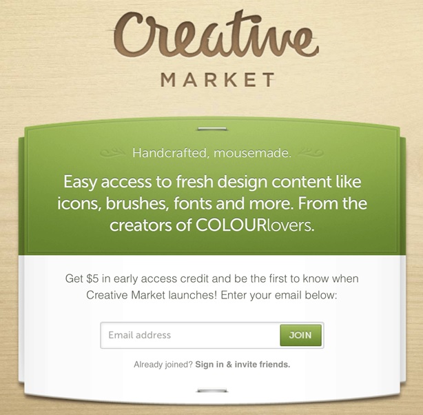
So a few months before we launched the full marketplace you see today, we shipped a pre-launch teaser page to capture potential buyers:
This gave us a platform to promote the marketplace and capture new potential buyers before we officially launched the site so that we’d have a built-in audience of buyers at launch.
2. Give buyers free money to spend
We didn’t just throw a “give us your email address” page out into the world, though. We offered $5 in free credits to anyone who signed up before we launched. This served two purposes for us:
- It gave potential buyers even more incentive to sign up, rather than us looking like Yet Another Teaser Website.
- It seeded the buyer side of the marketplace with $5 x total_members worth of dollars to be spent when we launched.
On the economics side, because we offered a 70 percent commission to sellers, this meant it would actually cost us only $3.50 for every $5 in free credits spent. We also made the assumption that not everyone would spend the full $5 (if any at all). And we were banking on buyers purchasing products that cost more than $5, meaning they would have to take out their credit cards to spend some real money as well.
What was most exciting about this from a marketplace dynamics perspective for us is that we’d be able to send a dedicated email blast to the entire community announcing the launch of the marketplace, with messaging like “Remember that $5 in free money we gave you? Now you can come spend it!” Who wouldn’t come take advantage of that and help us kickstart the buyer side of the marketplace?
3. Create a viral loop
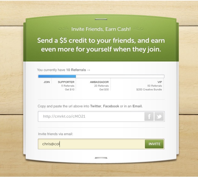
Once potential buyers signed up to claim their $5 in free credits, we gave them a fun way to invite their friends to join via Twitter, Facebook, and email to earn even more free credits to spend.
We built out a tiered system to encourage mass referrals and gave users a visual way to track how many of their friends had signed up.
- Refer 5 friends, get $10 more.
- Refer 20 friends, get $30 more.
- Refer 50+ friends, get $200 more.
We actually had dozens of people refer more than 50 of their friends before we had even launched the full site.
4. Attract buyers with free products
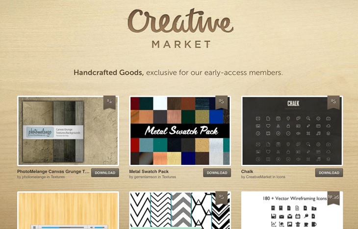
While buyers were signing up to claim free credit and referring their friends, we built out a new page on the site called “Free Goods.”
We manually reached out to dozens of top content creators to see if they’d be interested in offering a few of their products to our audience for free for a limited time (until we launched). And in order for people to be able to download the free products, they had to first create an account on the site. So if $5 in free credit wasn’t enough to get potential buyers to join the site, surely giving away 30+ free design assets would be.
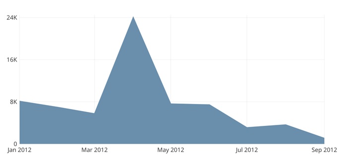
This was one of those rare things that was a win-win-win for everyone involved. It was a win for buyers because they got to download a ton of great design assets for free. It was a win for sellers because they got tons of great exposure for their work, which led to more exposure for their paid products when we launched. And it was a huge win for us, as we were able to sign up thousands of new potential customers from this one promotion alone. Can you guess which month we launched the Free Goods page based on the New User Signups graph below?
Besides the crazy number of signups this strategy generated, this also turned out to be a great way for us to begin to establish relationships with top content creators and begin to seed the marketplace with sellers and products ahead of the launch.
5. Use one side of the marketplace to attract the other
Once we had built up tens of thousands of registered users before even launching, we were able to approach content creators and say, “We have thousands of customers that will be waiting to purchase your products on day 1. Do you want to sell with us?” This, combined with our favorable terms outlined below, was usually enough to eliminate most of the risk that comes with trying out a new marketplace platform and encourage top content creators to open up shop.
6. Create favorable terms
We spent a lot of time analyzing the space to figure out how we could stand out and attract top sellers. We weren’t the first marketplace for design assets, but we were able to really resonate with both buyers and sellers because of how we decided to do things differently than they had come to expect.
We felt strongly that it was unfair that the creators were always getting the shaft in existing marketplaces. So we created uniquely favorable terms that would attract top content creators who were already selling on other marketplaces:
- We didn’t force sellers to sell exclusively with us. We wanted to prove we’re the best platform for them, not punish them for selling on their own sites or anywhere else. This also took the risk out of giving our marketplace a shot.
- We gave 70% of each sale to every single seller, far more than the 50% or less that most marketplaces offer.
- We reviewed sellers on a per-shop basis for quality control, rather than every time they added a product.
- We let sellers set their own prices.
Most sellers don’t want to waste their time with a brand new marketplace, since it’s risky to get invested, only to have it flop. We turned this fear on its head and used our small size as an advantage to attract new sellers.
7. Target buyers and sellers through existing relationships
Part of why we were able to grow our audience so quickly, even before launching the full marketplace site, is because our founding team had already built communities in the design space for years. We were able to leverage our existing audiences at COLOURlovers.com andColorSchemer.com, as well as personal relationships we had established over the years at design-related blogs and publications to help spread the word about our new marketplace.
We did this very deliberately too. Our pre-launch teaser page explicitly said “from the creators of COLOURlovers” on it, because COLOURlovers was a brand and community that many people in the design space were already familiar with and used on a regular basis. So even though no one had ever heard of our new marketplace before, it built up instant credibility.
We were also able to market to the COLOURlovers community through in-site banners, ads, and direct emails, to help spread the word about our new marketplace.
And then comes launch day
As launch day approached, we had a sense of nervous excitement. Using these techniques, we had built up a member base of more than 70,000 buyers and 200 top sellers without an actual marketplace, which far surpassed our expectations pre-launch. It also meant we were potentially on the hook for $5 x 70,000 = $350,000+ in free credits that we had used to seed the buyer side of the marketplace. This was a ton of money, especially for a small startup with less than $1M in the bank, and more than we had even anticipated with our projections.
What if everyone actually spent it all? How much runway would we have left?
We hit the Send button on that email blast on launch day to announce that we were open for business and waited for the sales to roll in. And when it was all said and done, we had made a total of … $3,000 in sales in the first 24 hours, $2,100 of which were from spending free credits.
It turns out that giving away free credits was a great strategy for getting potential buyers to sign up, but they didn’t actually spend the credits right away. This was the perfect scenario for us, and validation that our pre-launch strategies had worked. We were able to acquire tens of thousands of targeted buyers, most of whom came back to spend real dollars over the coming months. Sellers saw revenue on day 1, which gave them enough of a positive feedback cycle to continue to make and upload new products to sell. And the marketplace engine was off to the races.
With this jumpstart, 23 of the last 24 months have seen significant month-over-month growth, thanks to network effects we’re able to achieve at scale with a marketplace business. And we’re now paying out more than half-a-million dollars to our sellers each month, all because we were able to build and scale both sides of the marketplace simultaneously.
Aaron Epstein is cofounder of Creative Market.
VentureBeat's mission is to be a digital town square for technical decision-makers to gain knowledge about transformative enterprise technology and transact. Learn More


