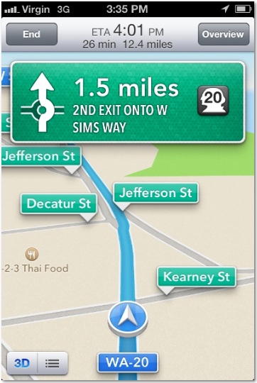
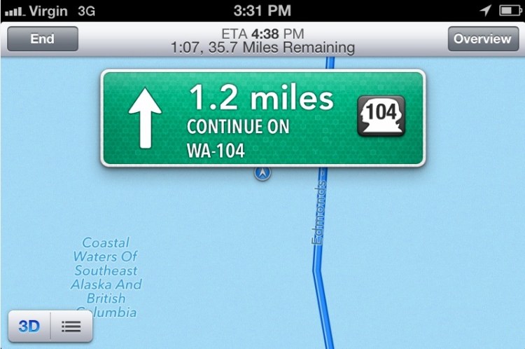
 I put iOS 6’s new turn-by-turn directions to the test over the weekend, often alongside Android’s turn-by-turn directions. I gave it some hard tests, such as routes involving ferries, obscure country roads, and out-of-the way destinations. (No, that image above isn’t an error in Apple’s iOS maps. That’s Apple correctly showing the ferry that I was on.)
I was in rural Washington state, but it’s important to note that commercial database providers, such as those that Apple uses, generally do a good job of covering the United States.
I tried to look for problems that likely fall into patterns as opposed to one-off data errors. No database as large as those used in mapping (including Google’s) will be error-free. There is just too much data that change too frequently. In addition to the weekend’s testing, this analysis is based on more than a decade working in the local space, including some time I spent working on in-car systems.
Neither Google nor iOS met my benchmarks for the ideal navigation app (I have very high standards), but Google was clearly better. There were a couple of ways in which I consider iOS to be better. I also found several ways in which Apple could significantly improve the iOS experience in the short term.
The best designed navigation systems gives you the right information at the right time, without distracting you with unnecessary information.
Problems generally fall into three categories: user interface, algorithm, and data. UI problems are generally the easiest ones to fix. The data is in the system, the system is finding it correctly, and the app just has to change the presentation. With algorithm problems, the data exist but are accessed in a way that the best data aren’t surfaced. Data problems are the hardest — they require either collecting or fixing the data. With mapping in particular, this can be a human-intensive task.
Points of Interest. Navigation systems generally have a hard time with non-commercial places and complex venues. For example, I searched for the Grand Ridge trailhead. iOS couldn’t find it. Google Maps gave me several results in Olympic National Park, but not the actual trailhead. A search for Olympic National Park Visitors Center on iOS brought me to the visitor’s center at the base of the mountain; the same search on Android brought me to another visitor’s center at the top of the mountain, a windy 17 miles away. I consider both wrong and incomplete; I would’ve preferred to see both options.
Coming down the mountain after our hike, we wanted pizza. A few miles out, Android showed several pizza places in Port Angeles. At roughly the same point, iOS only showed one. As we got closer, the search on iOS revealed the other pizza places. This was an algorithm problem — Apple had the right data, it just didn’t search out far enough. One approach to resolving this is to keep expanding the search until you have a certain number of results or reach a distance like 25 miles.
We also wanted to go to a cidery. We searched for Finnriver. iOS got us to the road leading up to the cidery. Android took us the additional 1/3 of a mile to the entrance of the cidery. The place was well signed, so iOS wasn’t a failure; but Google’s directions were better. This is a problem that can be solved with user-generated data. If you see that every one who searched for the cidery goes another 1/3 of a mile, you can then add that road segment.
I like that iOS provides names and locations of nearby points of interest as you drive. You can see that there’s a gas station, cafe, or hotel up ahead. Android doesn’t do that. (It’s my long-term hope that navigation systems will end the visual blight of highway billboards.)
 Road names. The biggest category of problems I found with iOS’s app is the road names it chooses to speak. Many roads have multiple names. One of the roads I frequently drove was Washington State Route 20. But iOS kept calling it “Sims Way.” (The iOS visuals showed both Sims Way and Washington 20.) Android spoke it as “State Route 20”. Most of the signage along the route referred to State Route 20. In another case, the road was identified by iOS as “Natl Forest Develop Road 2600 RD” but the sign said “Country Meadow Road”. Google had that correct.
If you watch the visuals of the map closely on iOS, you’ll get to the right place. But the best navigation systems will match the audible and visual directions to what’s on the road signs. The best way to do this is to actually drive the roads. But Google also had its issues: In one place, I was told to turn right onto 101 West, but the road sign only offered North and South as options. (iOS just told me to turn right onto 101.)
Audio cues. I found iOS to be way too chatty. In one span of less than a mile, it generated at least five prompts that were all some variant of “take I-5 north.” Such verbosity is only necessary when there are a lot of tricky maneuvers, not following a standard ramp with a lot of signage. iOS would also generate cues that included directions on what to do 10 miles or more out. When you’re that far out, the purpose of the cue is to tell the driver “keep going, don’t worry about listening to me for a while.” Asking the driver to remember what to do that far out is unnecessarily increasing the driver’s cognitive load. (Especially because the system will give the cues closer in.) It makes sense to give the left or right heads up a mile or two out so the driver can change lanes, if necessary.
In other cases, iOS didn’t give any audio cues at confusing intersections. I generally followed the path that most closely resembled straight ahead. Android was much better at this.
I also found iOS pronunciation of “W A 20” annoying. W A 20 should be expanded to “Washington 20” when spoken. (Abbreviation expansion is relatively easy, although in one navigation system I used, all of Washington’s roads were pronounced as “Western Australia” when I changed it to the sexy Australian voice.)
One thing I preferred in iOS over Android: in relatively urban areas, iOS gave me the next maneuver at 1/2 mile out instead of the 1/4 mile heads up that Android gave me.
Airports. Complex venues like airports have long been a challenge for navigation systems. Relying on iOS cost me about 15 minutes on my way to drop off my rental car at Sea-Tac Airport. Apparently, iOS routed me to what it considers the center of the town of SeaTac, instead of the airport. (If I weren’t testing, I would have just followed the signs on the freeway once I got near the airport.) My ideal navigation system would identify any query that looked like it might be an airport and then display a prompt asking if I wanted to go to arrivals, departures, or rental car return. My Android device wasn’t working on the trip to the airport, so I can’t offer a direct comparison. But I know Google has invested a lot of effort in making sure its airport data are correct.
It’s important to get airports right because so many users search for them, and bad directions can cause a missed flight. It’s also a relatively easy data challenge because it is a constrained problem set.
Ferries. My trip involved taking a ferry from Edmonds to Kingston. Both iOS and Android knew the ferry route existed, saving me the effort of driving around the bay. Neither won the available extra credit by telling me when the next ferry was departing. My ideal system would know ferry departure times and would calculate the optimal route based on my distance to the ferry and expected wait time at each dock. Heck, even a link to the WSDOT ferry schedule within the directions would have been very helpful. In my route, there were two different ferries I could have used; I manually calculated that I would miss the closer ferry and drove to the next one instead of waiting.
Visuals. I generally preferred iOS’s visuals to Android’s. Apple puts a lot less unnecessary information on the screen. The skeuomorphic design shows street names on street signs and generally looks cleaner than Google’s. Apple also did a better job of visually indicating the next step when multiple maneuvers were close together.
A subtle but important touch: Apple uses icons that correspond to road signage. In Washington, state route numbers are superimposed on a profile of George Washington. Apple displayed that; Google used an oval.
Speech. Android seems to make much more extensive use of concatenated speech; iOS uses much more synthesized speech. With concatenated speech, many short recordings of a human speaker are strung together and played back. With synthesized speech, a computer generates the audio. Concatenated speech is typically easier for humans to understand and creates less cognitive load on the driver.
Night mode. iOS lacks a night mode, which has been common in navigation systems for years. In night mode, the background of the map is dark and the screen emits a lot less light. The result is a display that is less distracting when driving at night. Although iOS does automatically dim the display based on ambient light, it’s not as effective as a real night mode. Android has this. This should be a very easy fix.
Miscellaneous. iOS doesn’t let you pan the map while navigating. I prefer having the option to see what else might be along my route. (Android allows this.) I would also love it if iOS paused my podcast when it gave a navigation instruction; as chatty as it is, I missed a lot of Wait Wait, Don’t Tell Me.
Turn by turn directions are an important addition to iOS. It’s great that Apple has finally made free directions available as part of the OS. Unfortunately, they still need a lot of work. Maybe Apple can use this post as a roadmap.
For more on mapping apps, tune in to NPR Science Friday this week, where I’ll be discussing these issues.
VentureBeat's mission is to be a digital town square for technical decision-makers to gain knowledge about transformative enterprise technology and transact. Learn More

